Seaborn Club Brand Identity
Overview
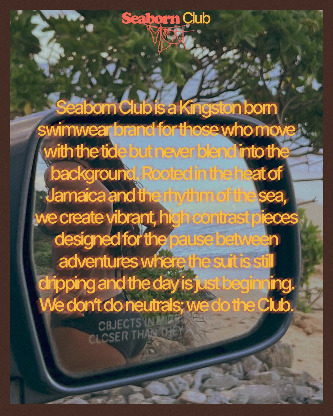
Seaborn Club is a spec brand identity for a Kingston-born swimwear label. No client, no brief handed down. A creative problem I set for myself and built a full system around.
The swimwear market is full of brands chasing an unattainable luxury aesthetic -- exclusive by design, aspirational by default. That approach has consistently left Black women and diverse communities with brands that feel like they were not made for them. Seaborn Club was built to fill that gap.
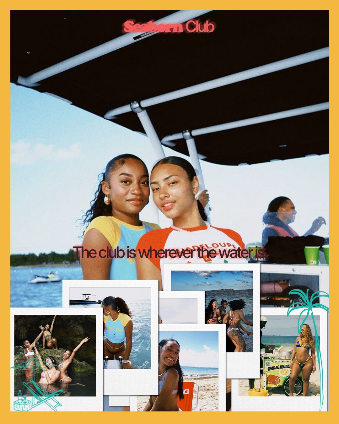
Exclusivity is overrated. The brand is built on radical inclusivity, specifically celebrating Black women, and positions itself as a stylish, confident, playful alternative to everything the market currently defaults to. The only membership requirement is a love for the water.
Type
Spec Work
Typography
Cooper Std / Inter Medium
Deliverables
Logo, Campaign, Packaging, Social
Year
2025
The Logo
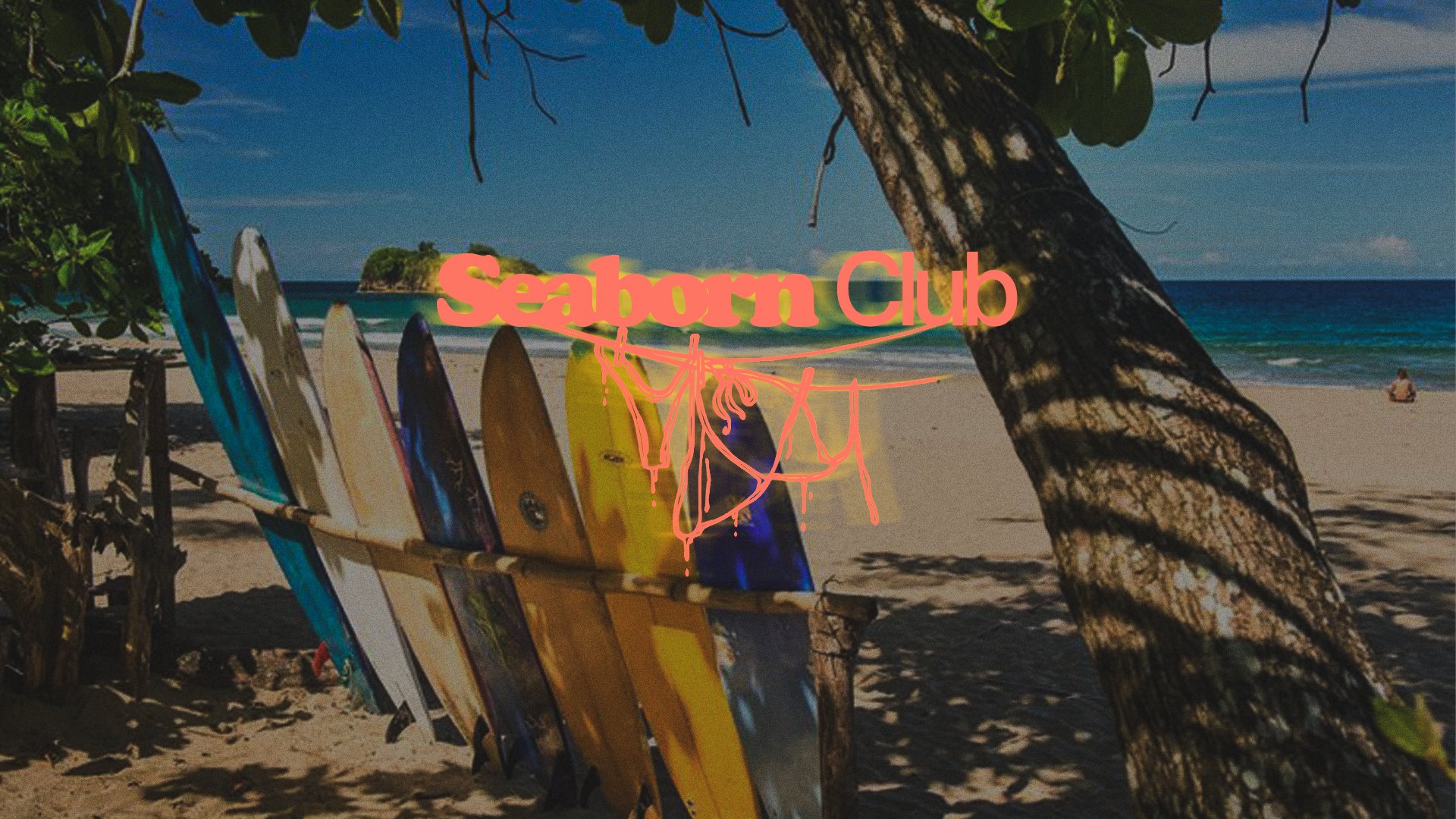
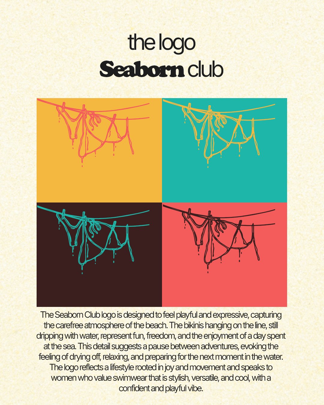
The logo is a hand-drawn bikini on a washing line, still dripping. It captures the pause between adventures -- the moment after you come out of the water, suit still wet, day just starting. Playful without being childish.
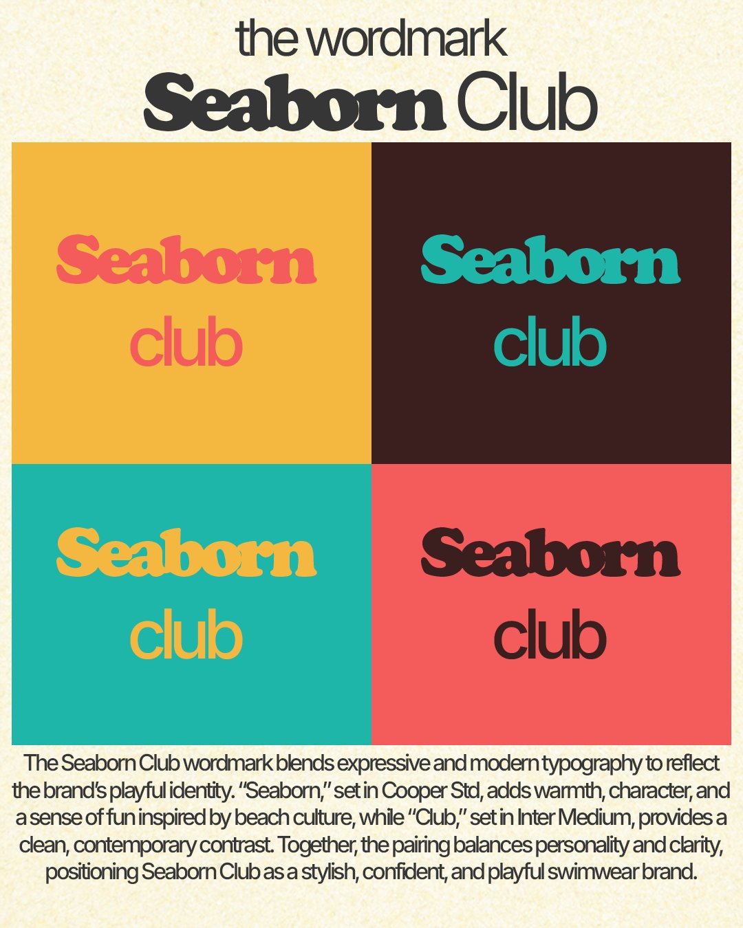
The animated version brings it to life with ocean sound design rooted in Kingston. The wordmark pairs Cooper Std for "Seaborn" -- warm, nostalgic, beach-worn -- with Inter Medium for "Club" -- clean, modern, no nonsense. Personality and clarity in the same breath.
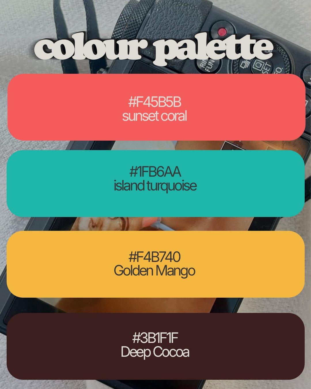
#F45B5B
Sunset Coral
Heat, joy, presence
#1FB6AA
Island Turquoise
Shallow water, fresh contrast
#F4B740
Golden Mango
Warmth, celebration, melanin-forward
#3B1F1F
Deep Cocoa
Warm anchor, richer than black
Colour Logic
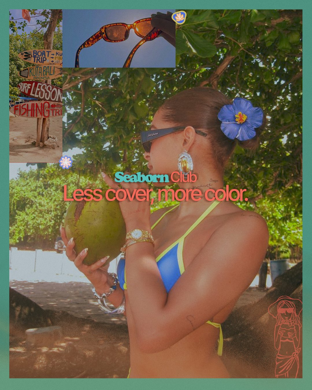
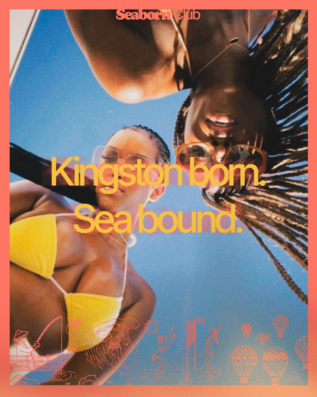
Four colours built specifically to pop on deeper skin tones and feel like the Caribbean actually looks -- not how tourist brands imagine it. High saturation used with intention, not decoration.
Colours are paired in approved combinations only: Sunset Coral with Golden Mango, Golden Mango with Island Turquoise, Island Turquoise with Deep Cocoa, Deep Cocoa with Sunset Coral. Two per layout, one dominant, one accent. That constraint is what keeps the palette feeling coherent across every touchpoint.
Asset Library
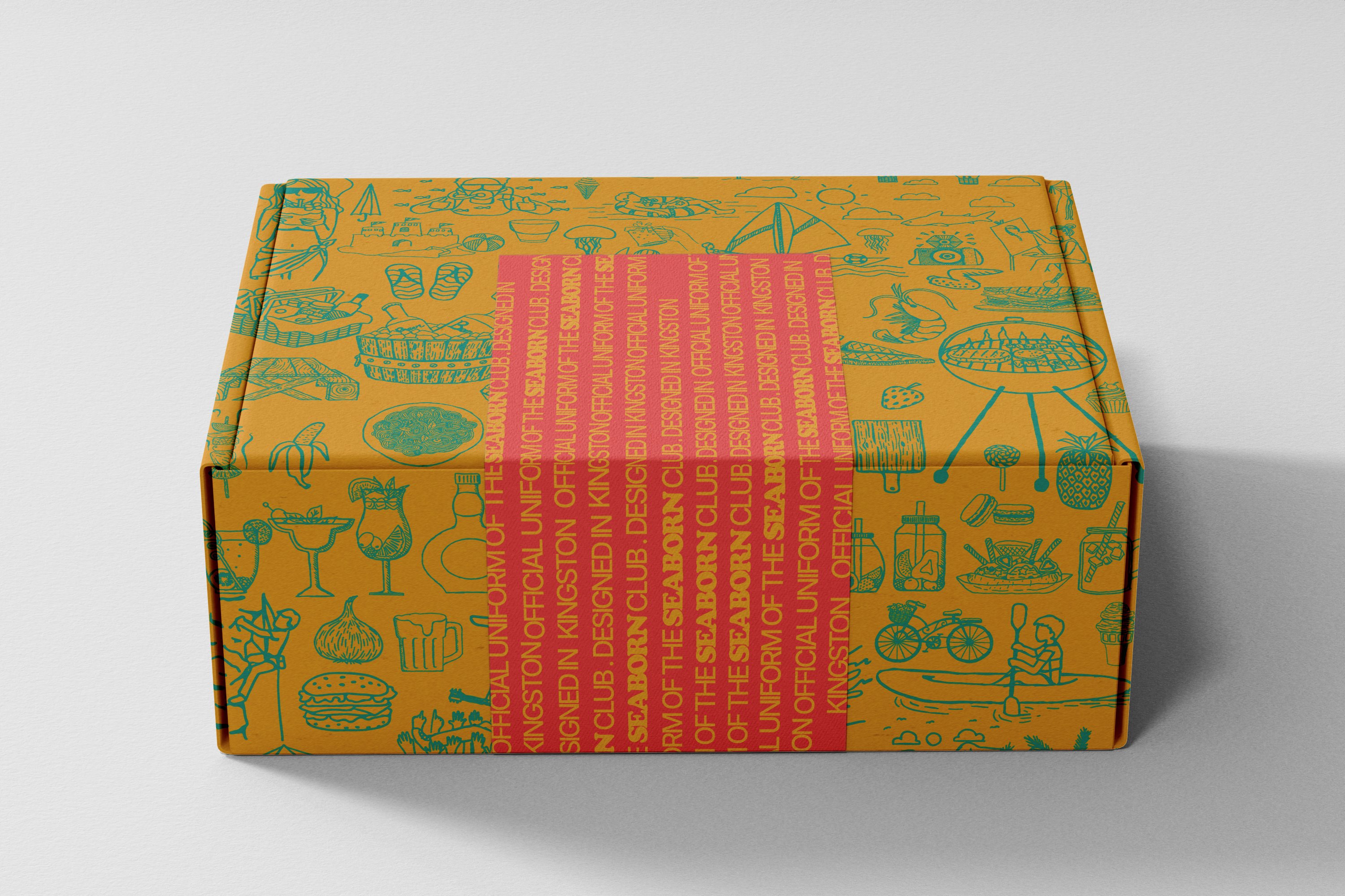
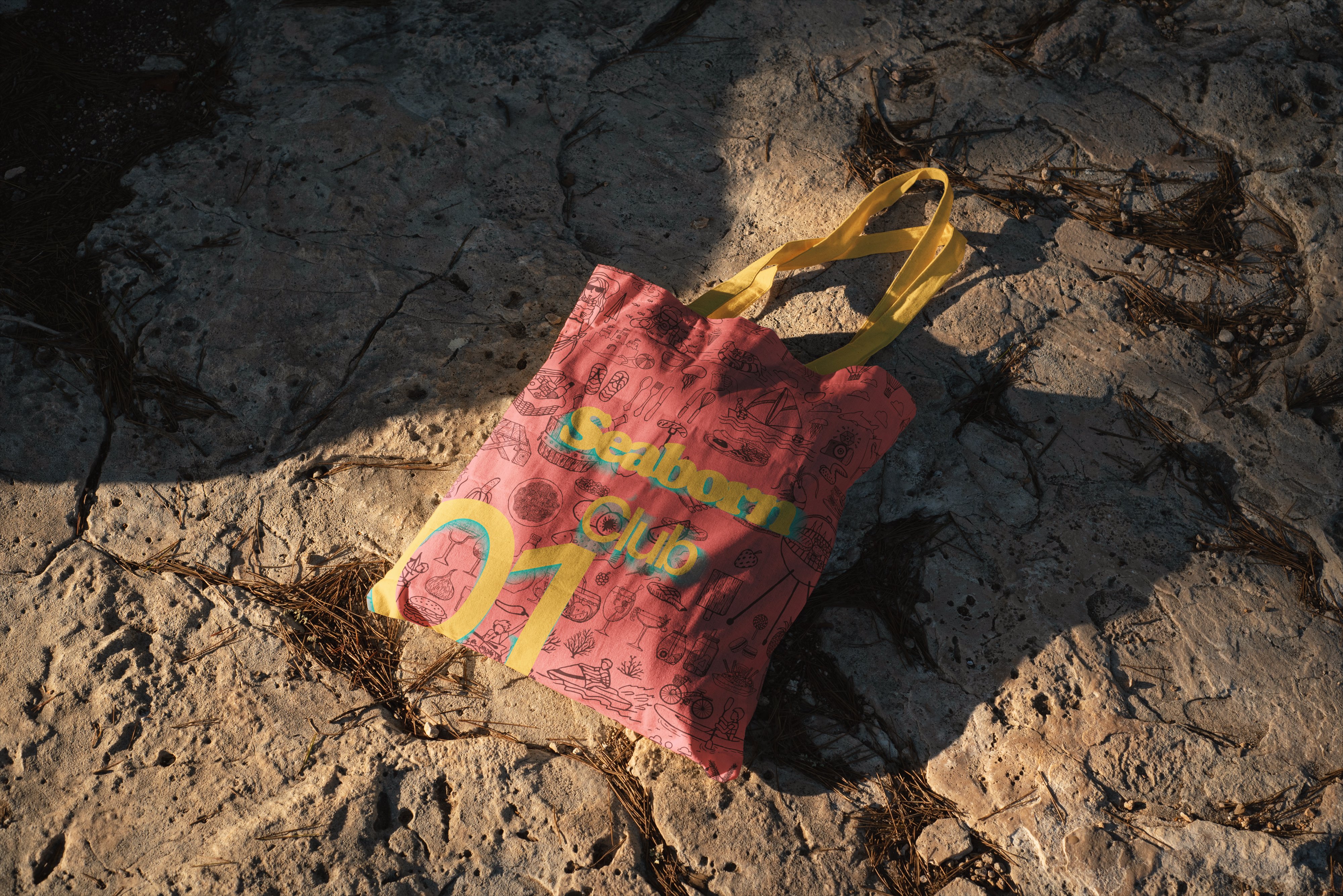
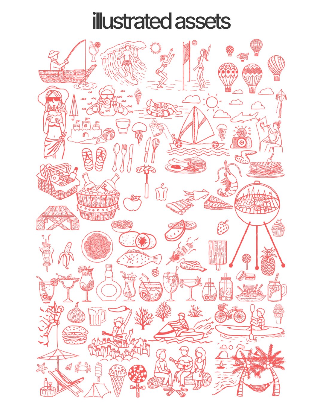
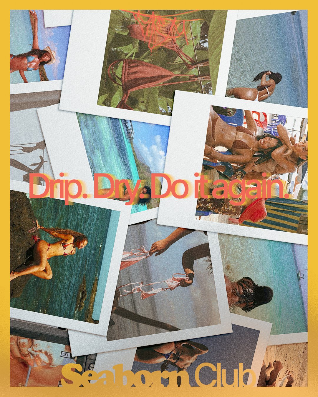
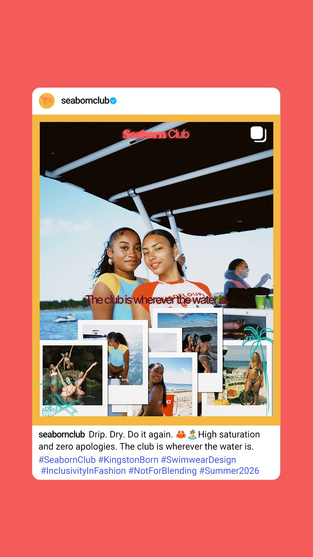
A hand-drawn illustration library covering everything from tropical fruit and beach gear to full scenes of island leisure. These run across every touchpoint -- packaging, tote bags, social posts, hang tags -- giving the brand infinite storytelling range without losing coherence. The secondary visual language that holds the whole system together.
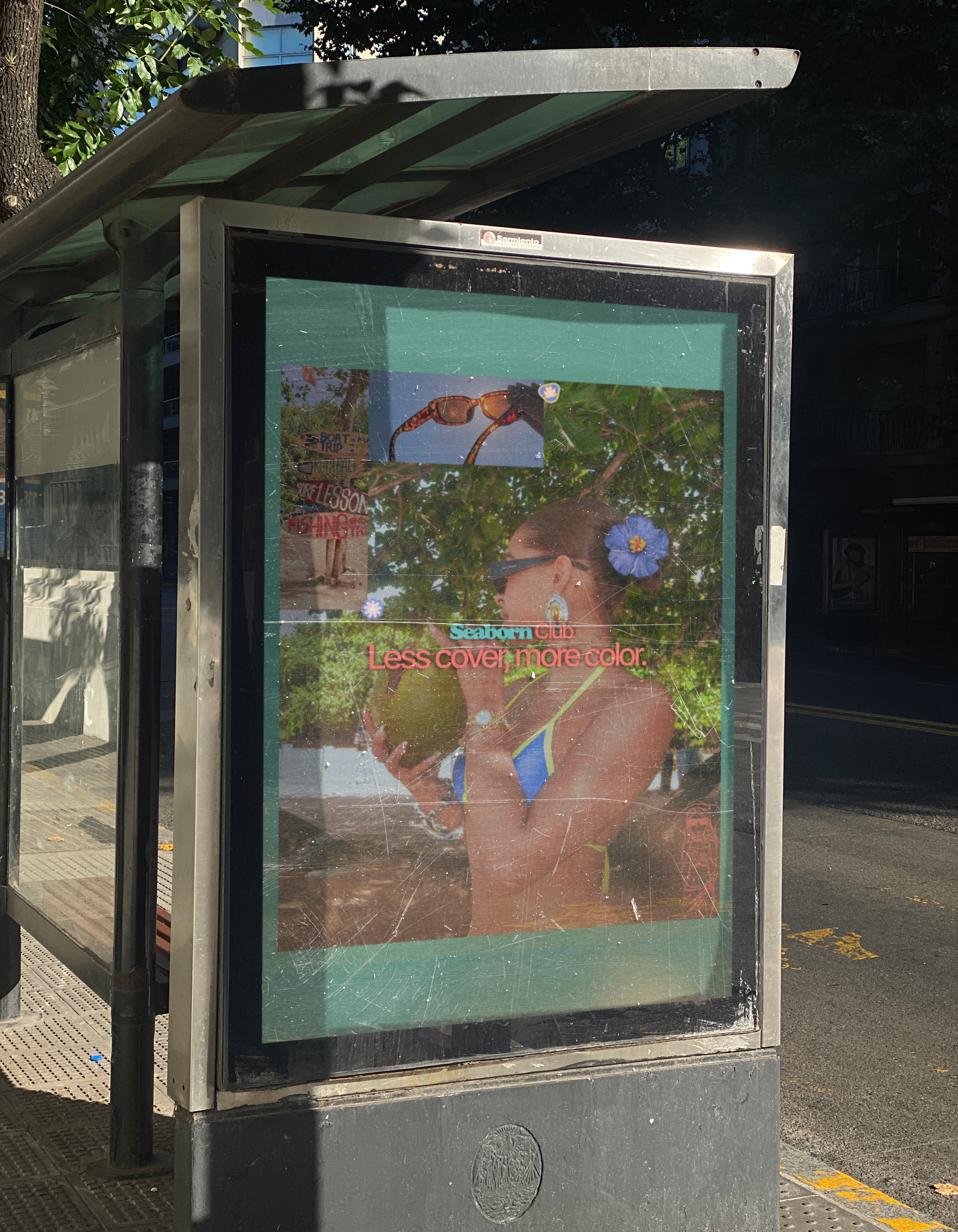
Touchpoints
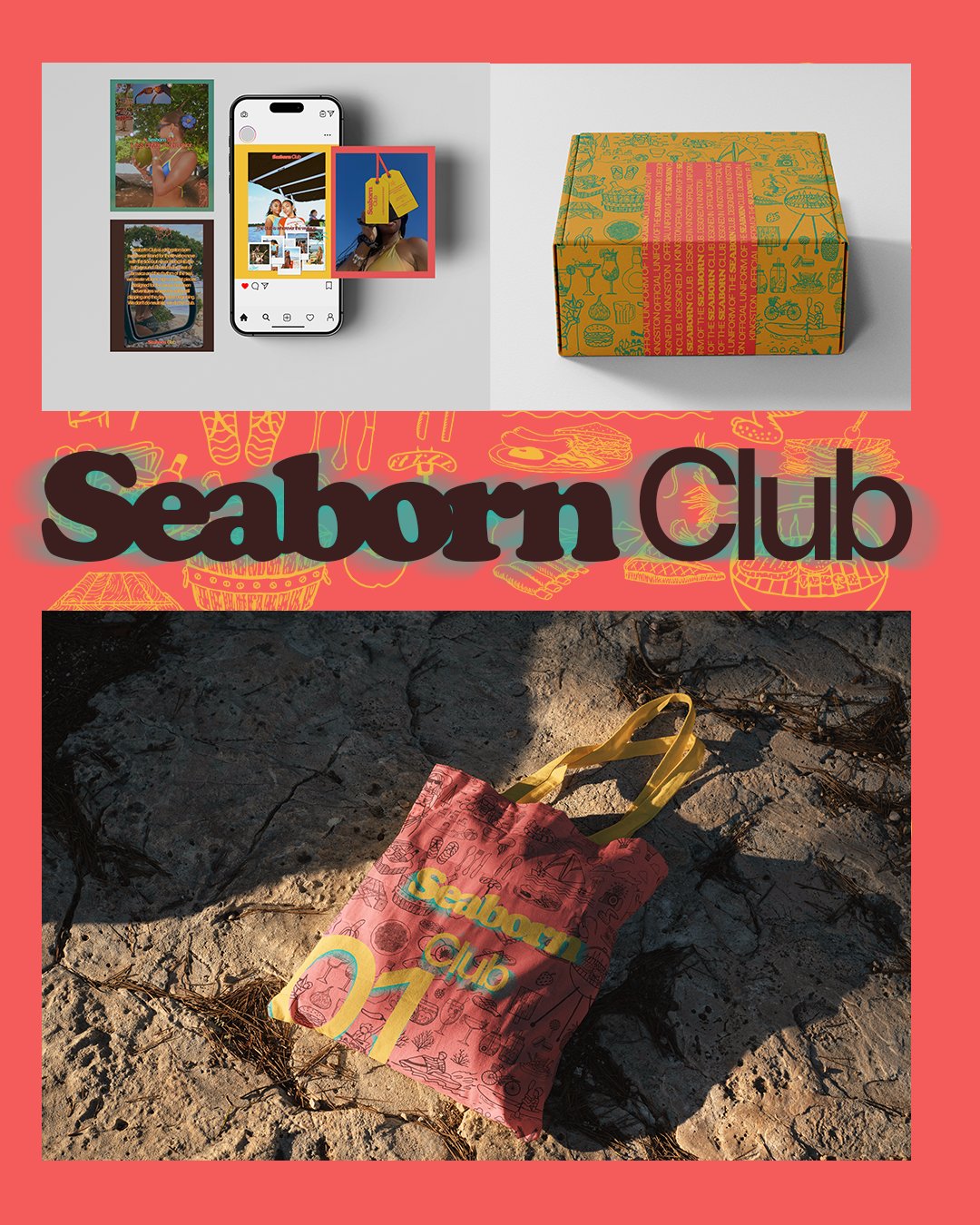
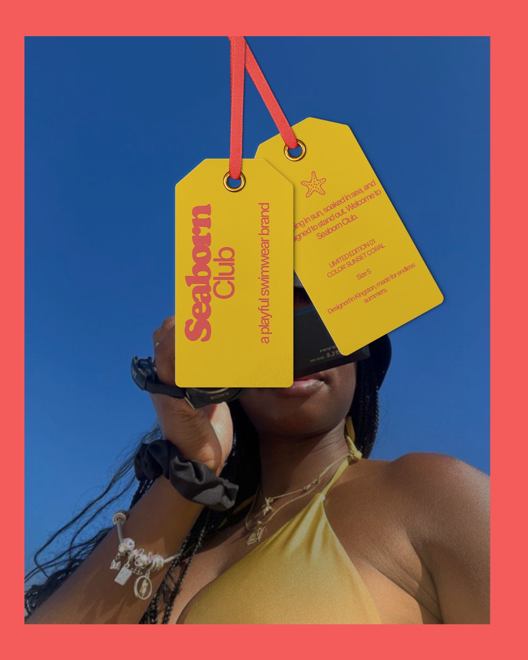
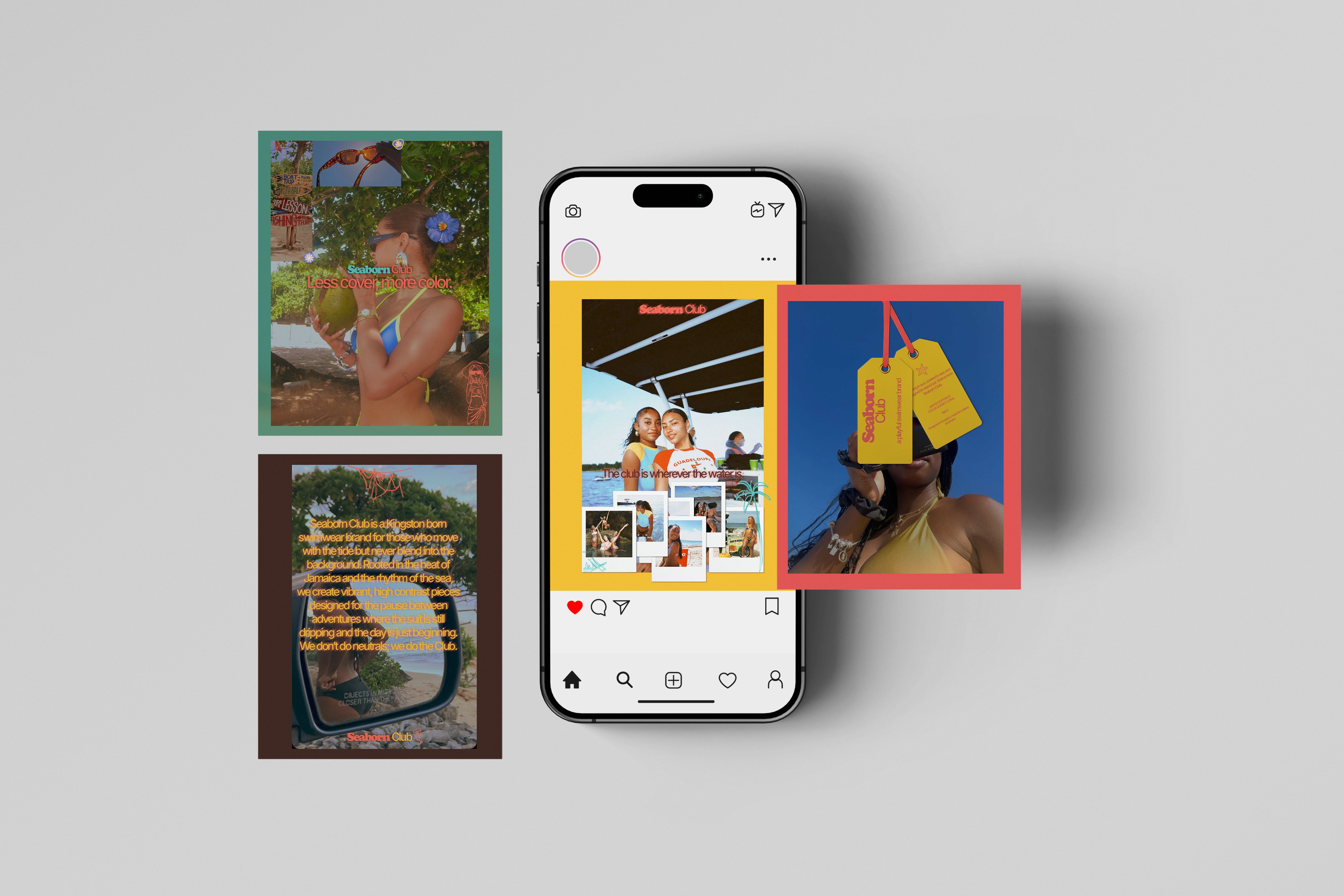
The hang tag functions as a membership credential. Golden Mango base, Sunset Coral type, limited edition colourway detail on the back. Curated artifact, not mass market product.
The brand box carries the full illustration pattern wrapped with a Sunset Coral band. The tote carries the wordmark over the repeat illustration system. Every physical touchpoint reinforces the same world.