About
When my friend, who runs 90 Mins Ago, brought me in for the World Cup, the brief came with an unusual advantage: no deadline pressure. Match timing meant most of these graphics went up after the final whistle instead of racing to beat it.
That constraint became the entire philosophy behind the project. Every piece here had time to be considered, referenced, and built properly, rather than assembled fast enough to catch a trending moment. Thirty plus graphics came out of that approach, across six distinct creative systems, spanning the full tournament from group stage to final.
Client
90 Mins Ago
Role
Design & Art Direction
Output
30+ Graphics, 200+ Polaroids
Year
2026
Every England graphic pulls its color, composition, and typography from a specific album cover — treating the match like it belonged on a record sleeve.
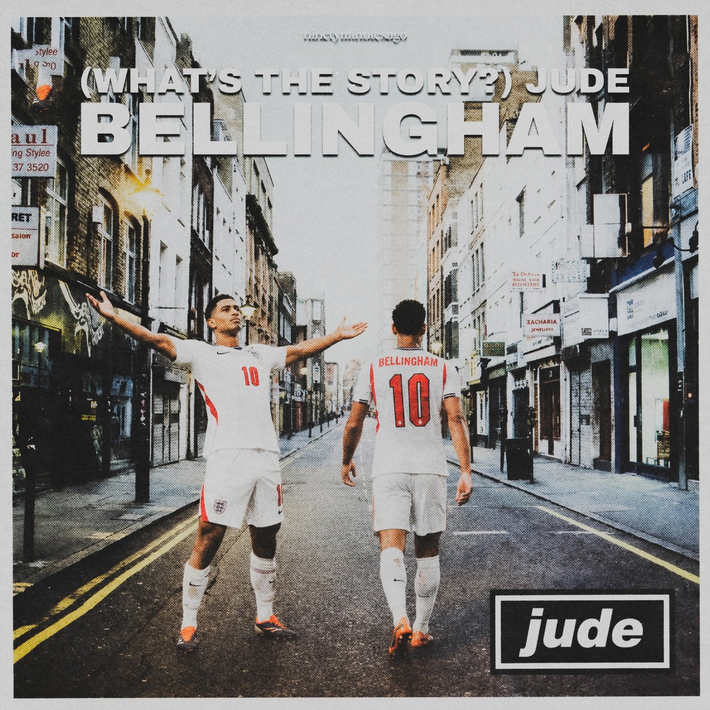
(What's the Story?) Jude Bellingham
A direct recreation of Oasis's "(What's the Story) Morning Glory?" cover — the same empty London backstreet, the same two figures walking away from camera, down to the grain and flattened terrace-house perspective.
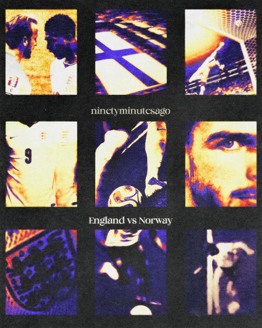
England vs Norway
Built in the duotone orange-and-blue halftone of Skepta's "Ignorance Is Bliss," using a tight 3x3 grid of match details instead of one hero image to match the fragmented, mosaic feel of the original cover.
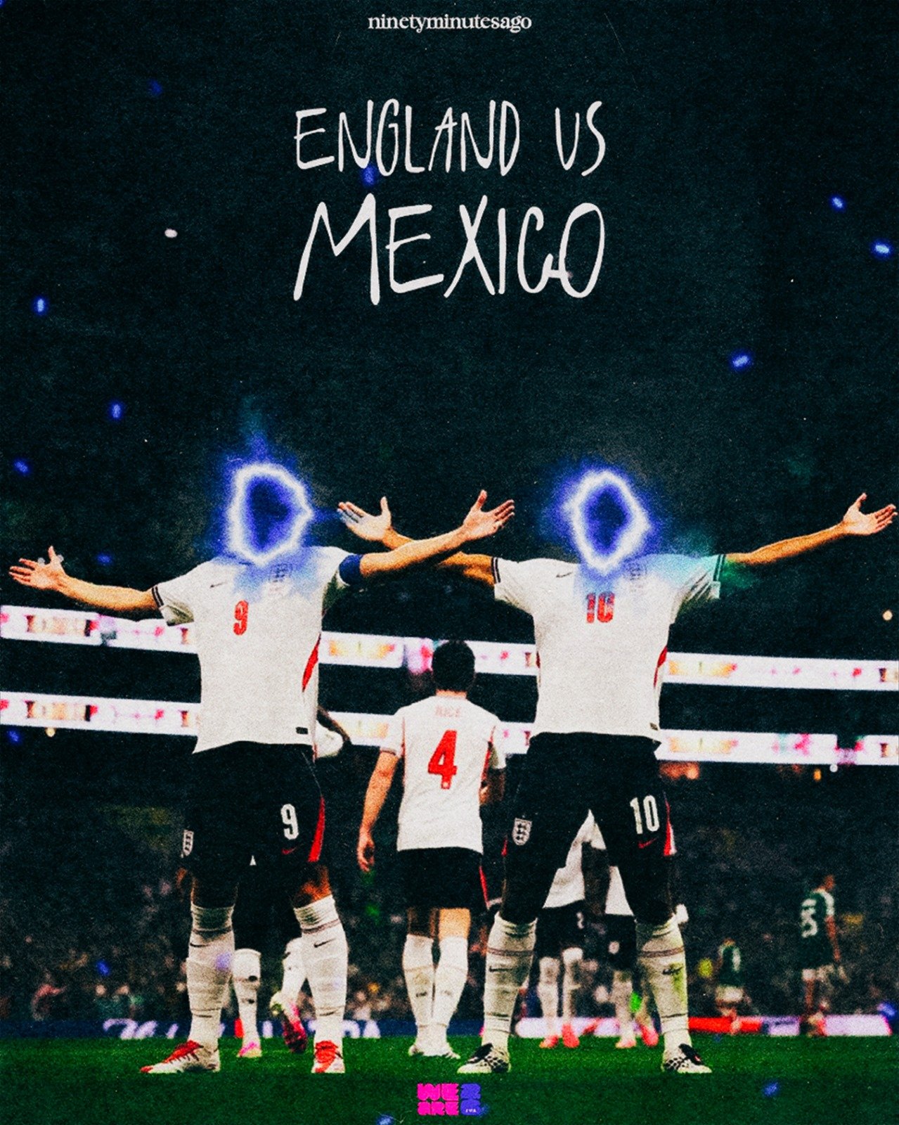
England vs Mexico, Harry Kane
Kane's face is replaced with a glowing blue haze, lifted from the obscured-figure motif running through Dave's "Psychodrama" artwork, where identity dissolves into symbol rather than portrait.
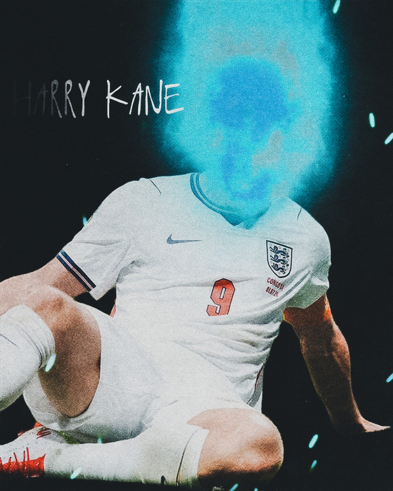
Harry Kane
A second treatment from the same "Psychodrama" reference, isolating Kane in the same obscured-glow language against total black.
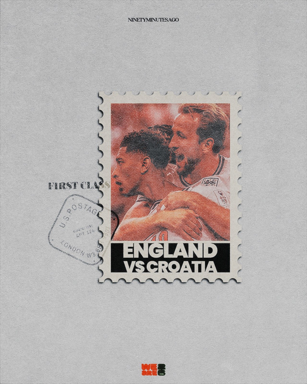
England vs Croatia
Rendered as a weathered first-class postage stamp, aged paper texture and all, echoing the collage-and-stamp visual language across Skepta's "Konnichiwa."
A poster gets scrolled past. An object gets picked up. These pieces stopped functioning as posters and became things people already recognize.
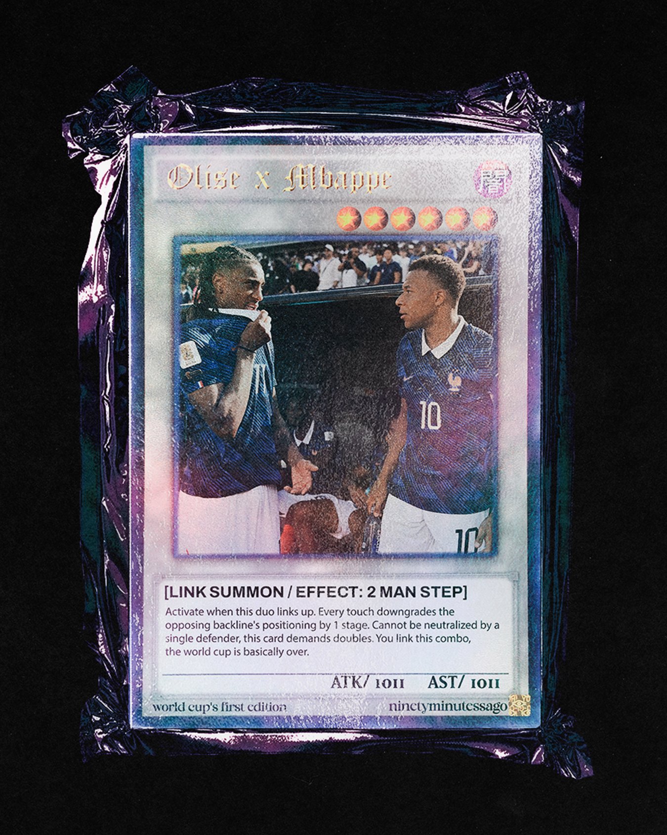
Olise x Mbappé
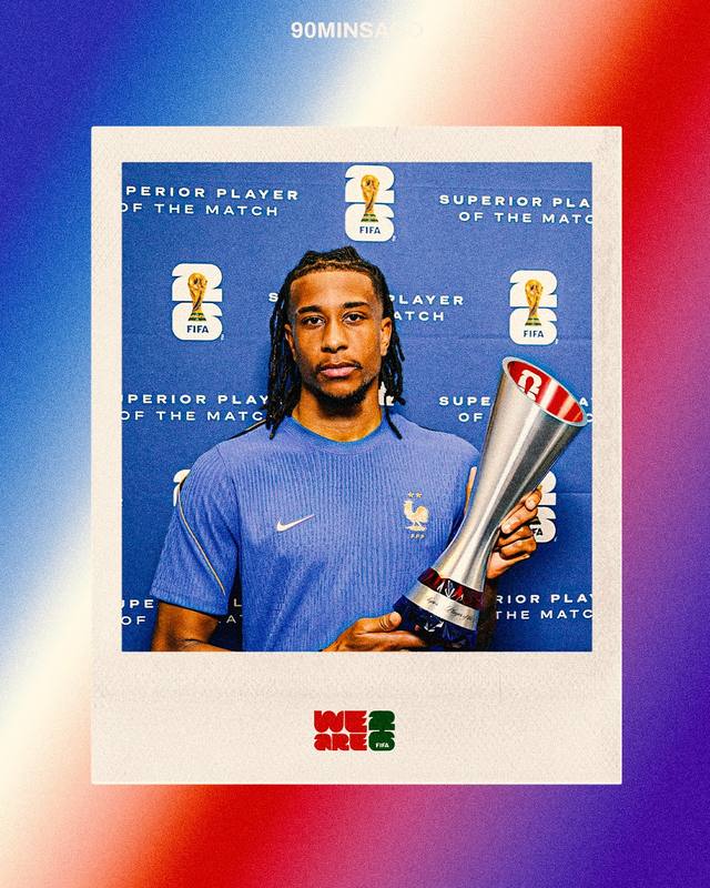
Built as a full Yu-Gi-Oh trading card, complete with a star-rarity rating, a card number, and its own written special ability — "Link Summon / Effect: 2 Man Step." The card sits inside a torn foil pack, treating the partnership as something you'd pull and immediately want to keep.
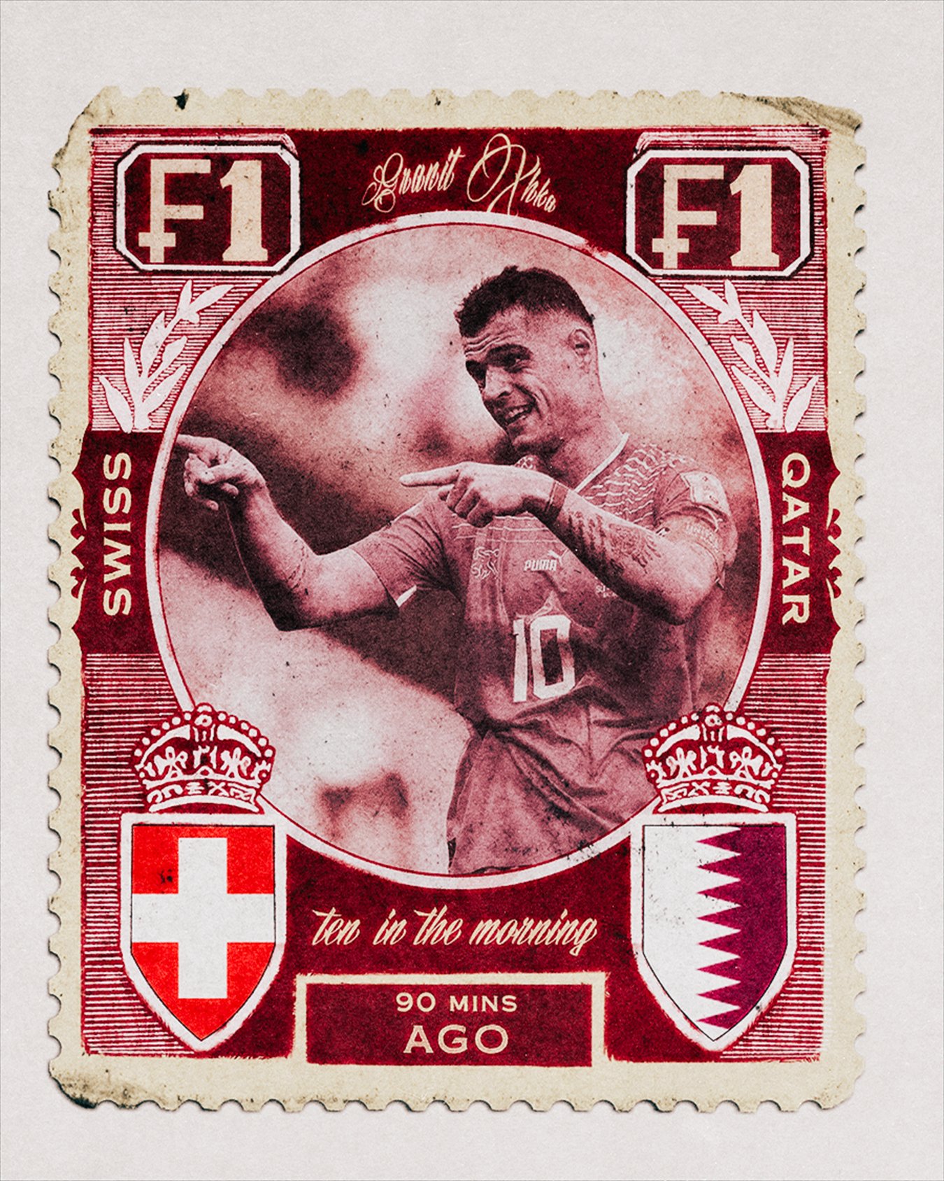
Switzerland vs Qatar
A vintage postage stamp in deep crimson and cream, kickoff time worked into the design like an old-world postmark: "ten in the morning."
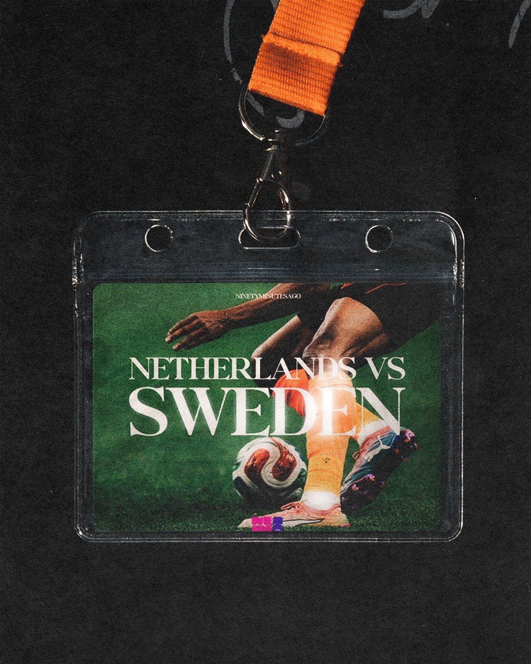
Netherlands vs Sweden
A laminated backstage pass on an orange lanyard, marking the only team that hadn't lost in ninety minutes across the whole tournament.
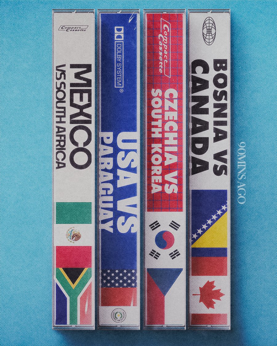
Group Stage Fixtures
Mexico vs South Africa, USA vs Paraguay, Czechia vs South Korea, Bosnia vs Canada — rendered as a stack of cassette spines, flags doing the work labels usually do.
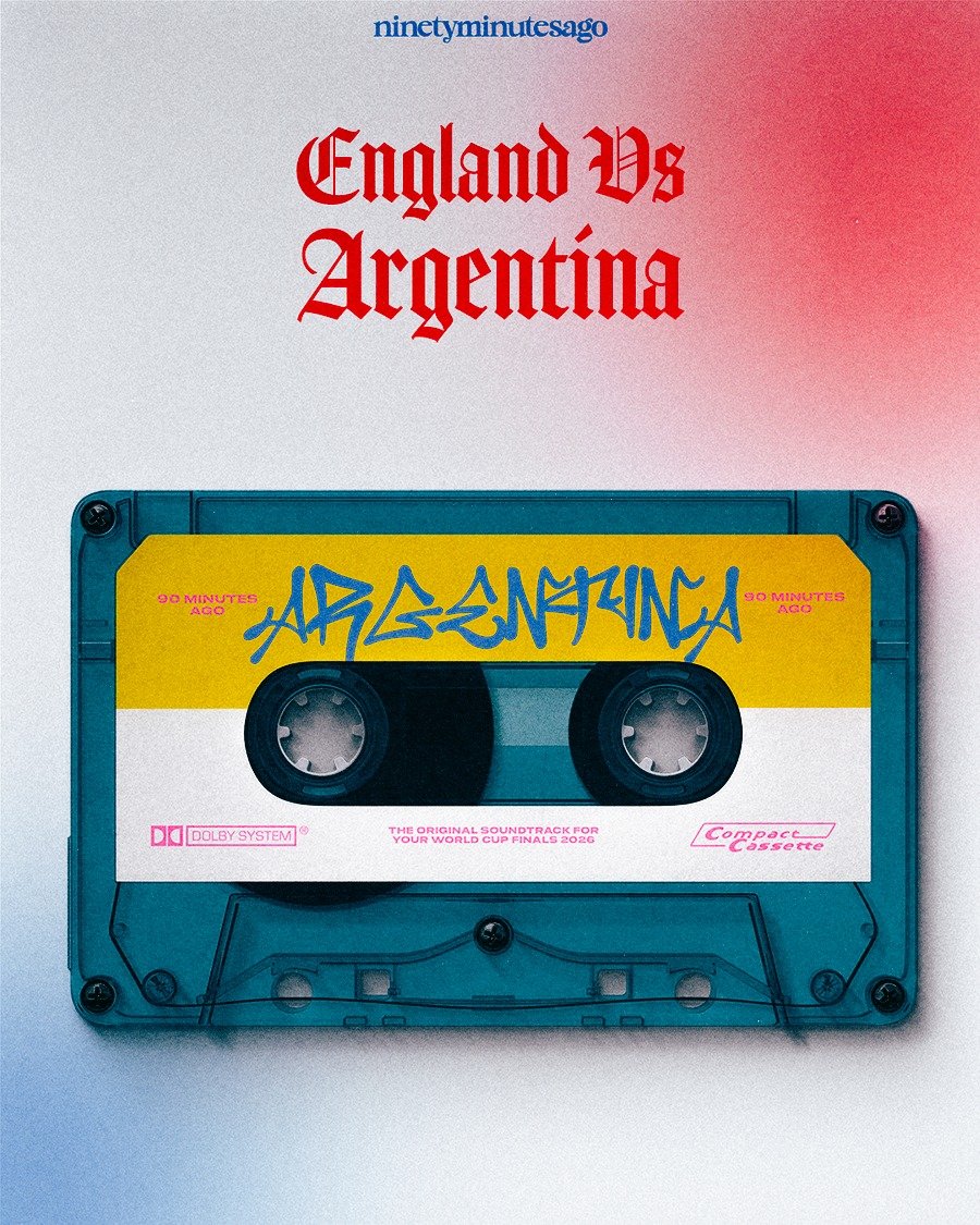
England vs Argentina
A cassette labeled "the original soundtrack for your World Cup finals, 2026."
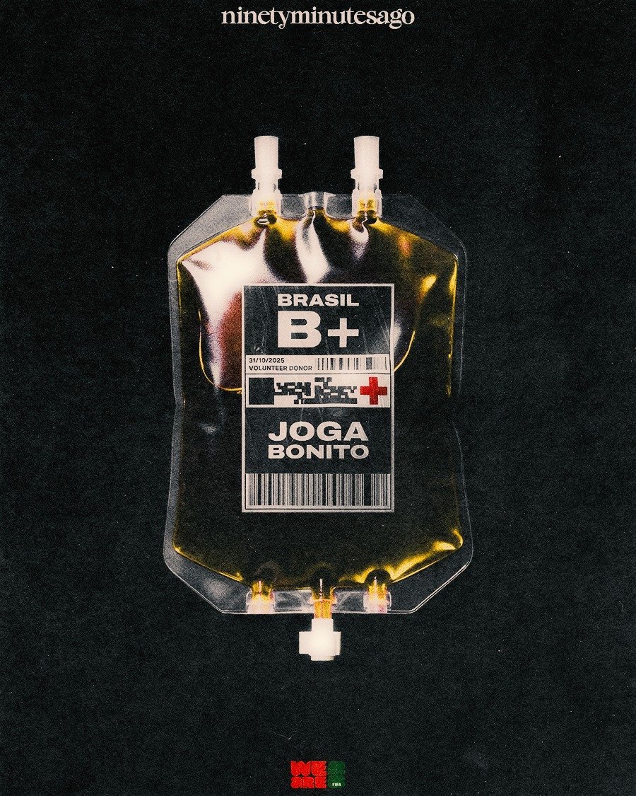
Joga Bonito, Brazil
A blood donation bag rendered in gold-toned liquid, labeled "Brasil B+, Joga Bonito" — treated as something written into the biology of the shirt.
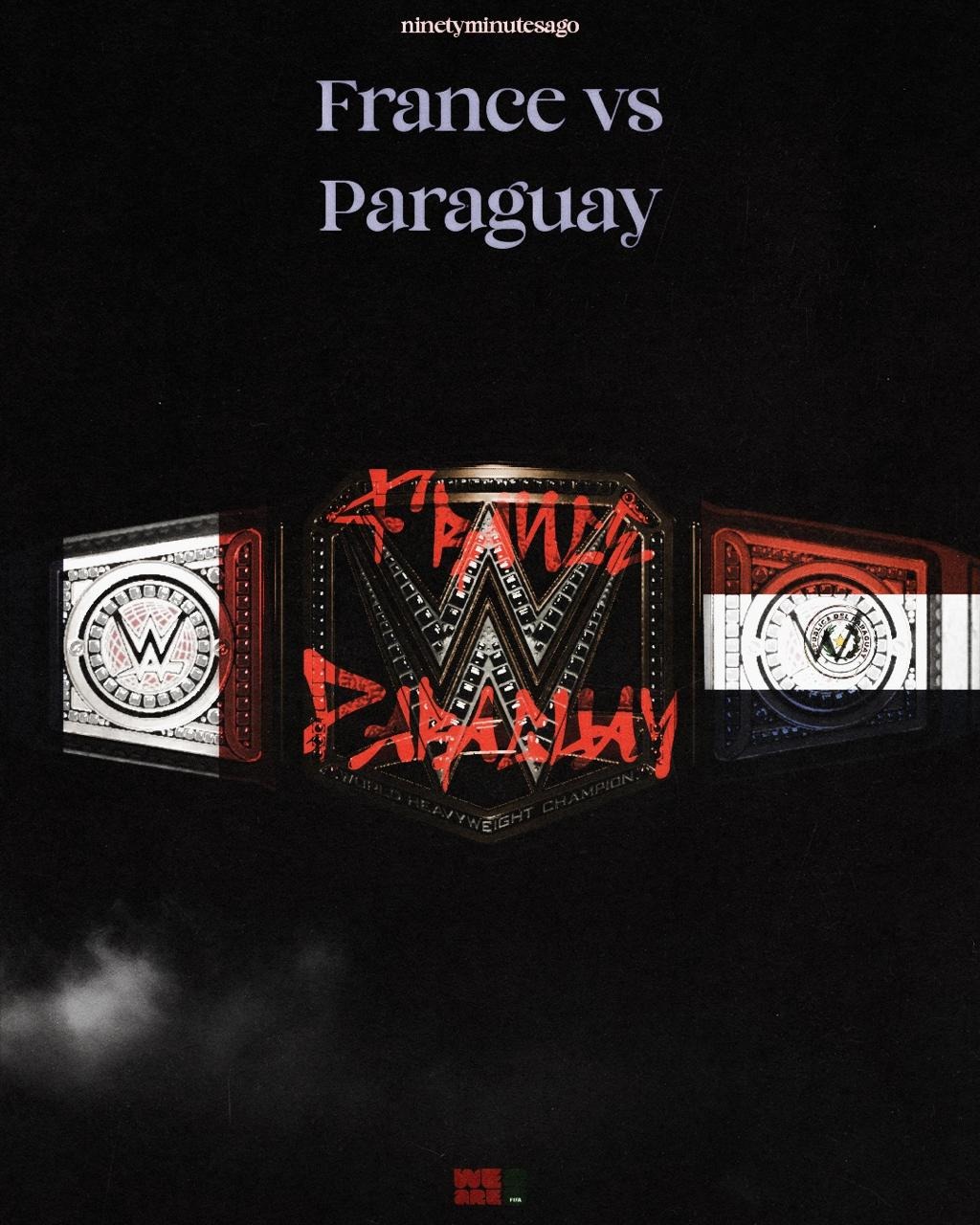
France vs Paraguay
A WWE World Heavyweight Championship belt, both crests set into the side plates, the matchup scrawled across the center plate like a challenger's tag.
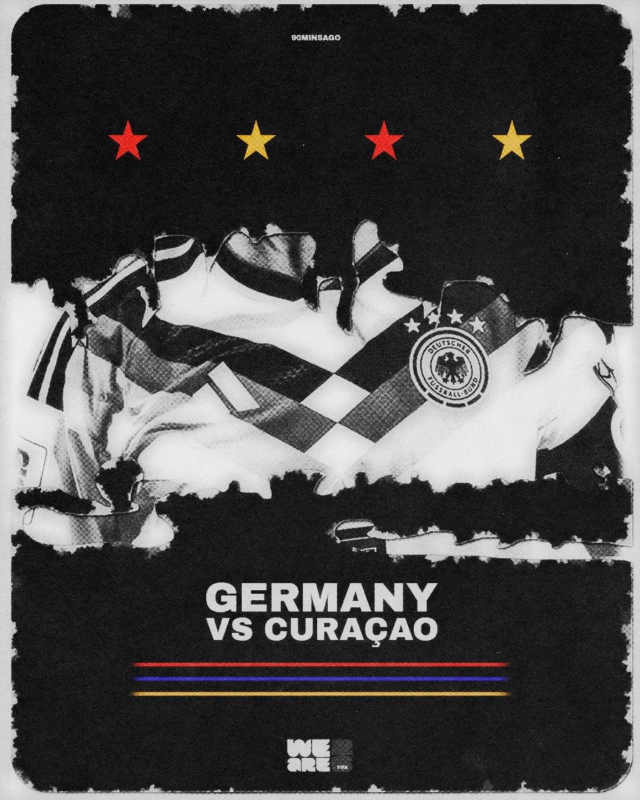
Germany vs Curaçao
No concept, no borrowed language — just execution. Some pieces in this series exist to prove the floor is high even without a story to lean on.
Some fixtures carried a story too big for a straight photo to hold, whether pulled from folklore and pop culture, or built entirely from the tension of the matchup itself.
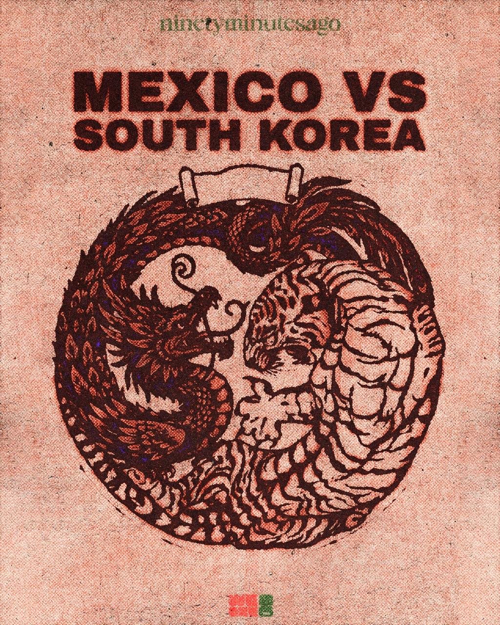
Mexico vs South Korea
A dragon and a tiger locked jaw to jaw inside a single ink-circle illustration, quetzalcoatl against baekho, rendered in a faded terracotta woodblock style that reads like it was pulled from an old scroll.
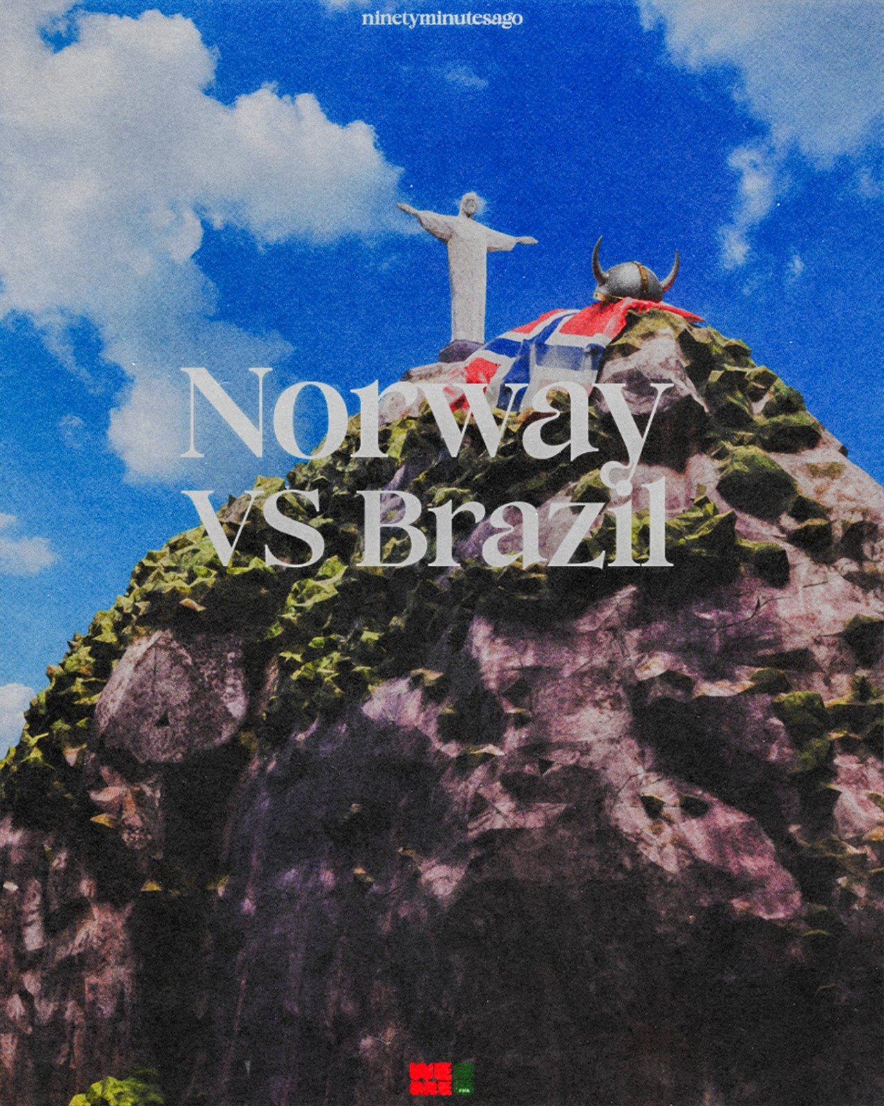
Norway vs Brazil
Christ the Redeemer on its mountaintop, with a horned Viking helmet and Norway's flag set on the rocks in front of the statue — one nation's landmark standing over the other's claim staked at its base.
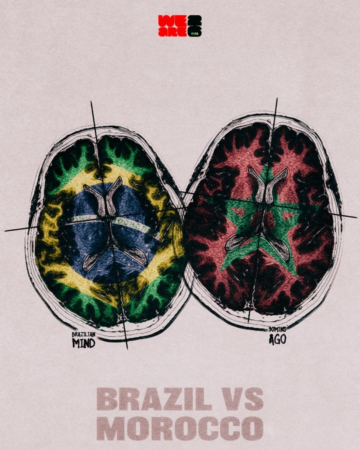
Brazil vs Morocco
Titled "Brilliant Mind II" after Blanco's song and cover art of the same name, whose lyric "caught a Brazilian vibe" is the reason the title fits. A clinical brain scan split down the middle, each hemisphere colored in a flag.
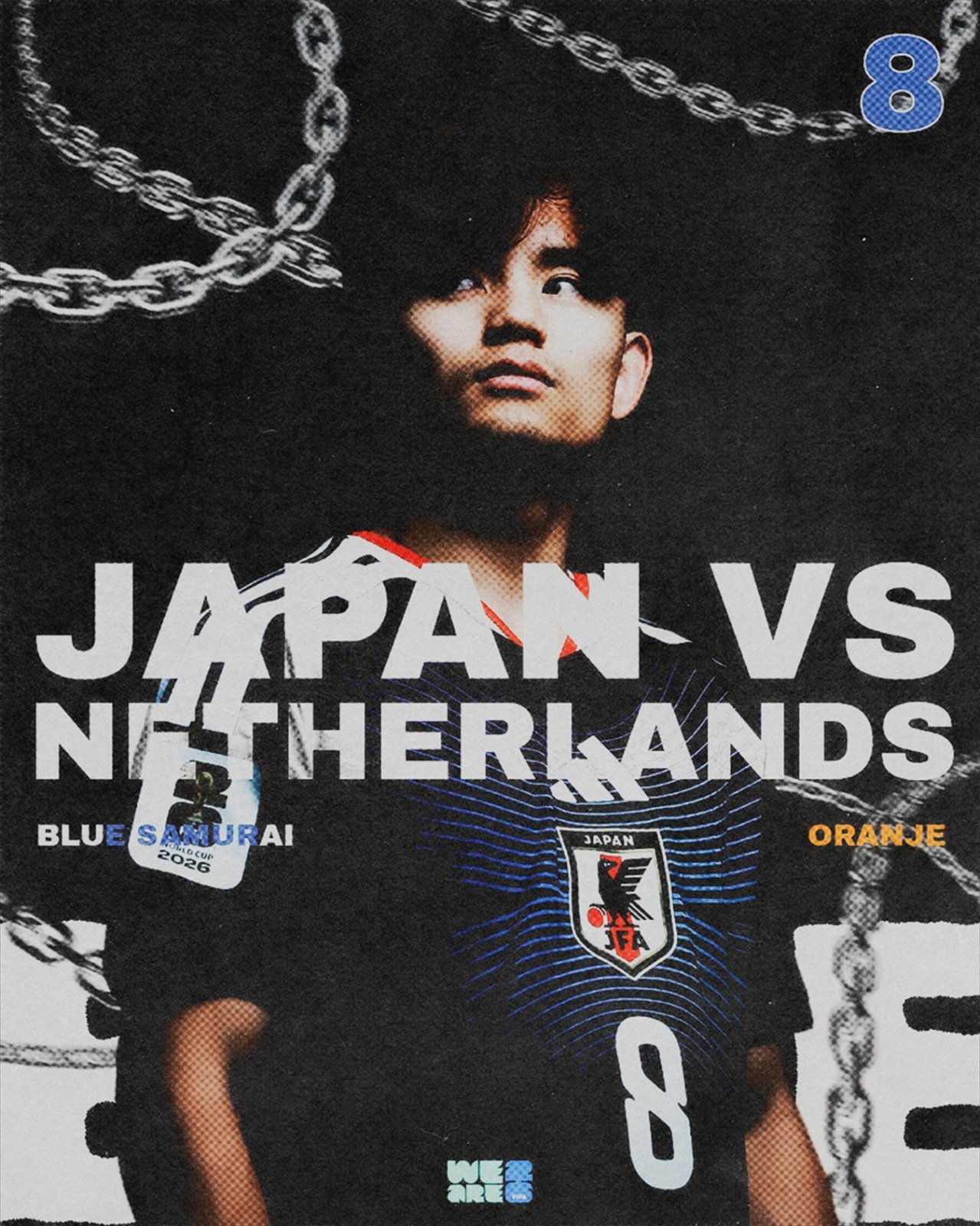
Japan vs Netherlands
Built from Blue Lock manga cover language — heavy chains across the frame, halftone dot shading, oversized broken type spelling out the matchup.
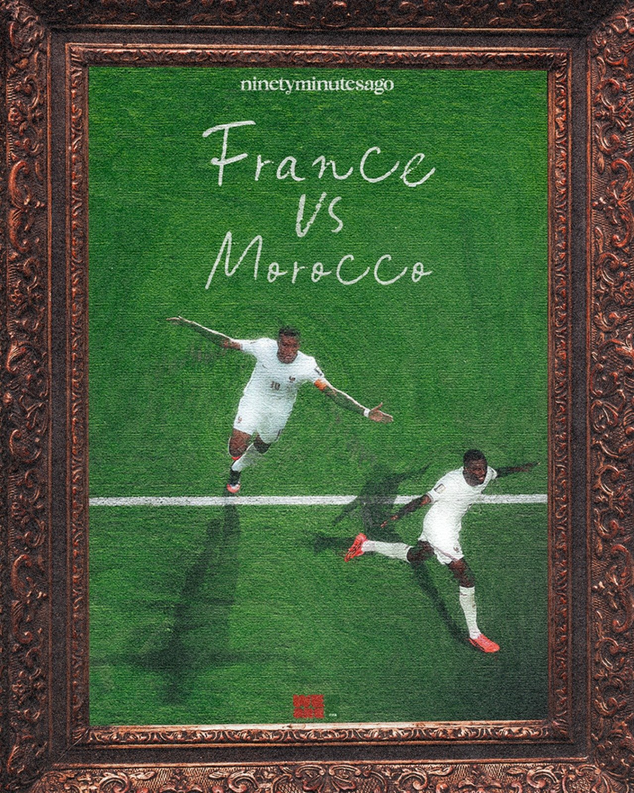
France vs Morocco
Started from one line stuck in my head: "hang it in the Louvre." Built an ornate, gilded frame around the celebration photo to earn it.
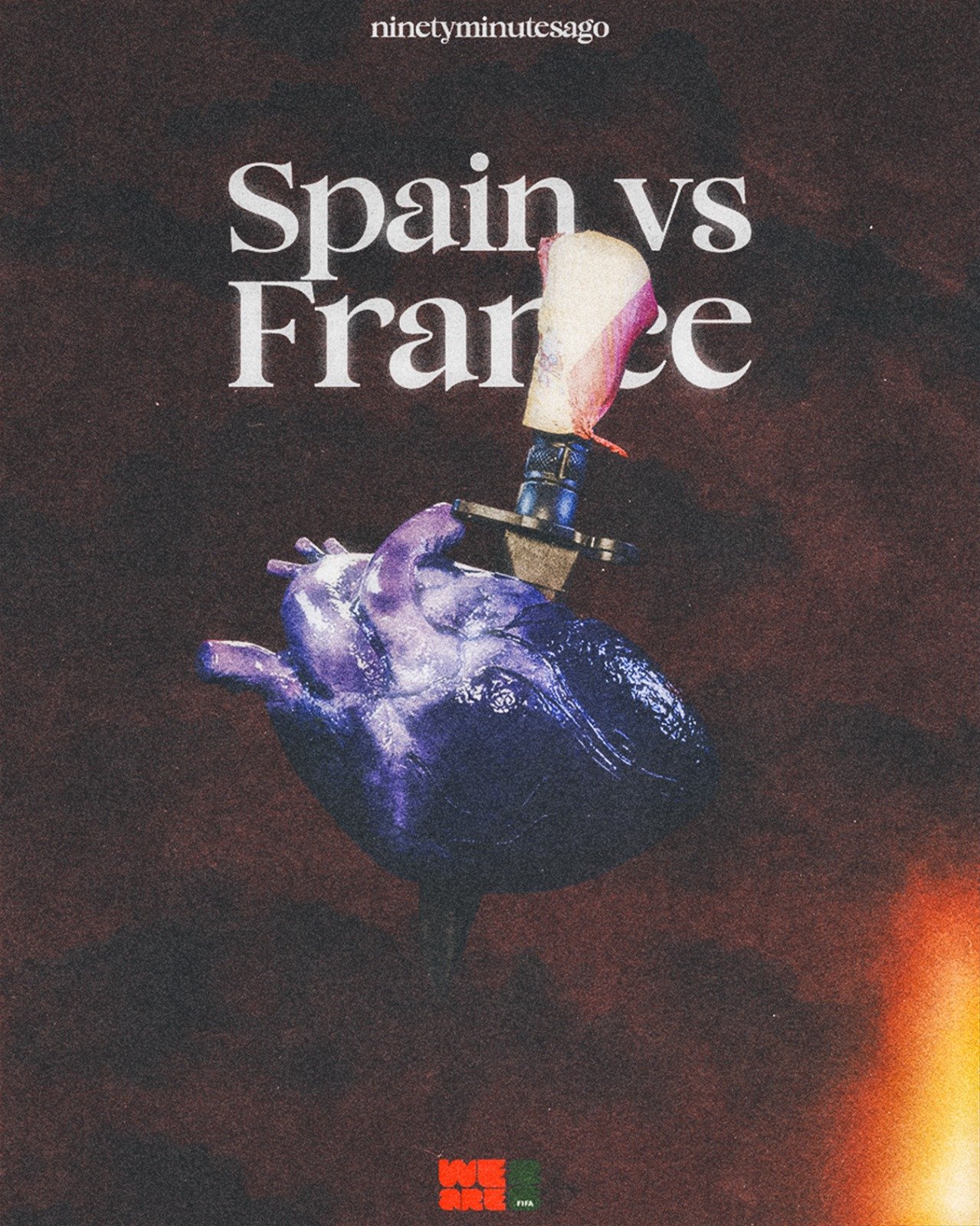
Spain vs France
A single anatomical heart pierced by a dagger wrapped in Spain's flag. France arrived as favorites. Spain ended the run the way that image suggests.
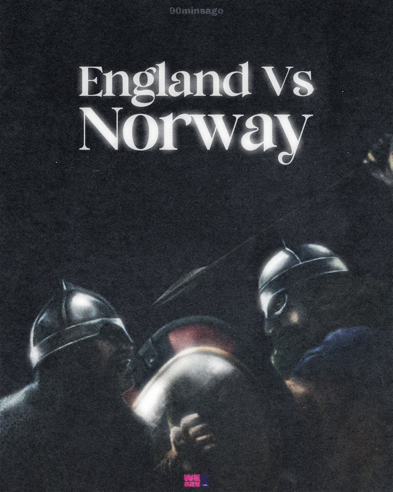
England vs Norway
Two warrior helmets in near-total darkness, only rim light catching the metal — Anglo-Saxons and Norsemen facing off centuries after the history books say they last did.
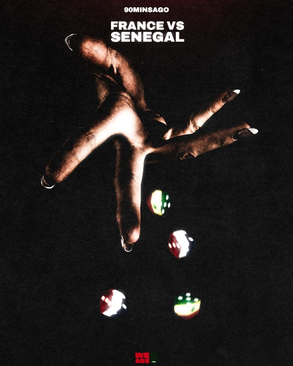
France vs Senegal
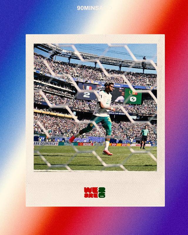
A hand caught mid-toss, dice frozen in the air beneath it. Two of the strongest sides from their confederations, rendered as literal chance.
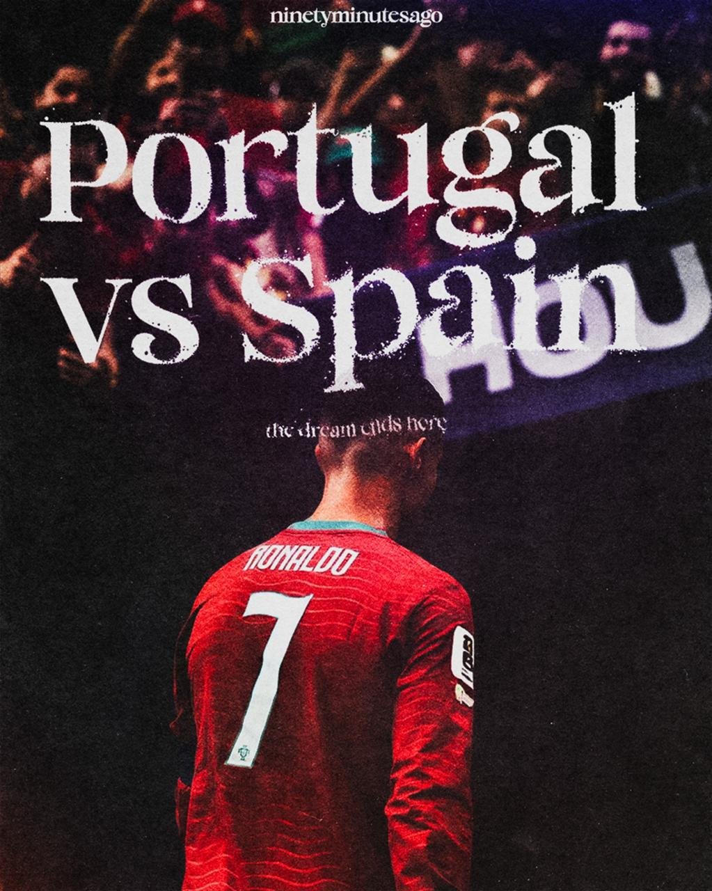
Portugal vs Spain
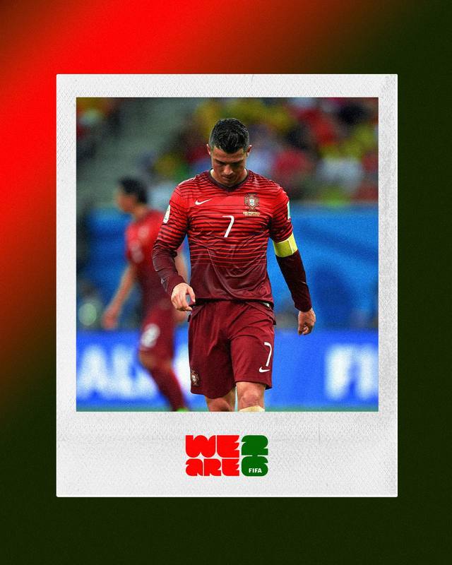
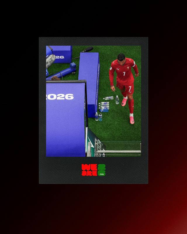
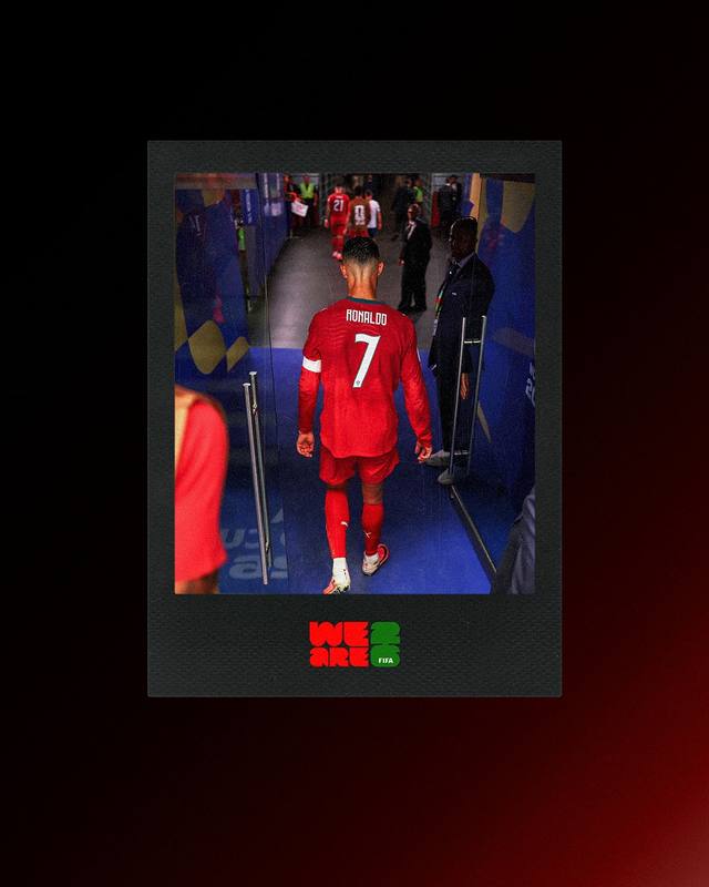
Ronaldo, back to camera, walking off. "The dream ends here."
The strongest pieces in this project aren't about what happened on the pitch — they're about who the player is when the cameras aren't rolling.
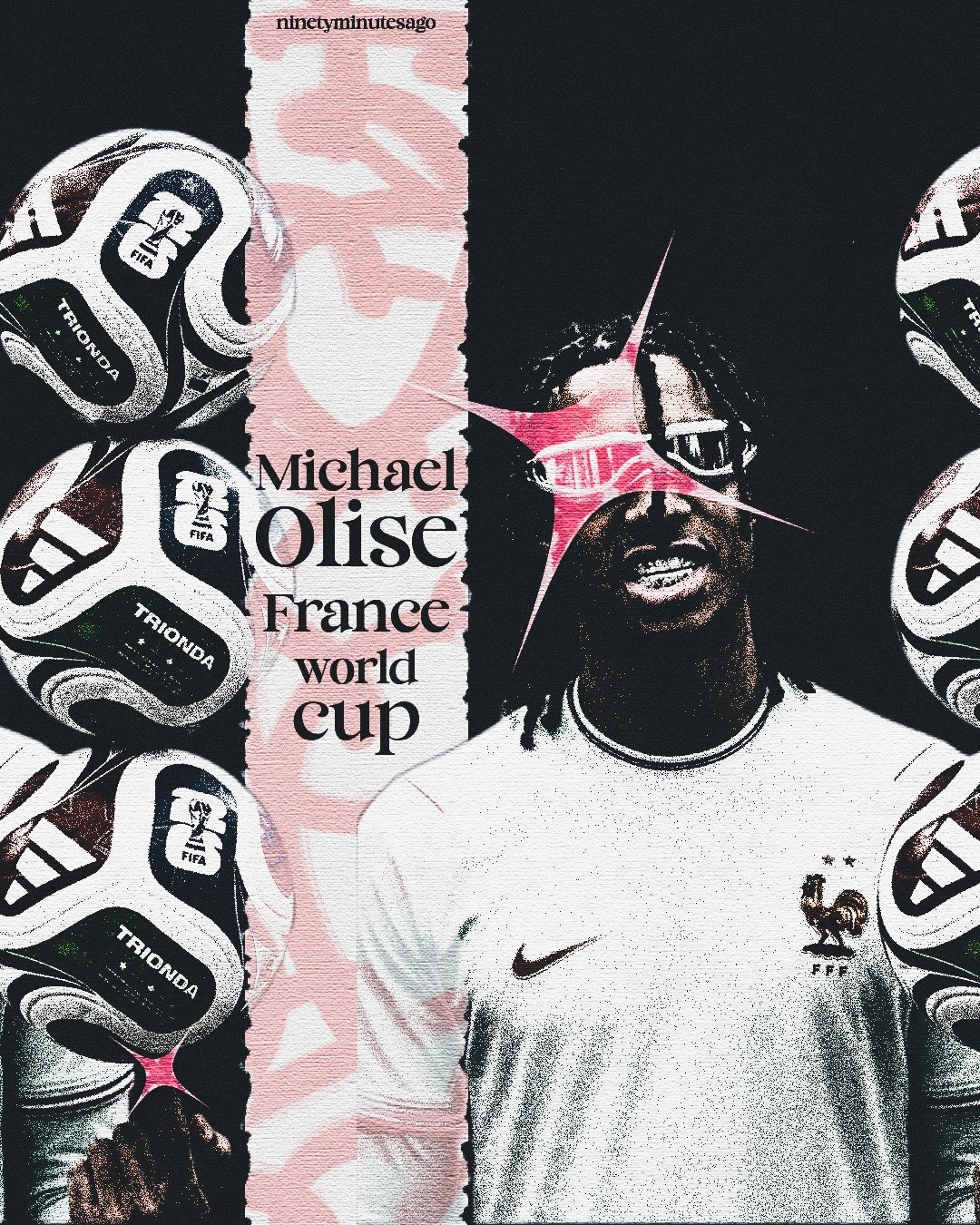
Michael Olise, France
Olise reads as quiet and nonchalant on the pitch, but he's a serious Playboi Carti fan underneath that — sharp pink lightning-shard graphics and a bold serif wordmark carry that energy instead of a generic hero shot.
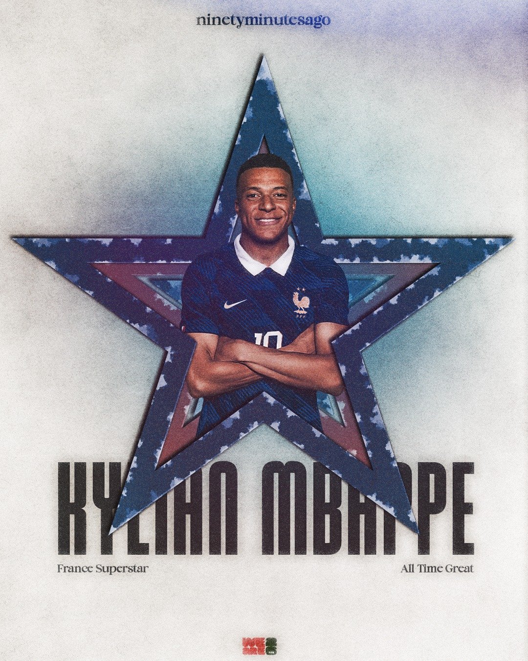
Kylian Mbappé
France Superstar, All Time Great — framed inside a layered star motif, treating him as an institution of the tournament rather than a single standout performance.
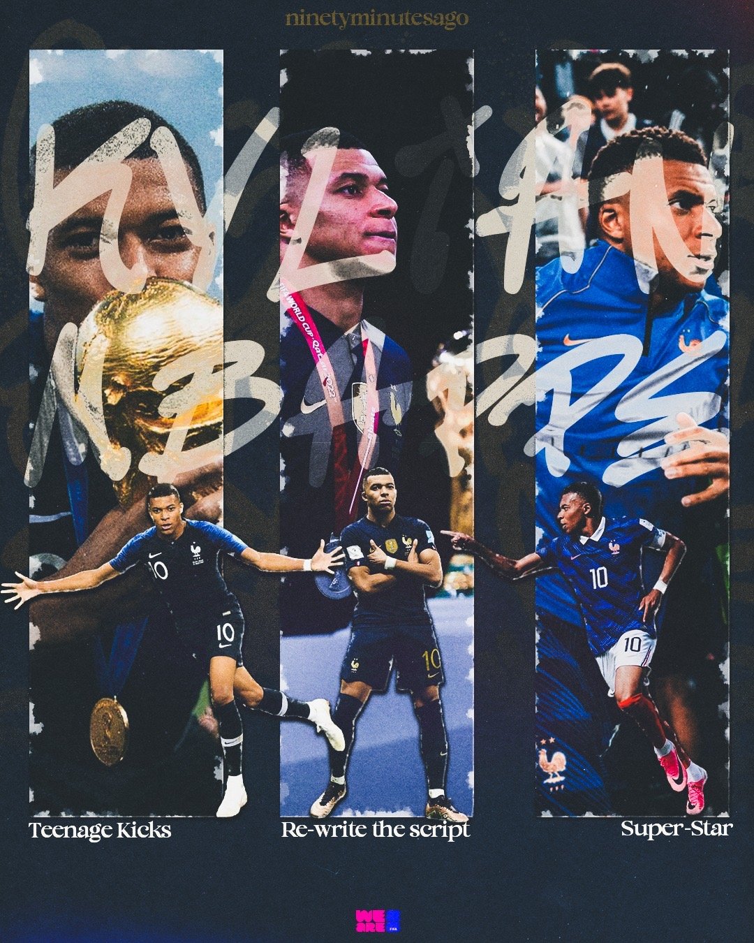
Teenage Kicks → Super-Star
A three-part chapter piece tracing Mbappé's international career: 2018's breakout, 2022's captaincy and weight of expectation, 2026's undisputed superstardom — treated as one unfolding story.
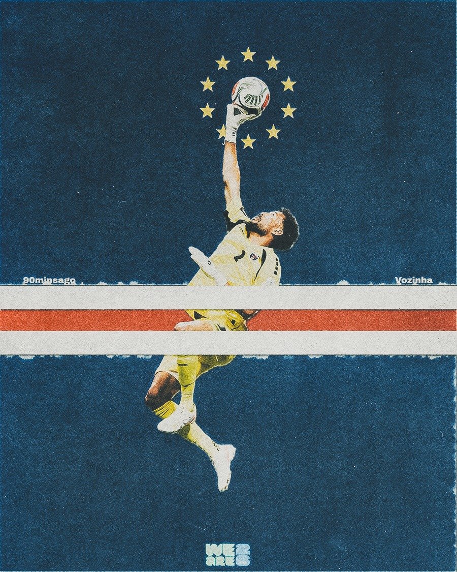
Vozinha, Cape Verde
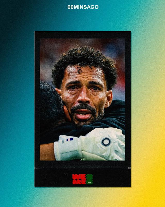
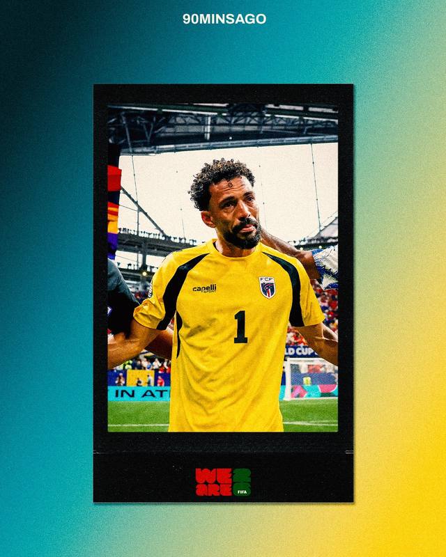
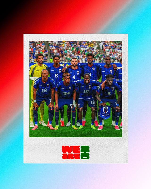
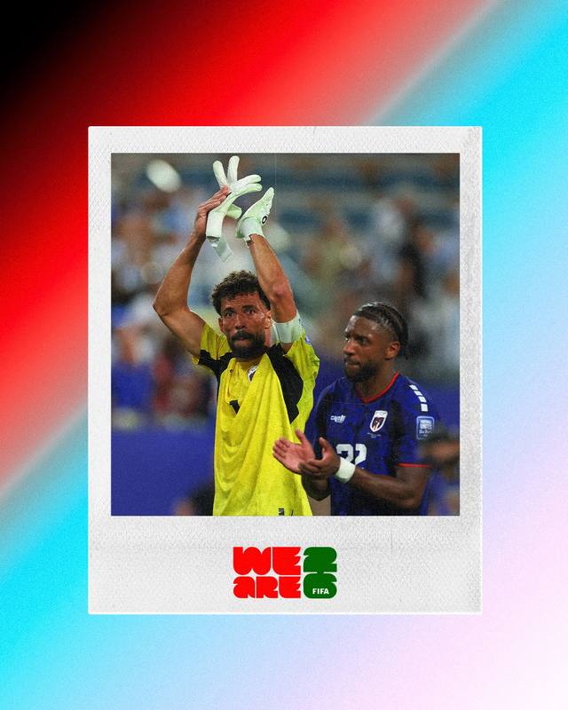
Built in Cape Verde's national colors, a ring of stars circling the ball to mirror the flag's own emblem, made after a genuinely standout individual display.
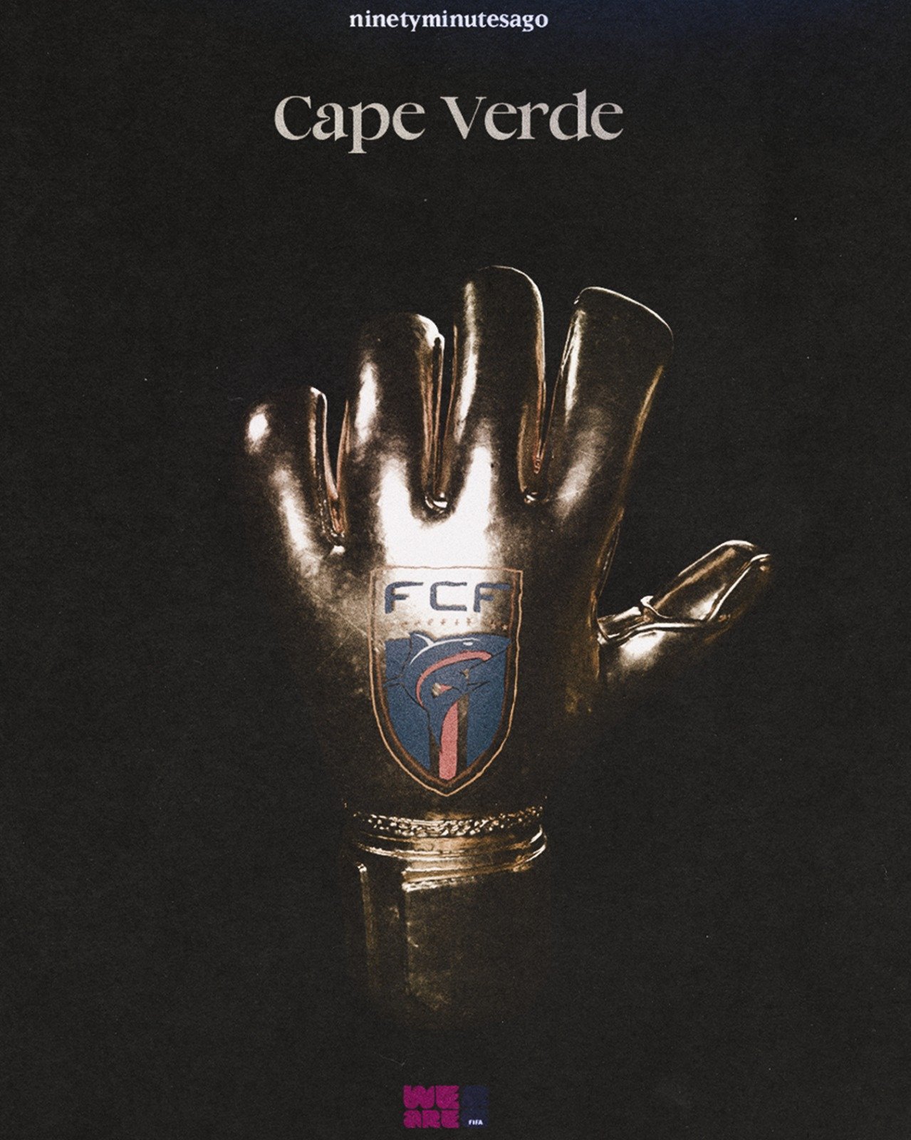
Cape Verde
A single golden goalkeeping glove rendered like a trophy object against total black, marking their first ever World Cup and a statement result against Argentina.
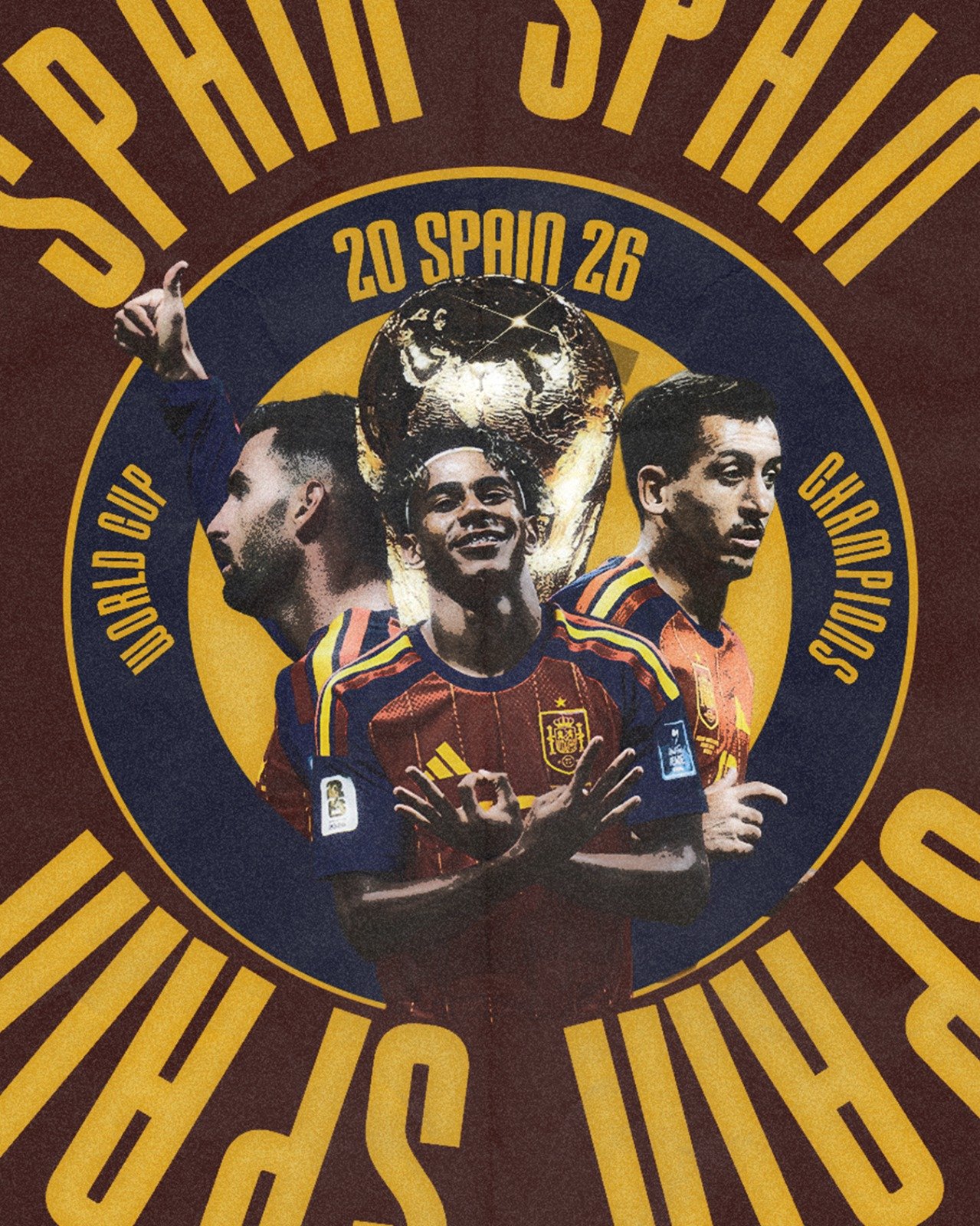
Spain, World Cup 2026 Champions
Players and trophy set inside a circular championship seal, sun-ray type radiating out from the center — the graphic built like an official crest rather than a social post.
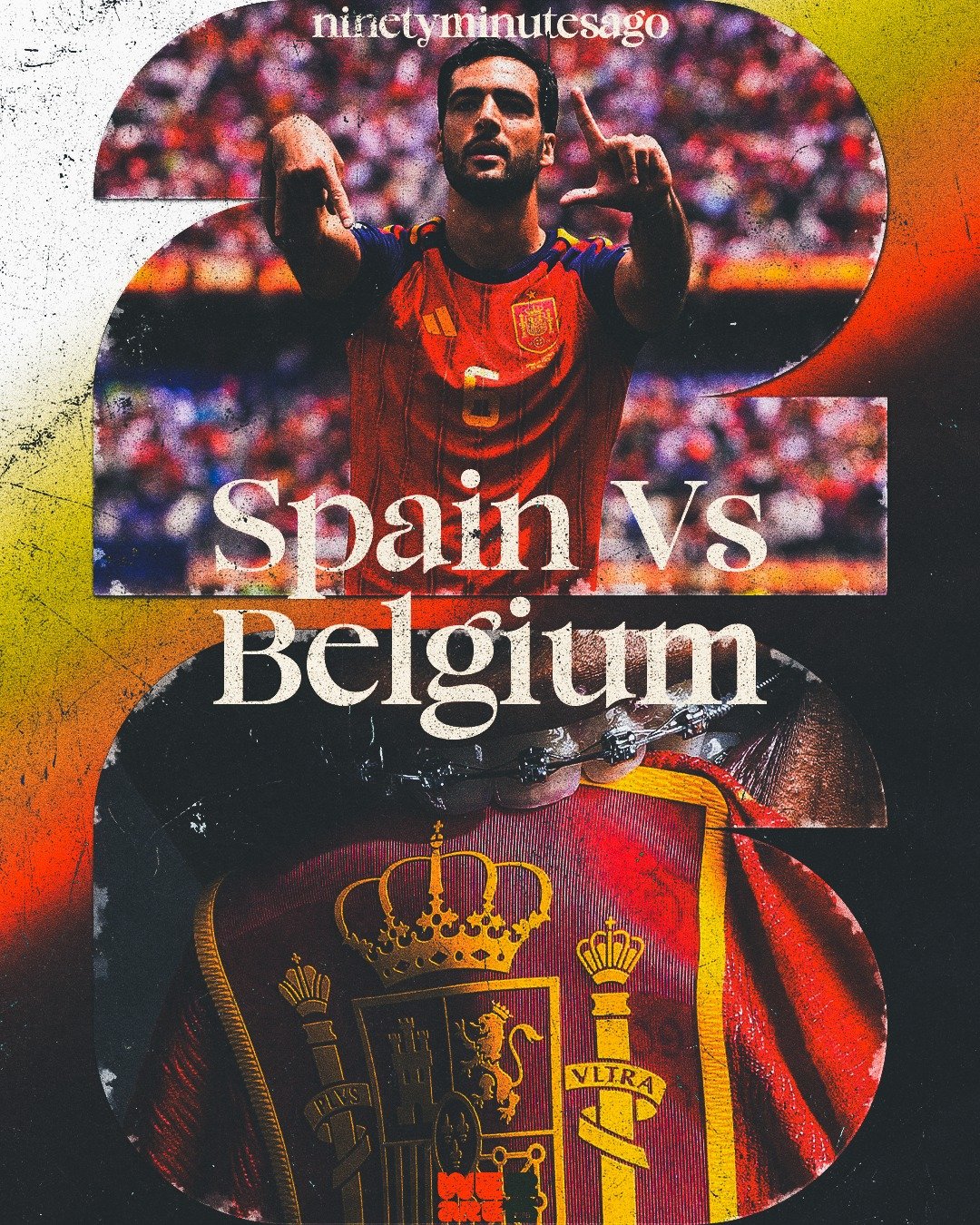
Spain vs Belgium
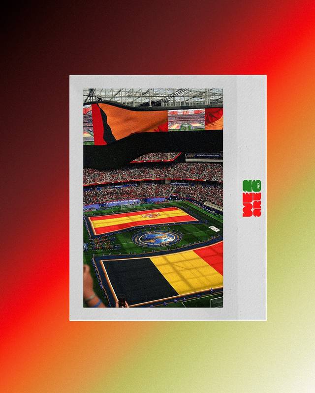
Match imagery set inside the tournament's own "26" numeral, treating the fixture as inseparable from the World Cup identity around it.
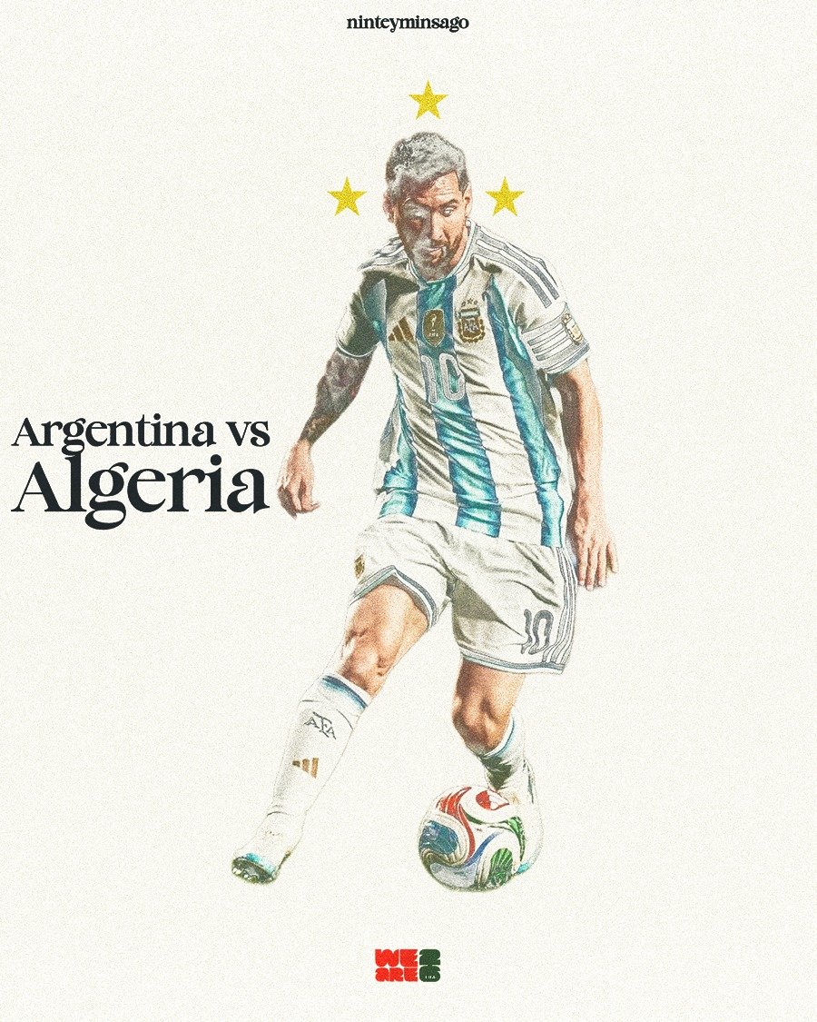
Argentina vs Algeria
Messi, rendered almost like a pencil sketch, three stars held above him doing the talking about what he's carrying into this tournament.
This is the series I needed to get right.
Neymar. James Rodríguez. Modrić. Players we grew up watching, and for most of them, this is genuinely their last World Cup. After this they don't disappear overnight, they just fade, slowly, out of the present and into memory. That idea needed to be felt rather than explained.
So instead of a sharp, defined portrait, I used Photoshop's Blend If tool to dissolve each player into a cream background. Pulled the blacks out, softened the whites, let the edges disappear into the page. Heavy grain on top. The gap between the raw press photo and the finished piece is the whole point of the series. One is documentation. The other is emotion.
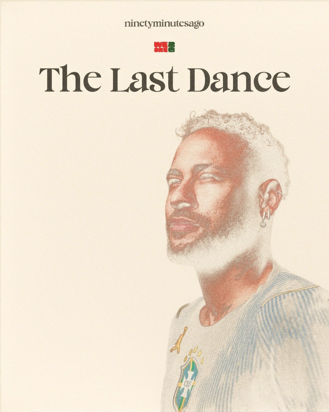
Neymar — Brazil
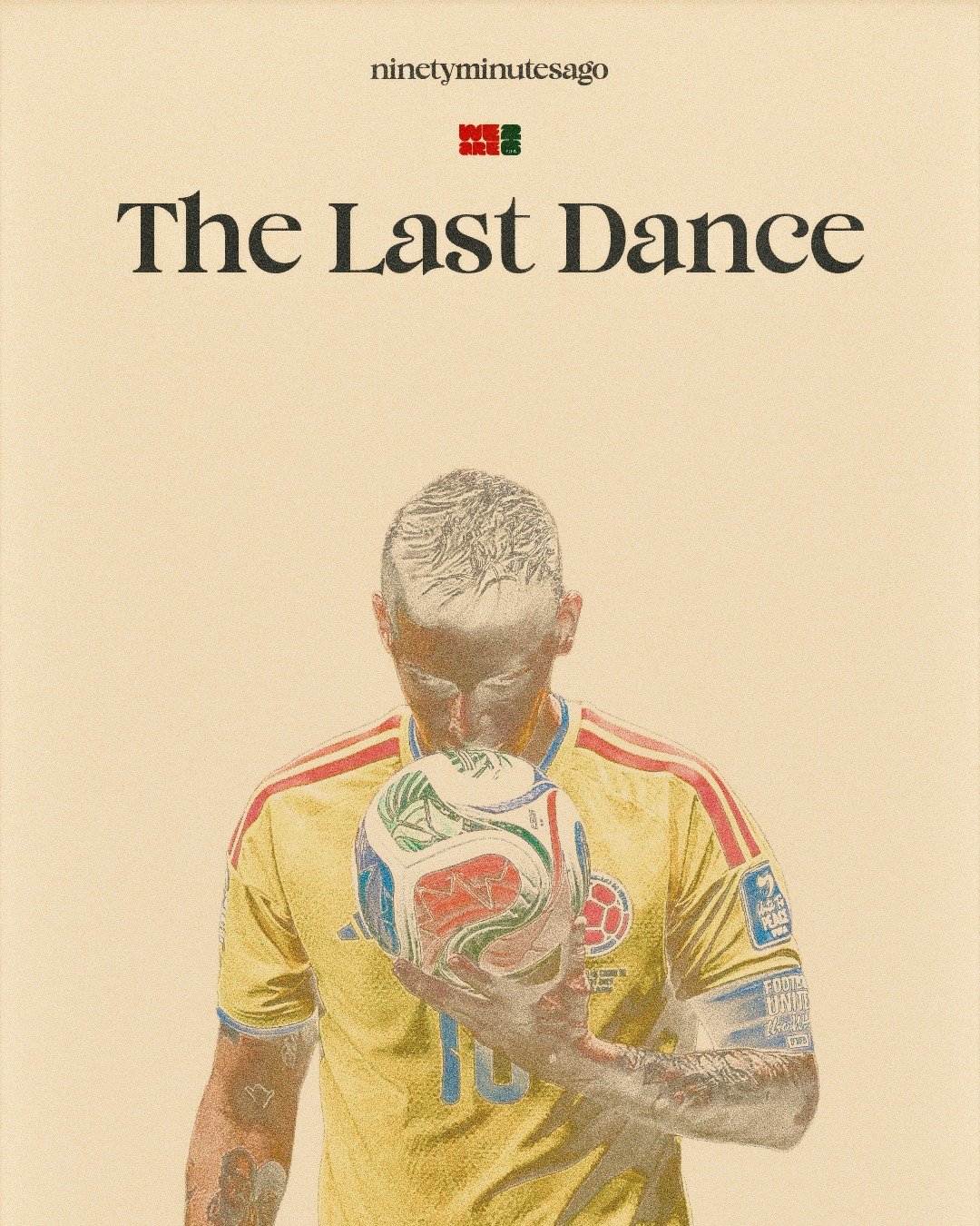
James Rodríguez — Colombia
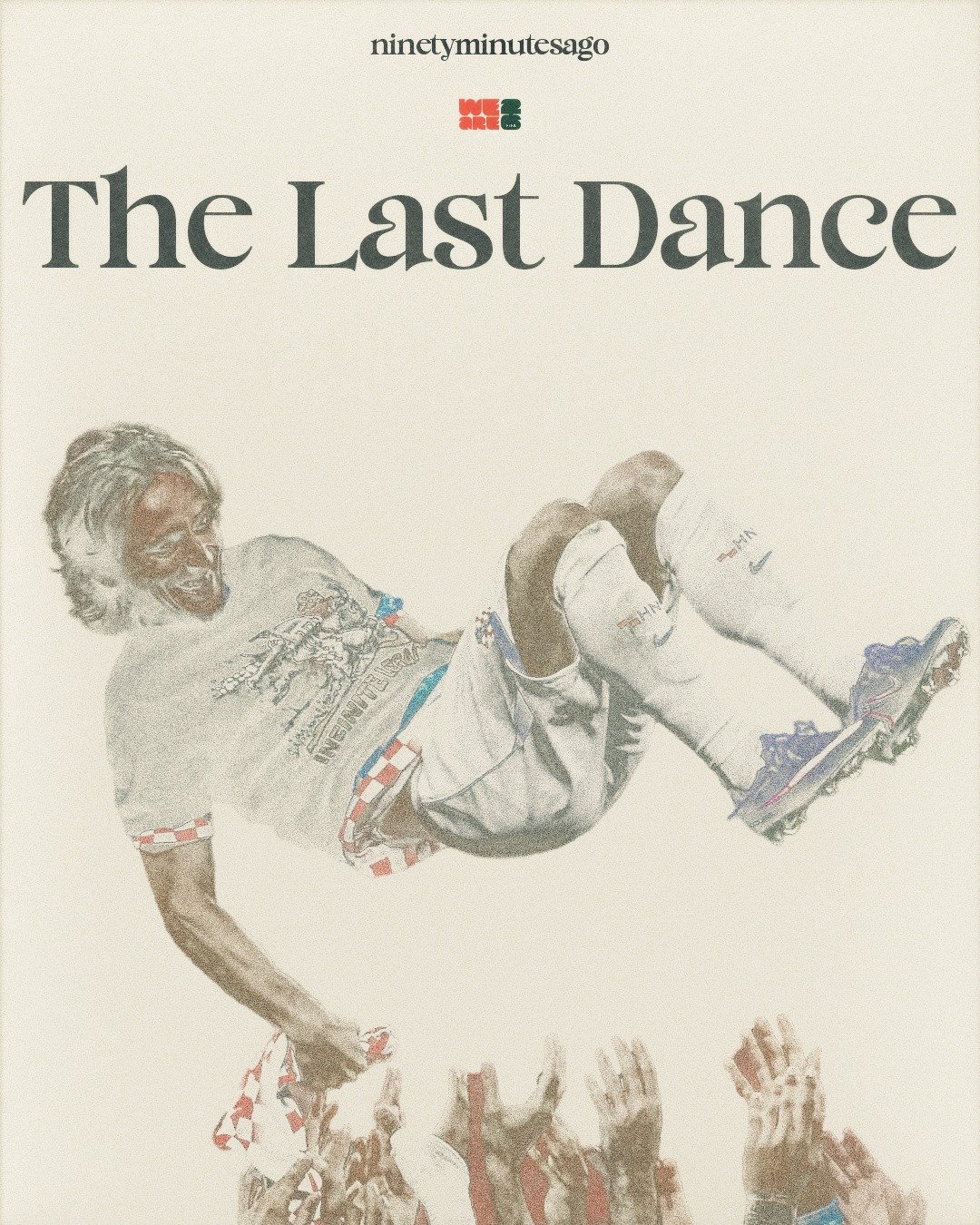
Modrić — Croatia
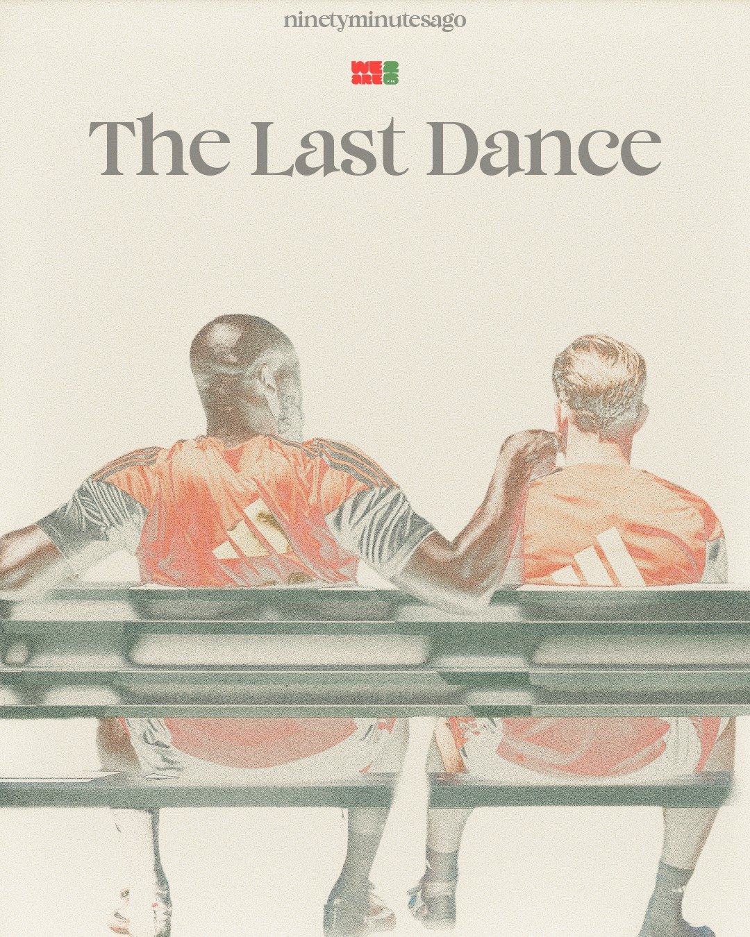
De Bruyne & Lukaku — Belgium
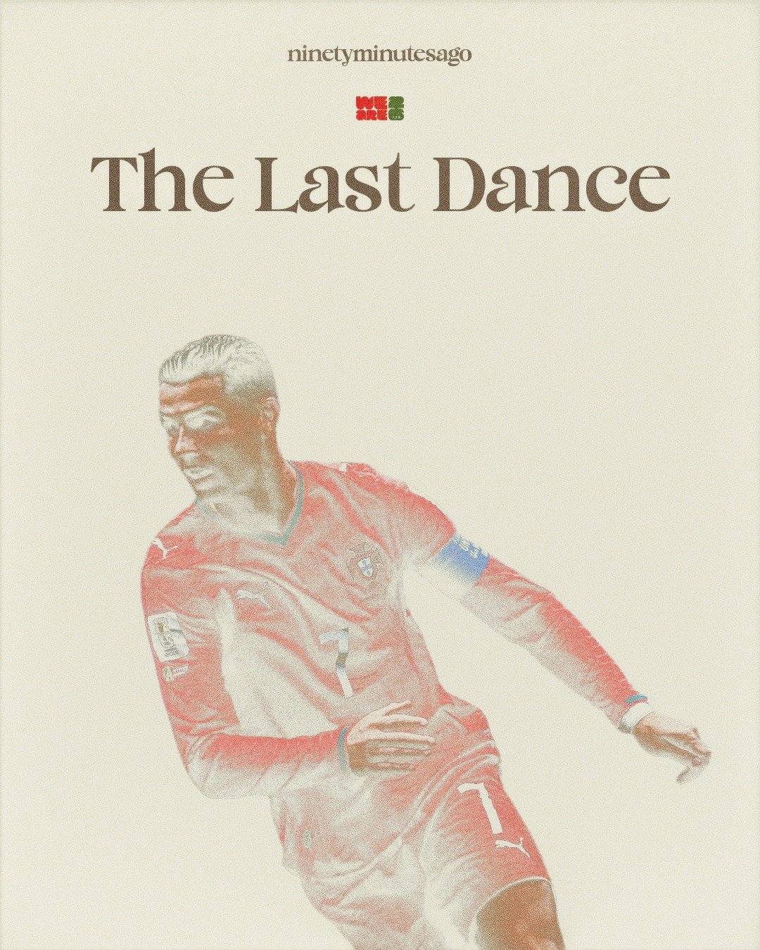
Ronaldo — Portugal
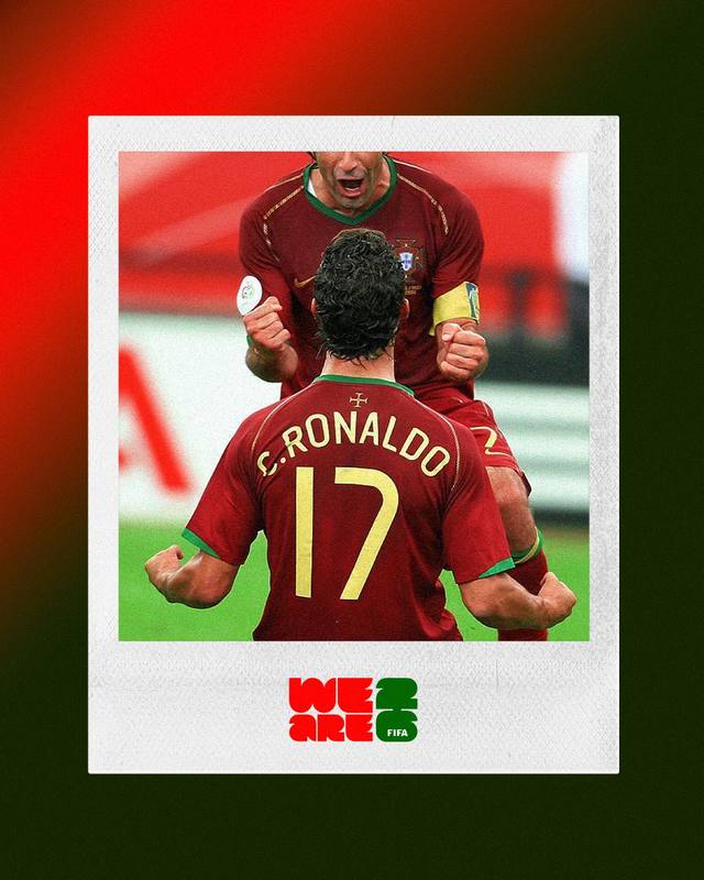
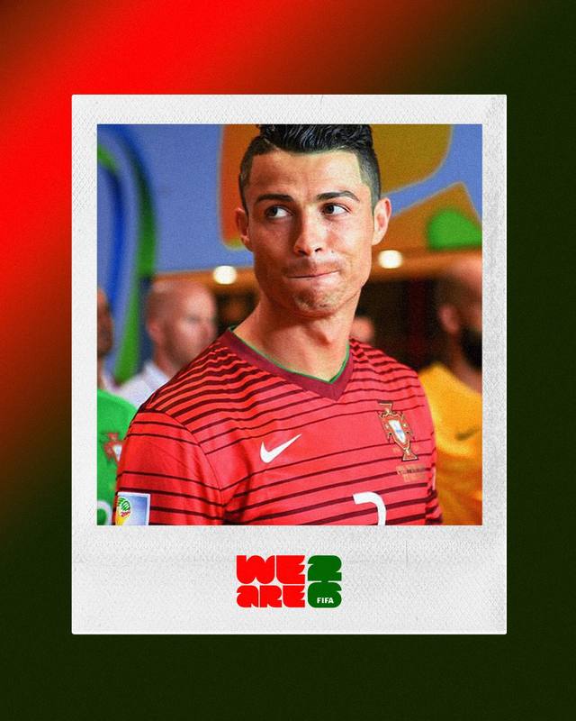
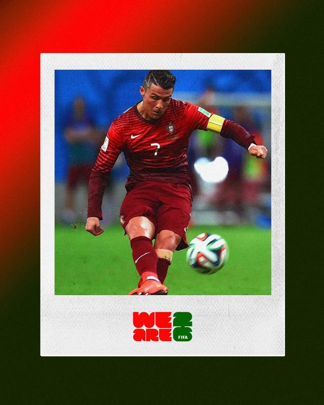
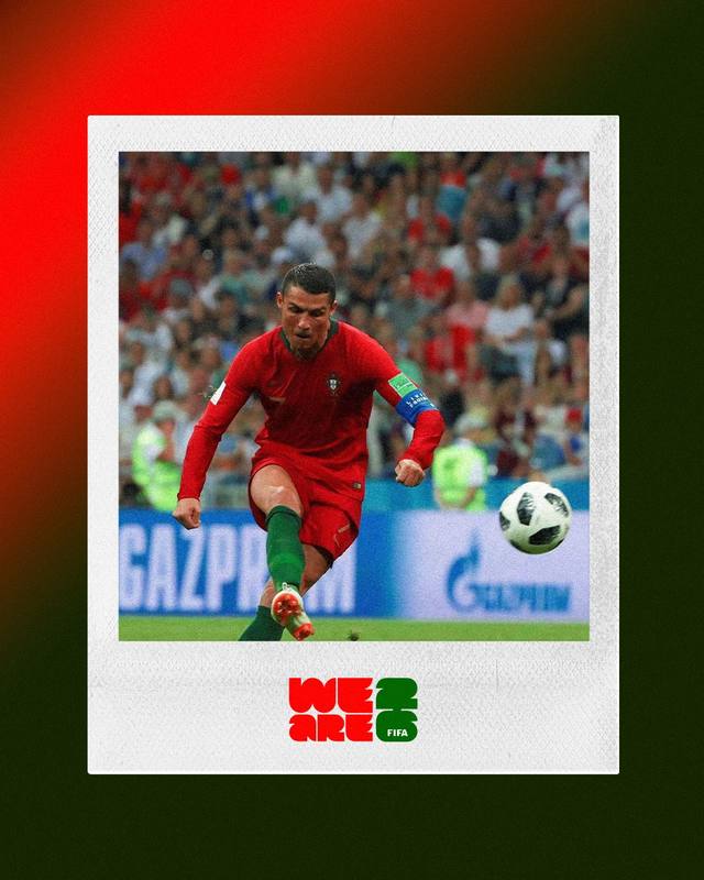
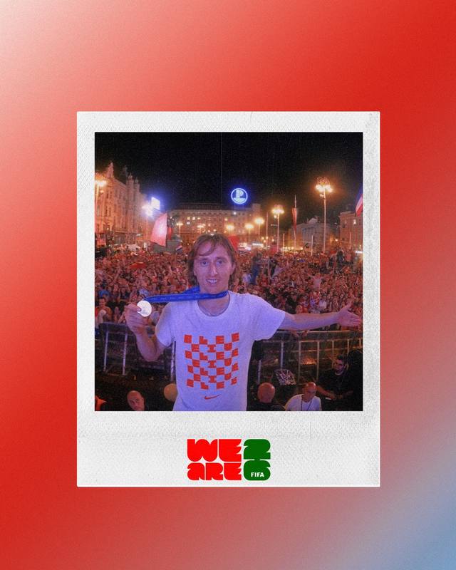
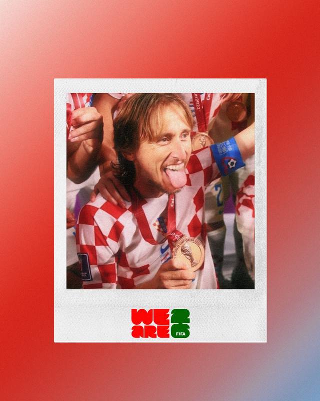
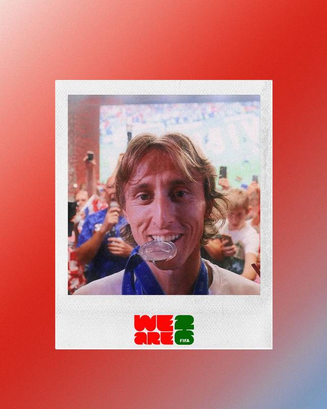
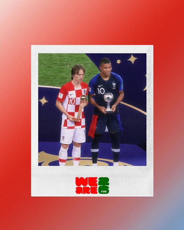
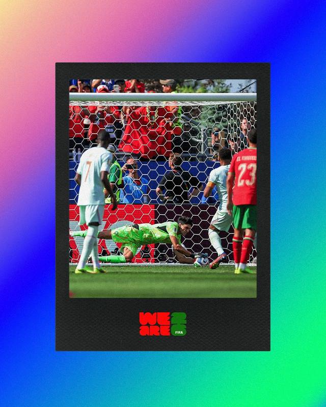
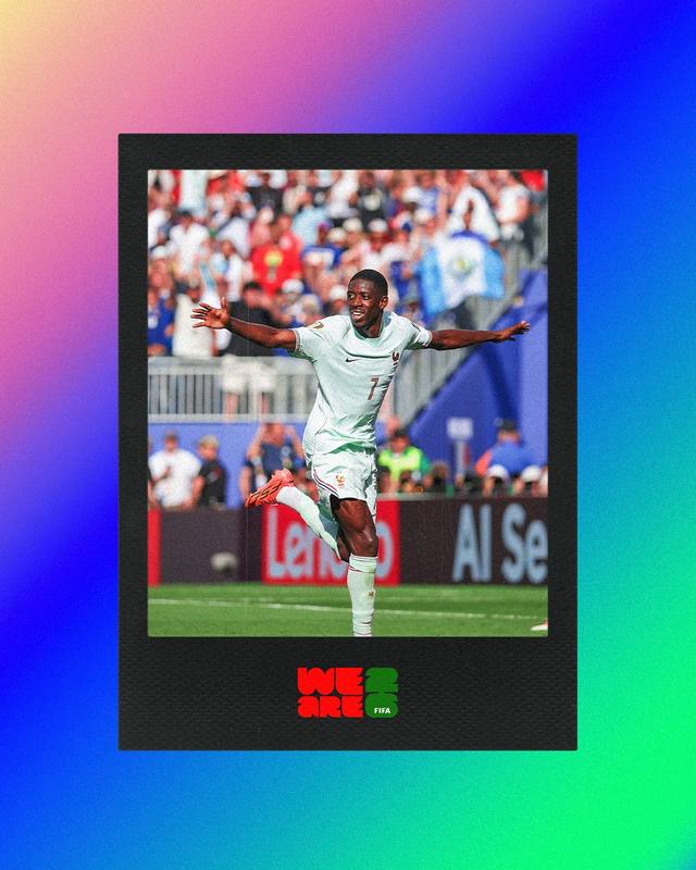
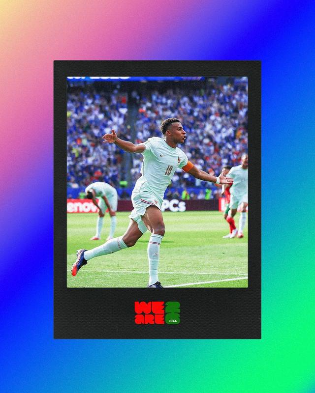
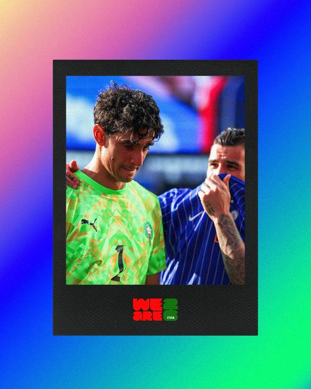
The Polaroids
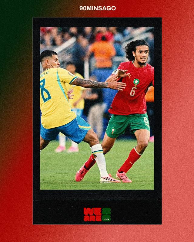
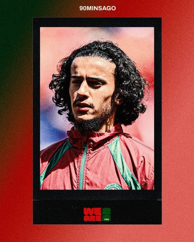
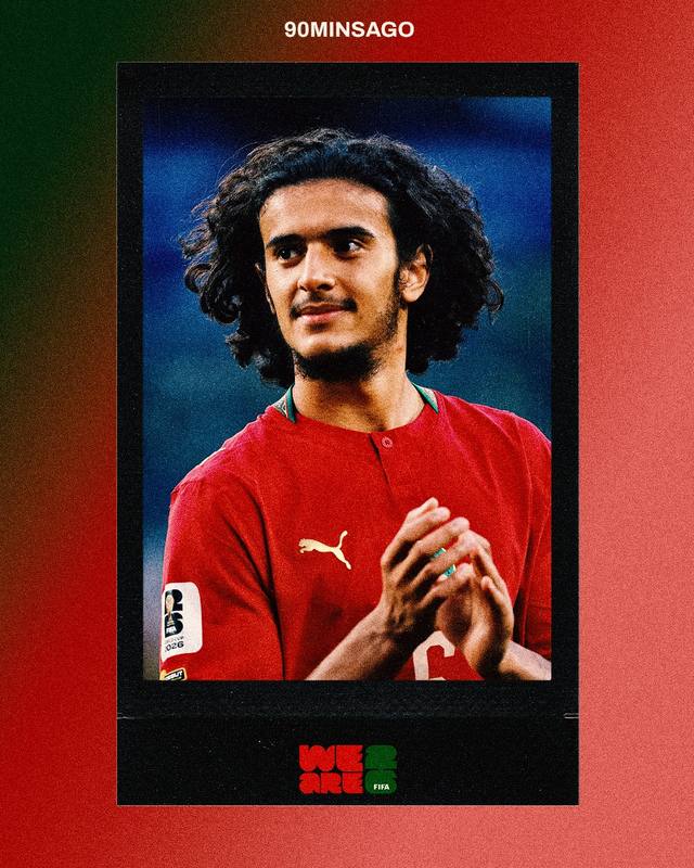
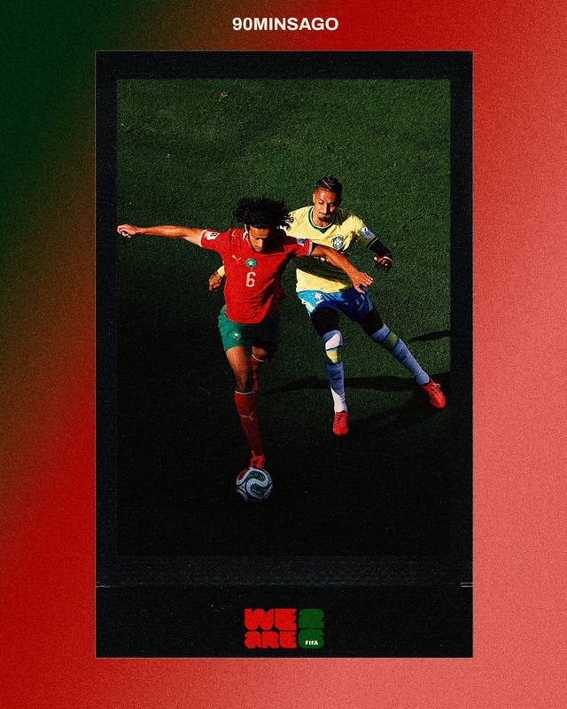
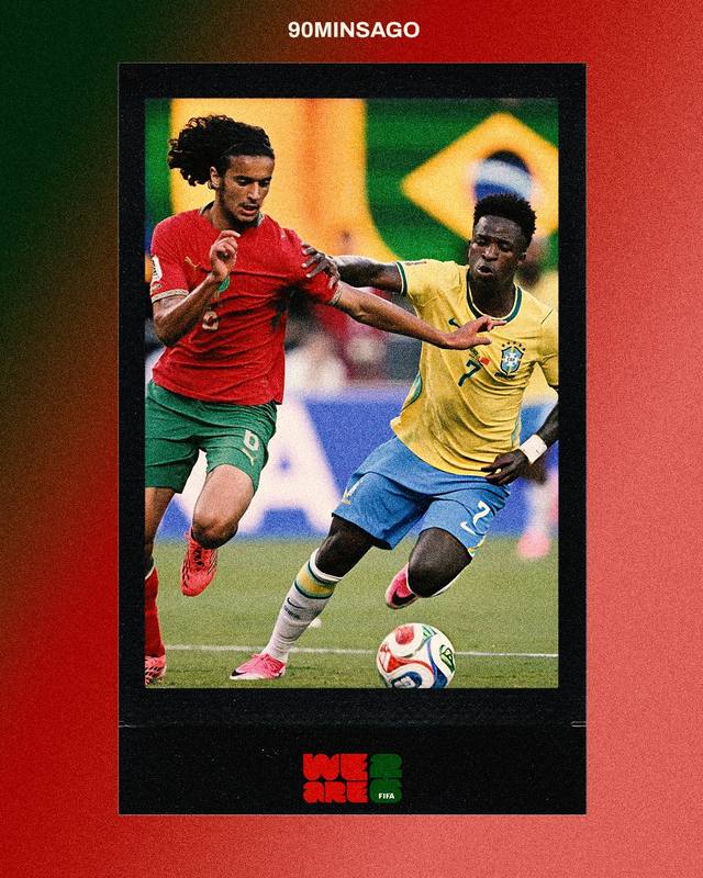
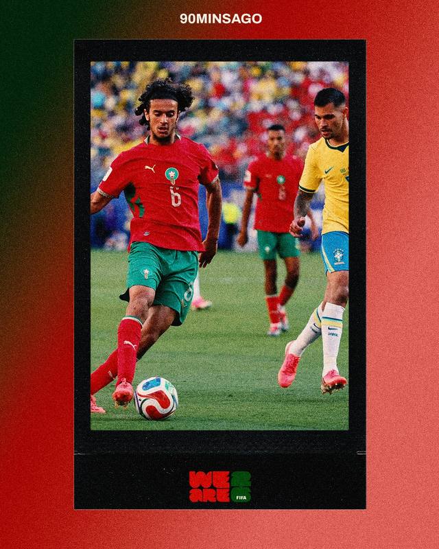
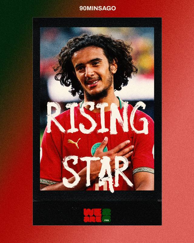
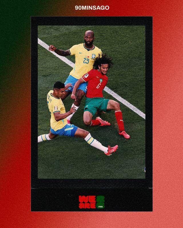
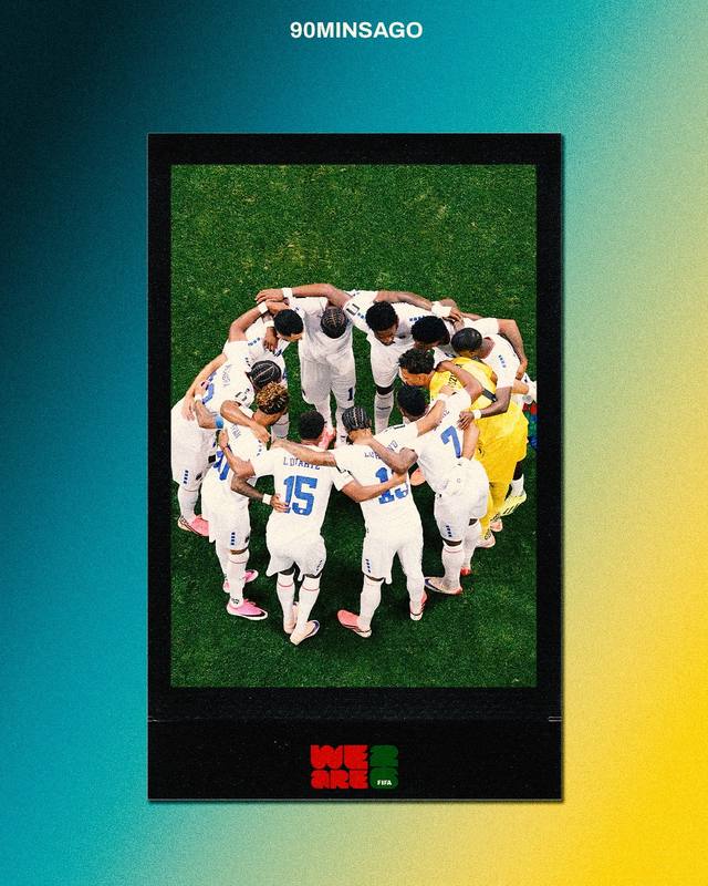
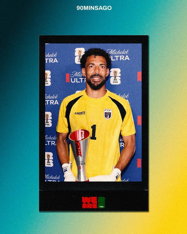
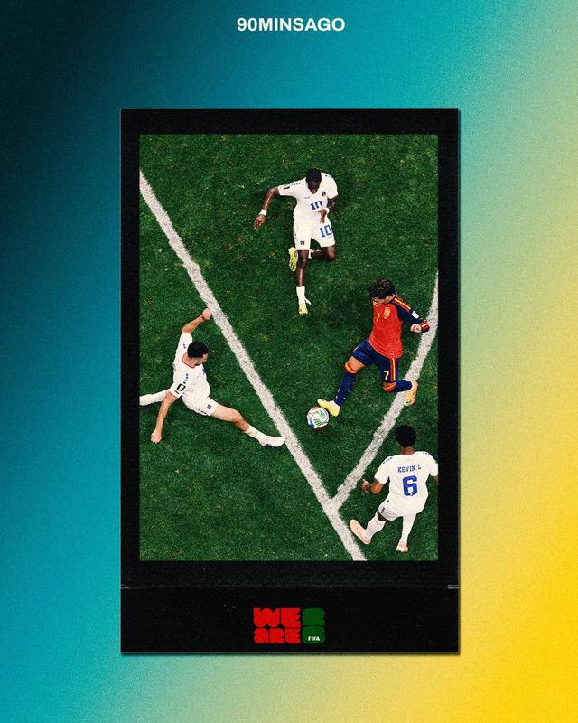
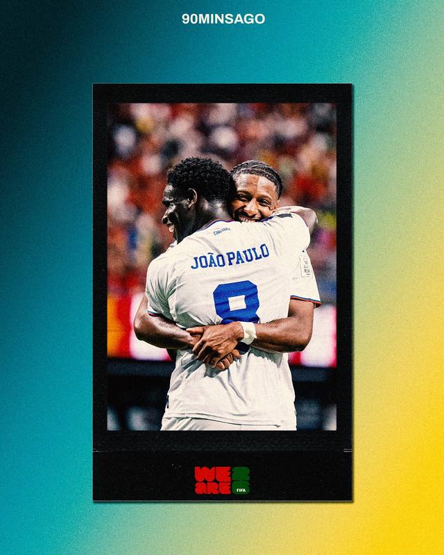
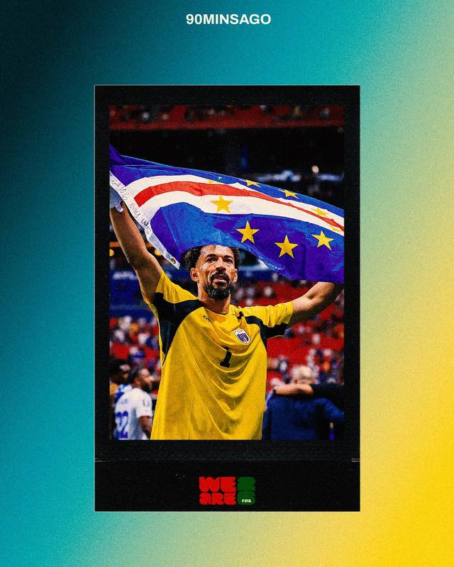
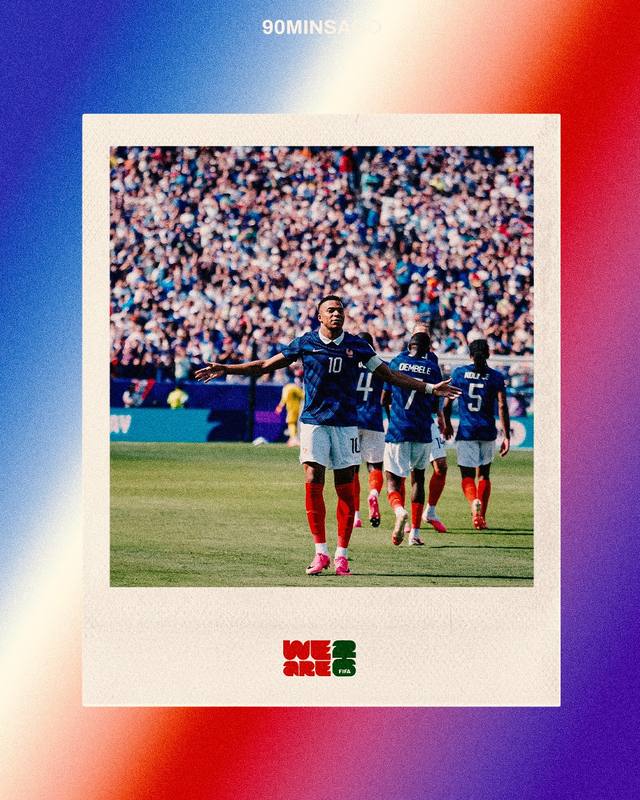
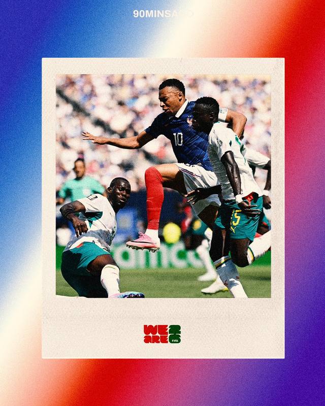
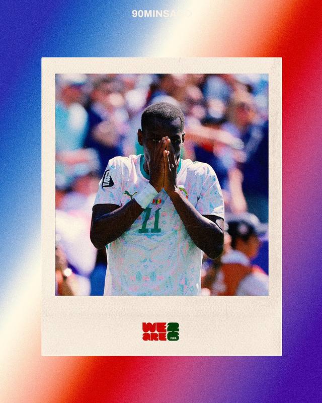
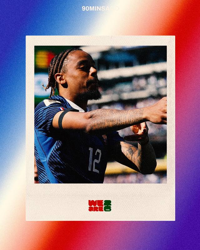
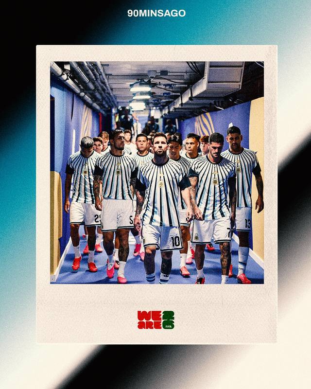
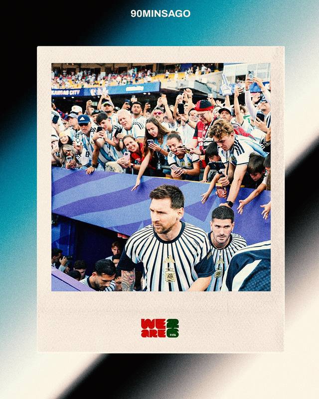
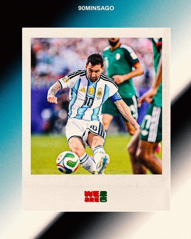
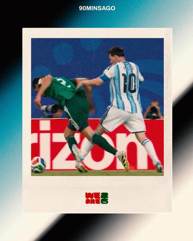
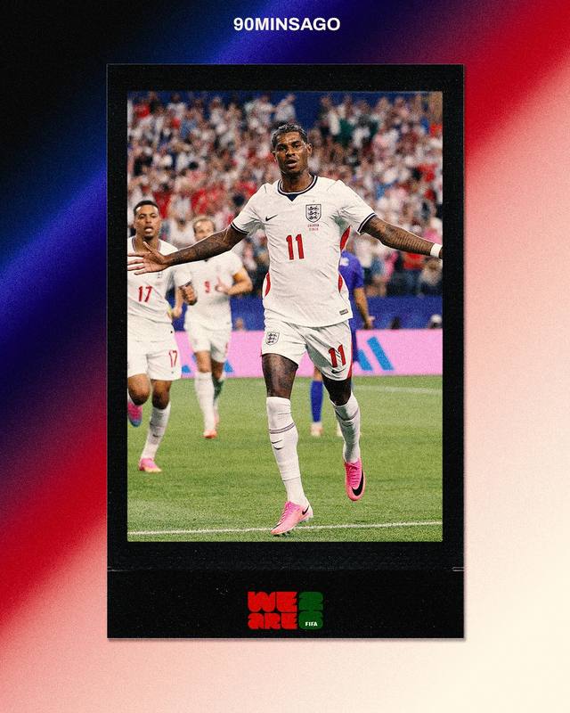
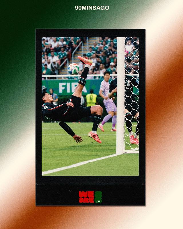
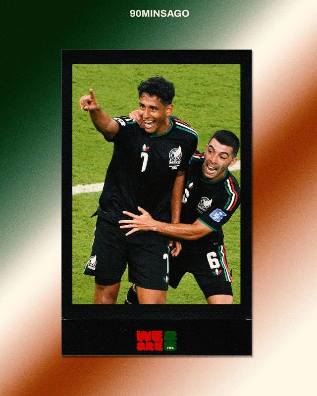
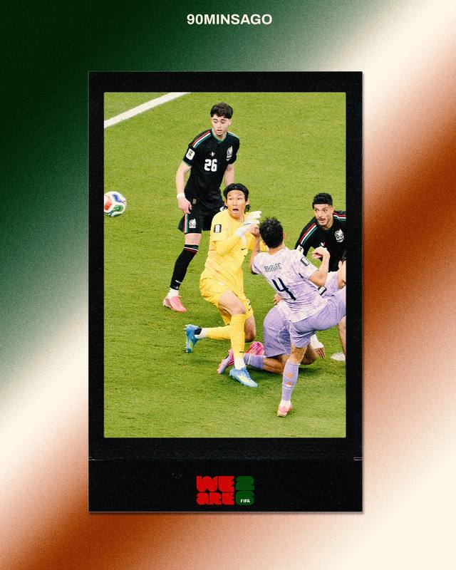
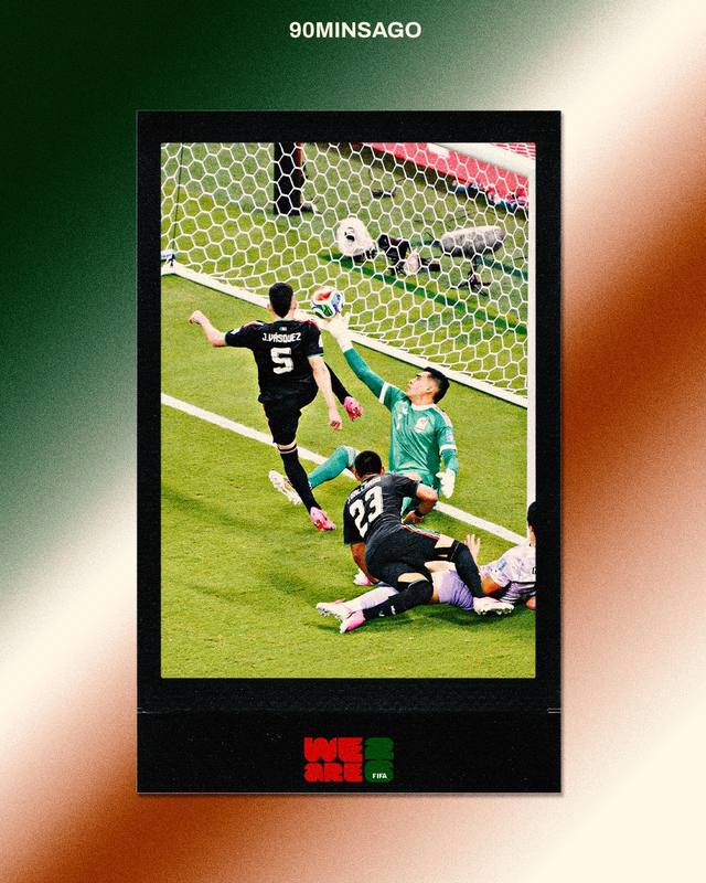
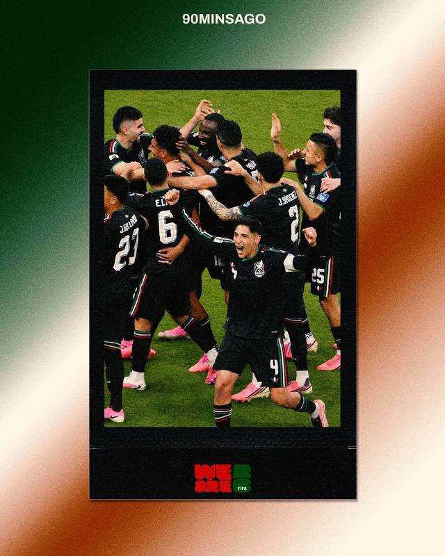
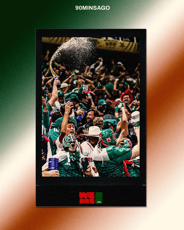
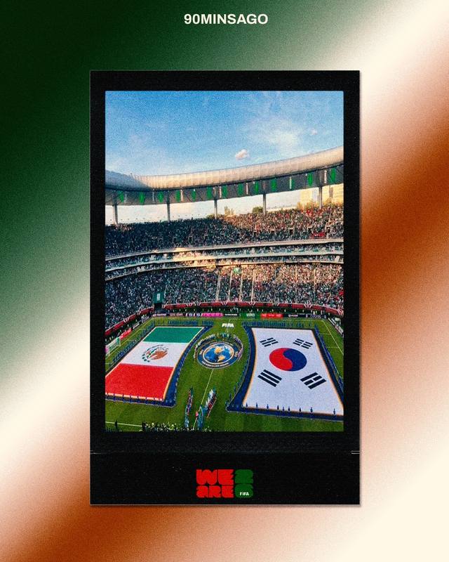
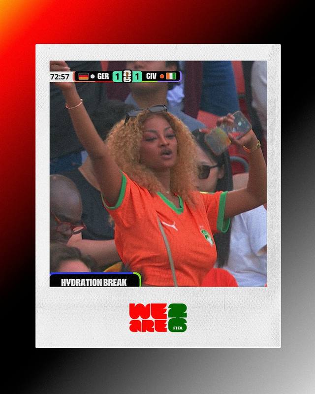
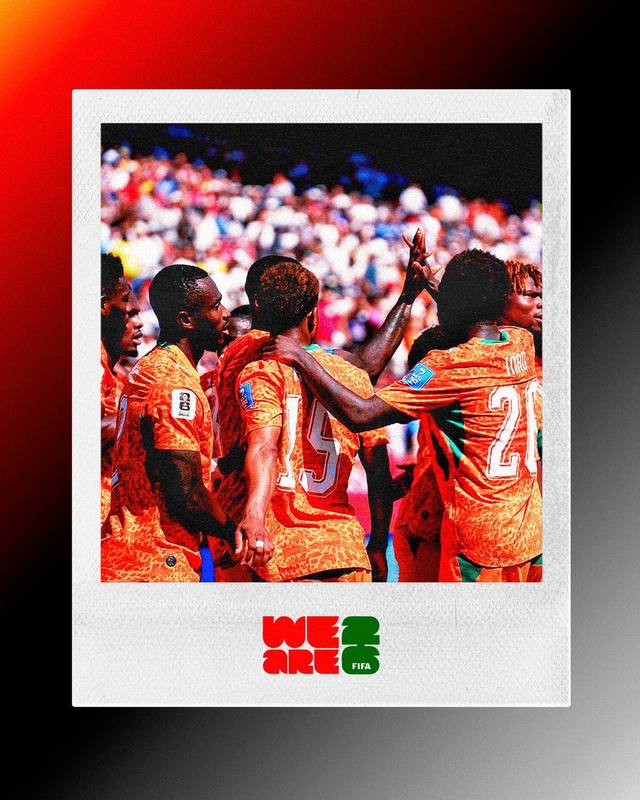
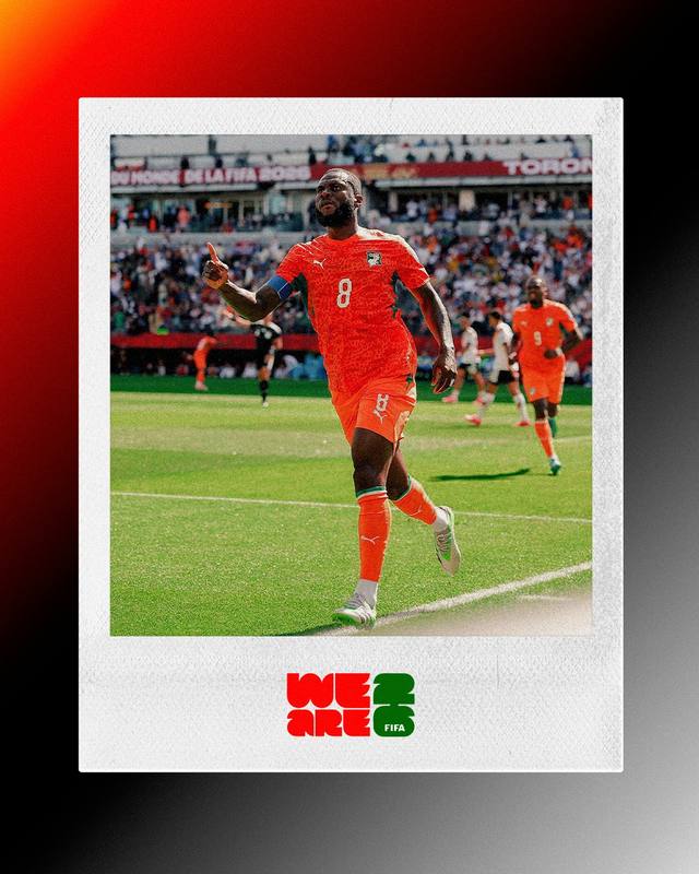
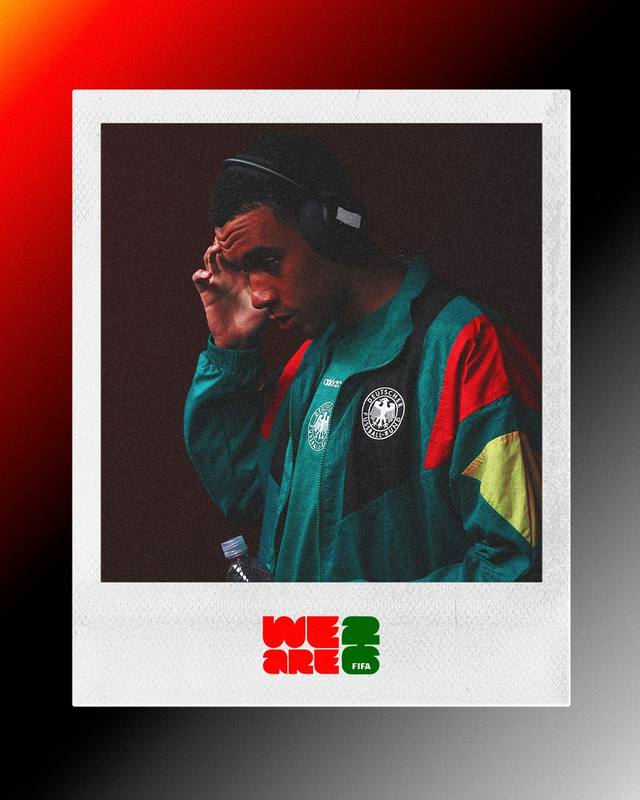
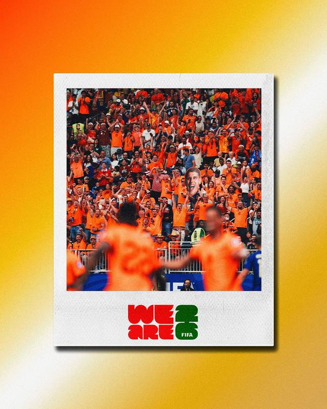
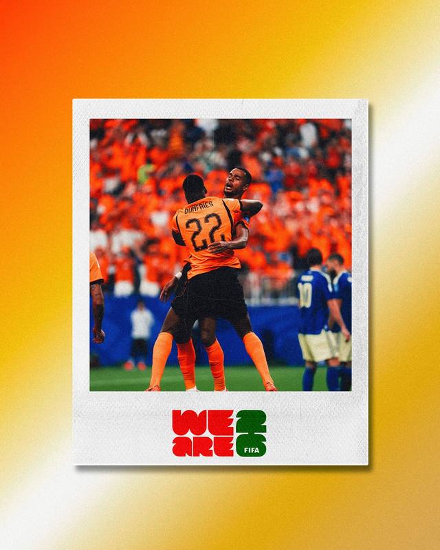
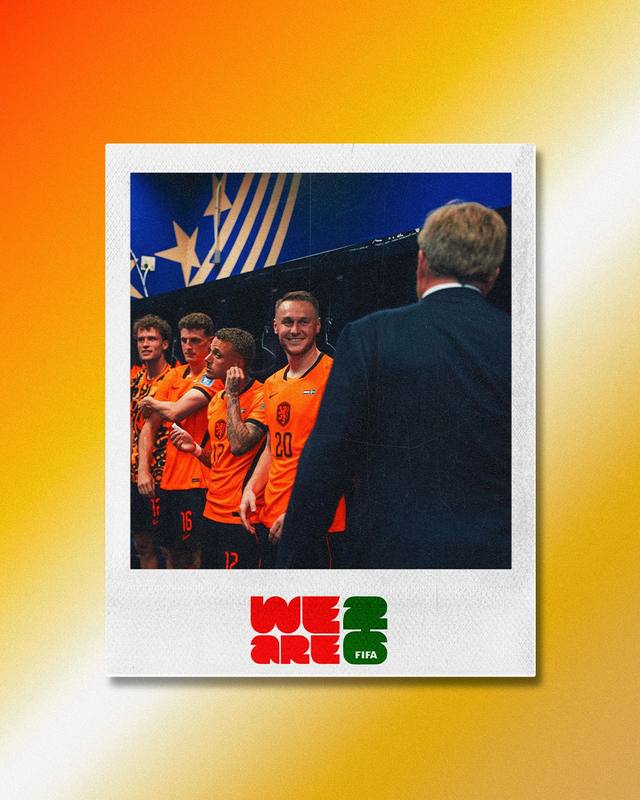
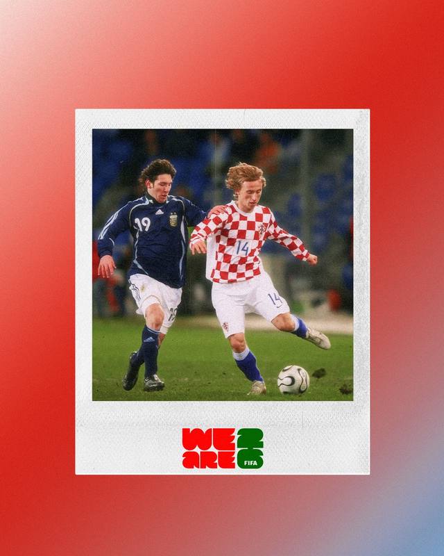
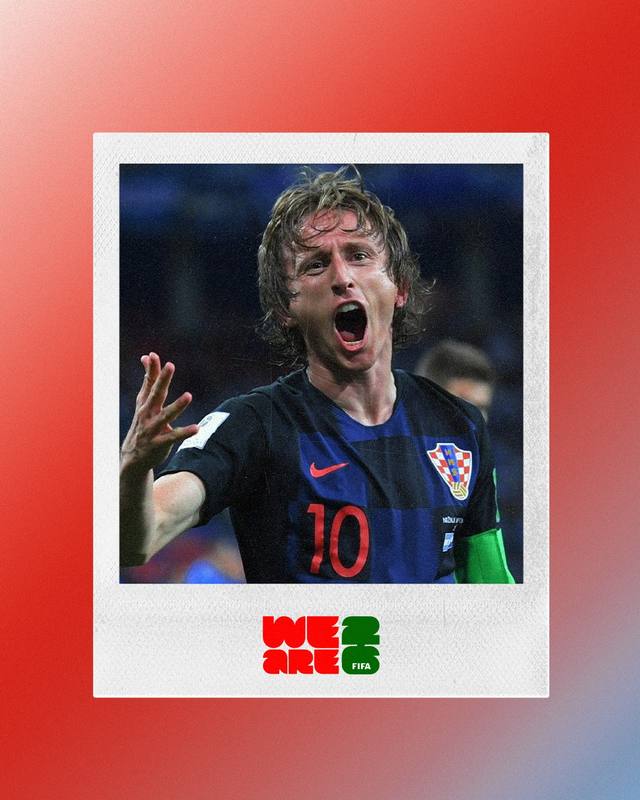
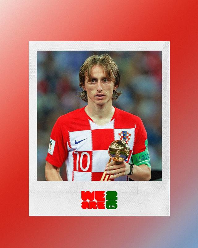
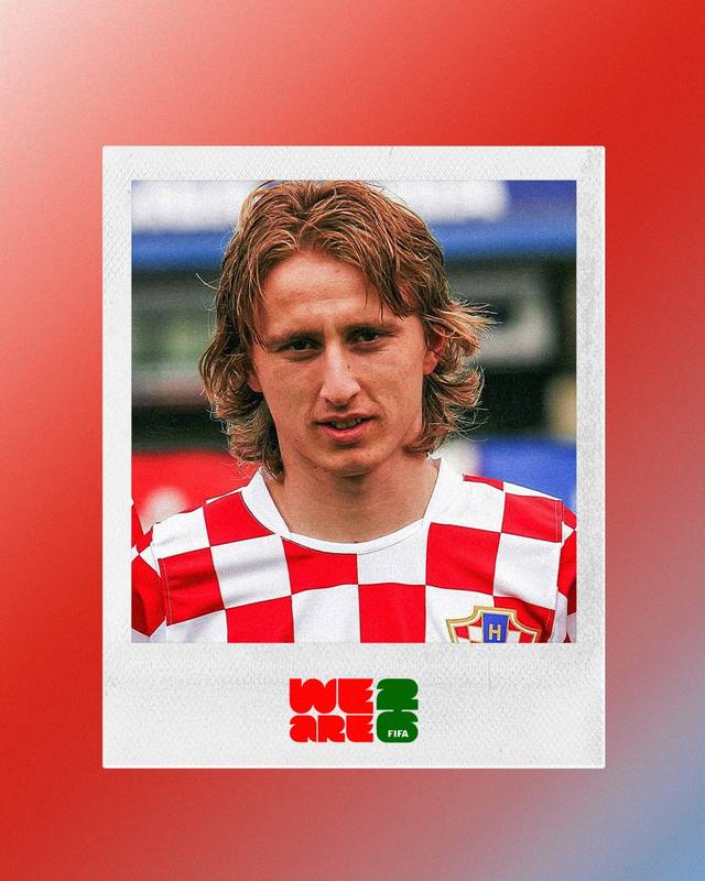
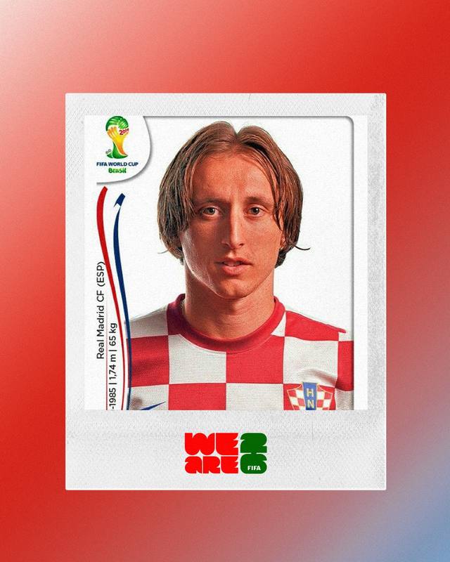
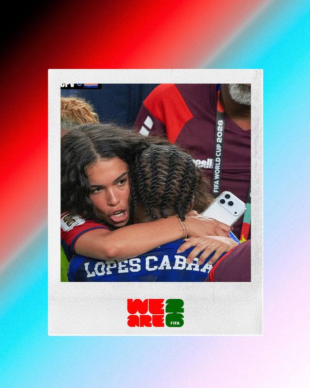
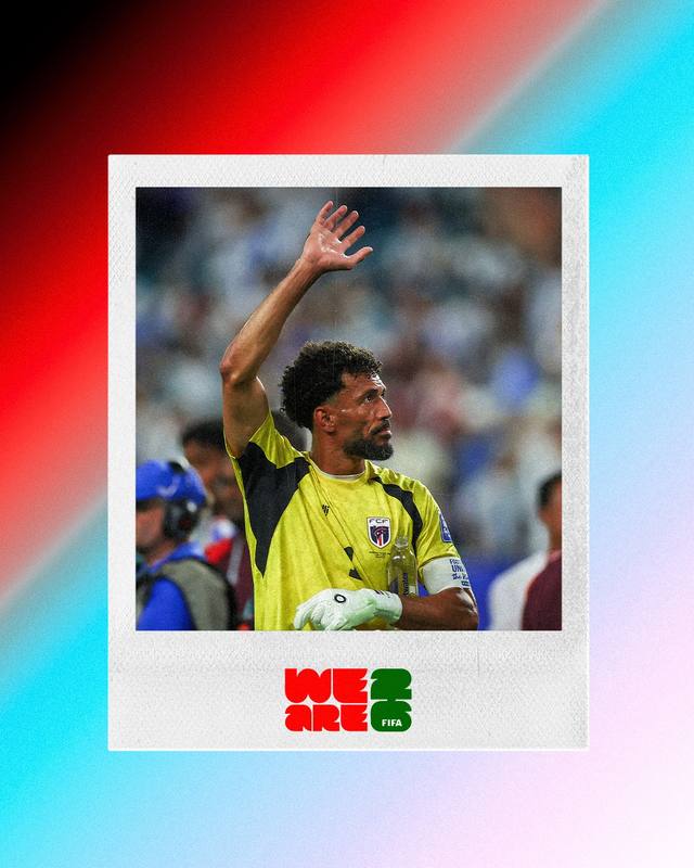
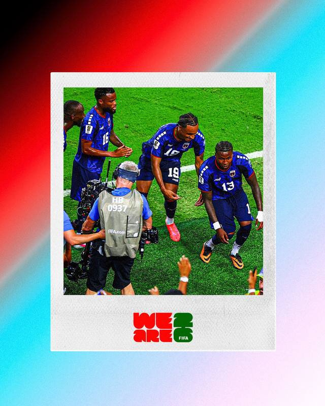
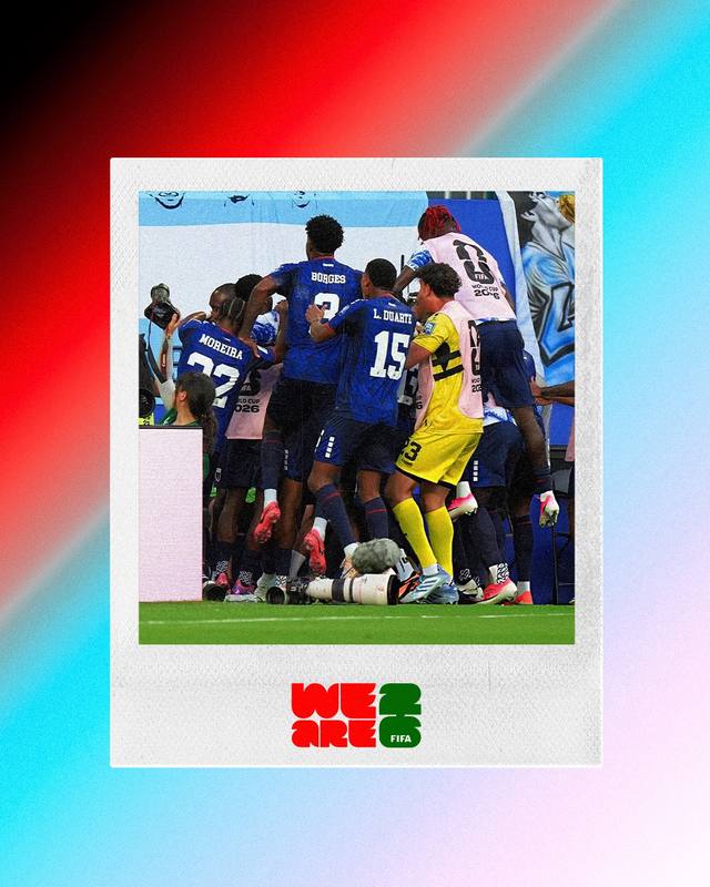
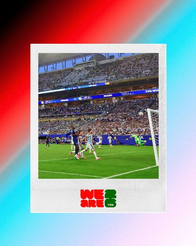
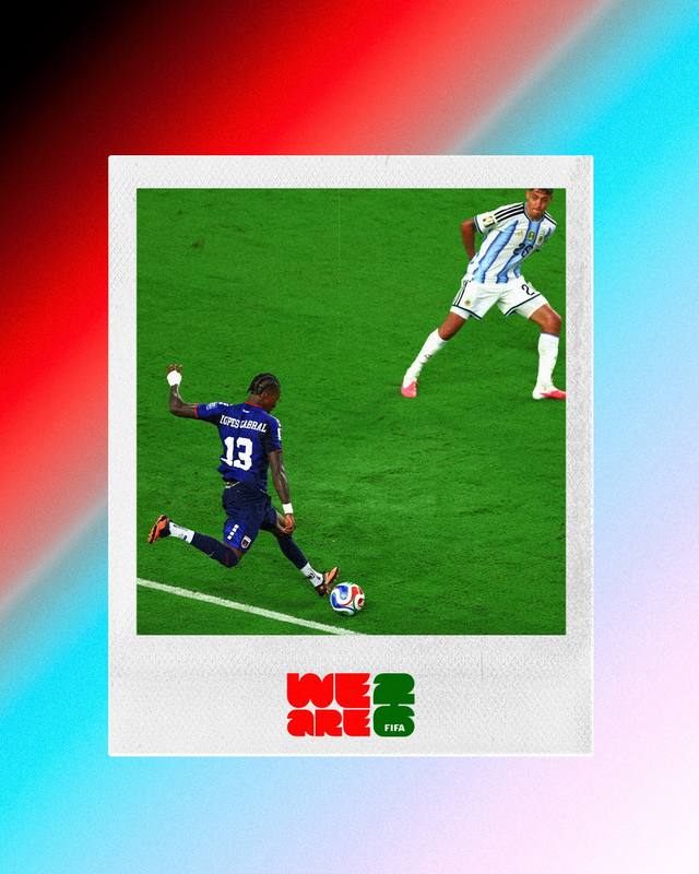
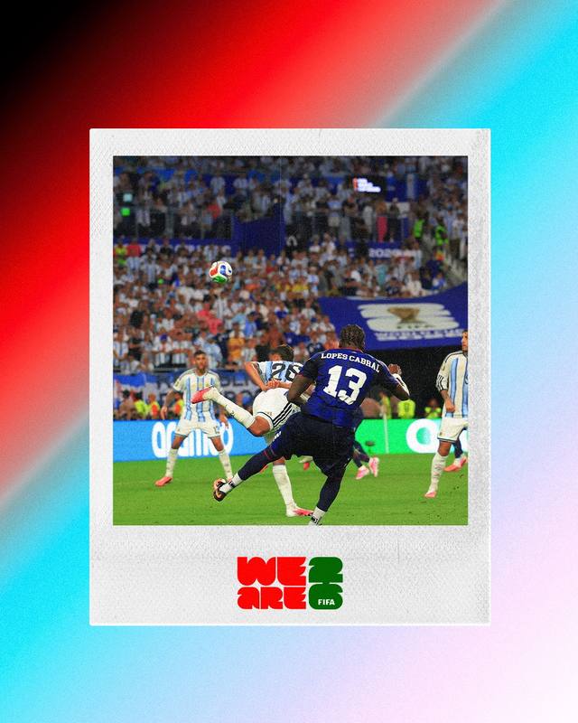
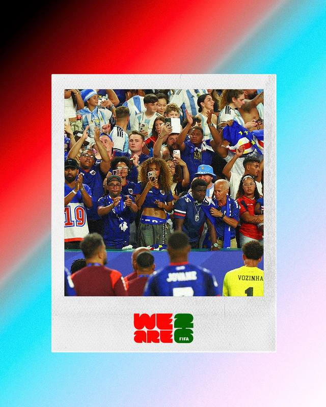
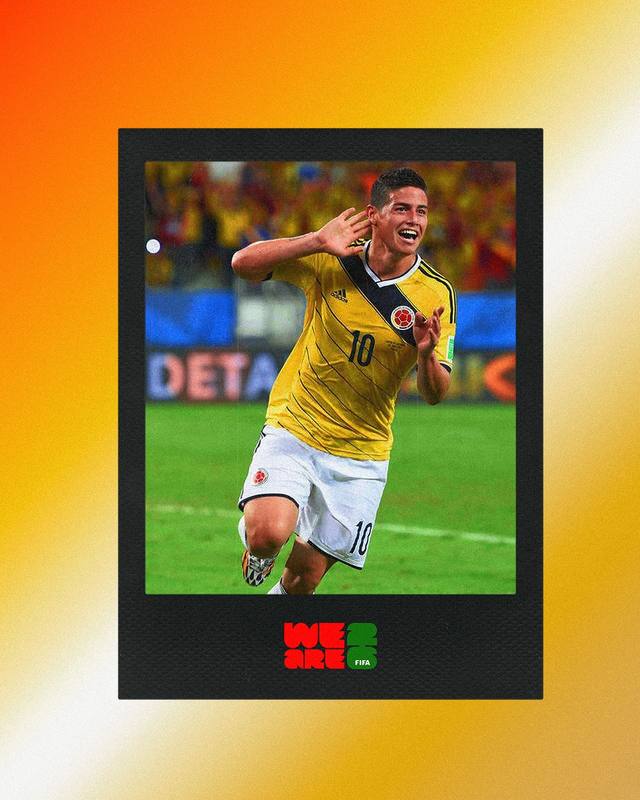
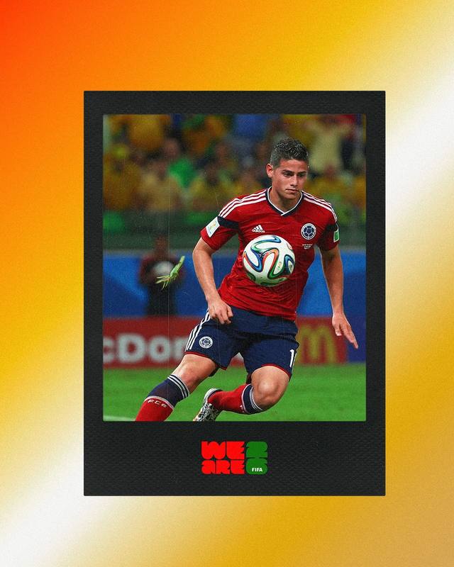
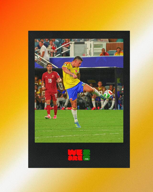
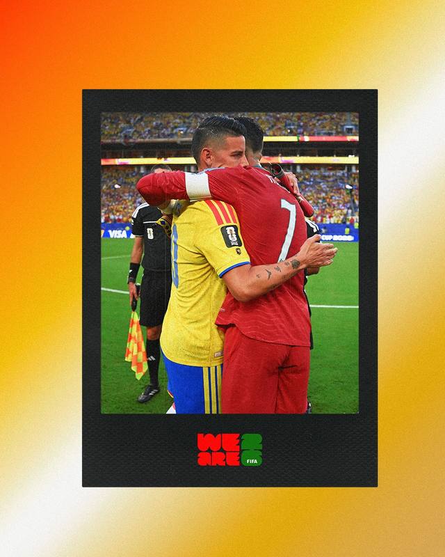
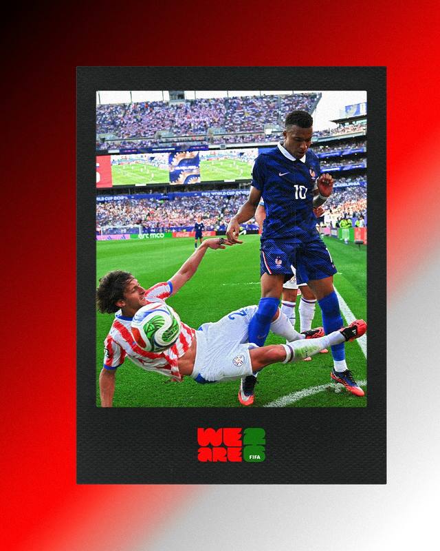
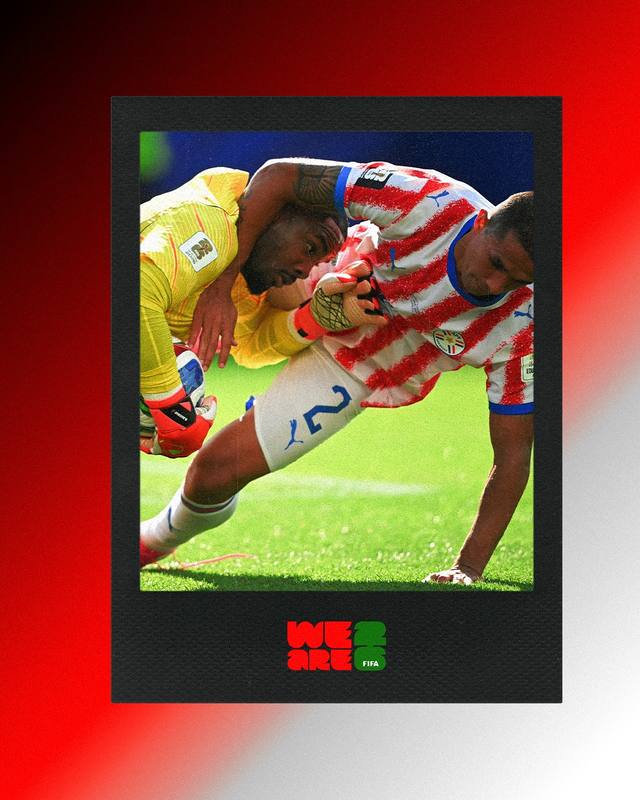
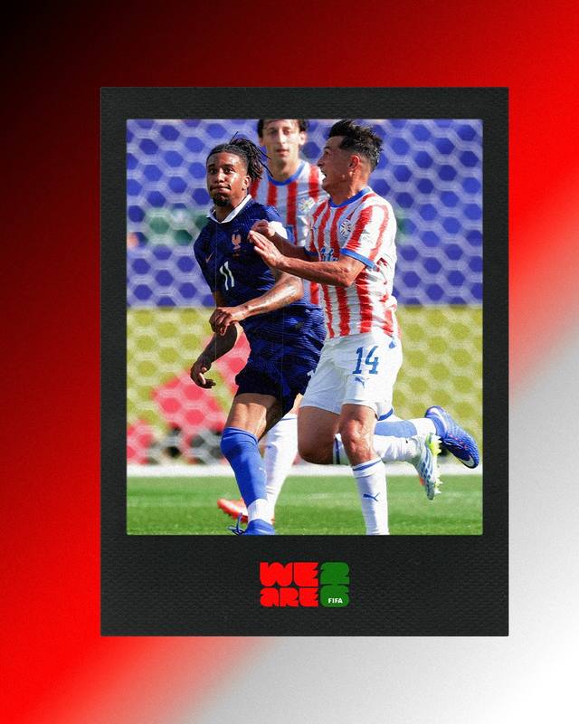
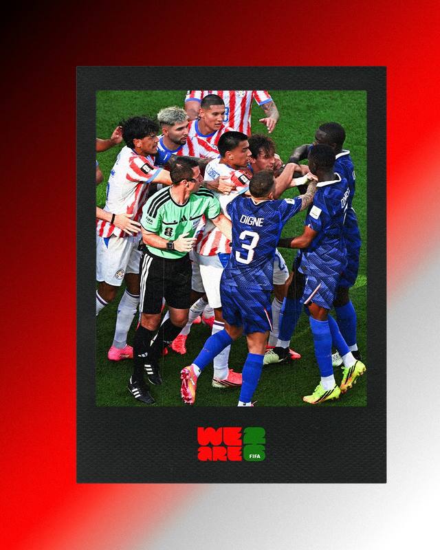
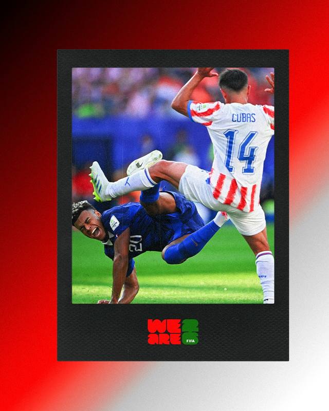
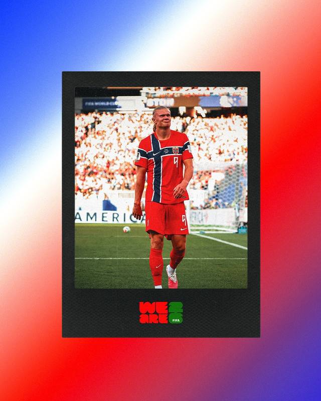
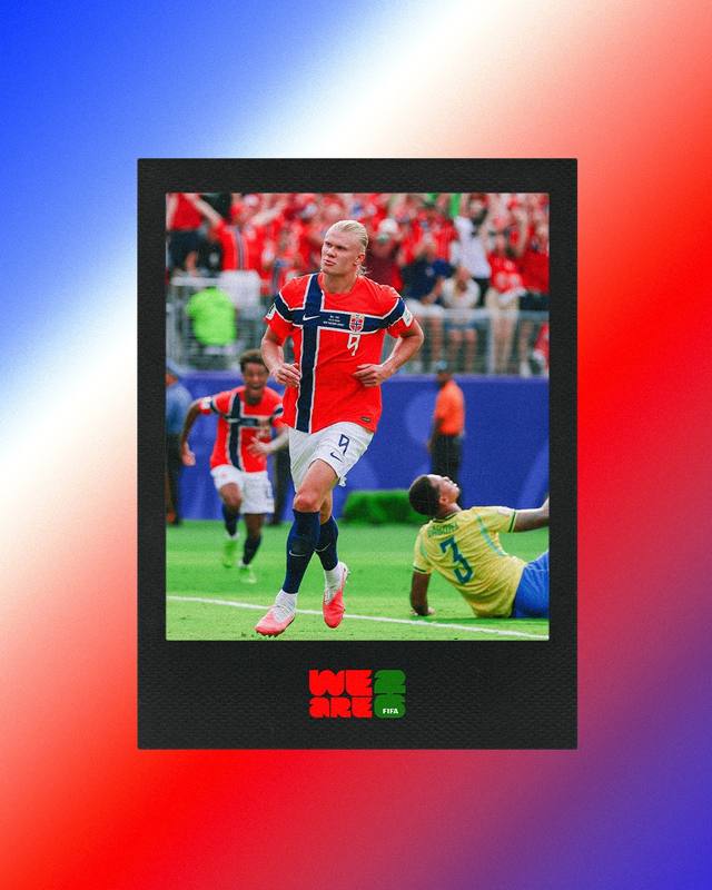
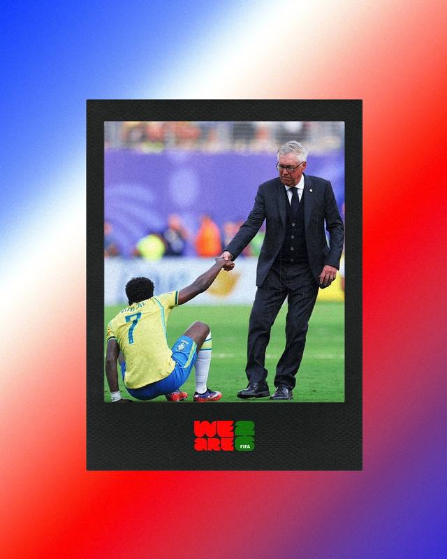
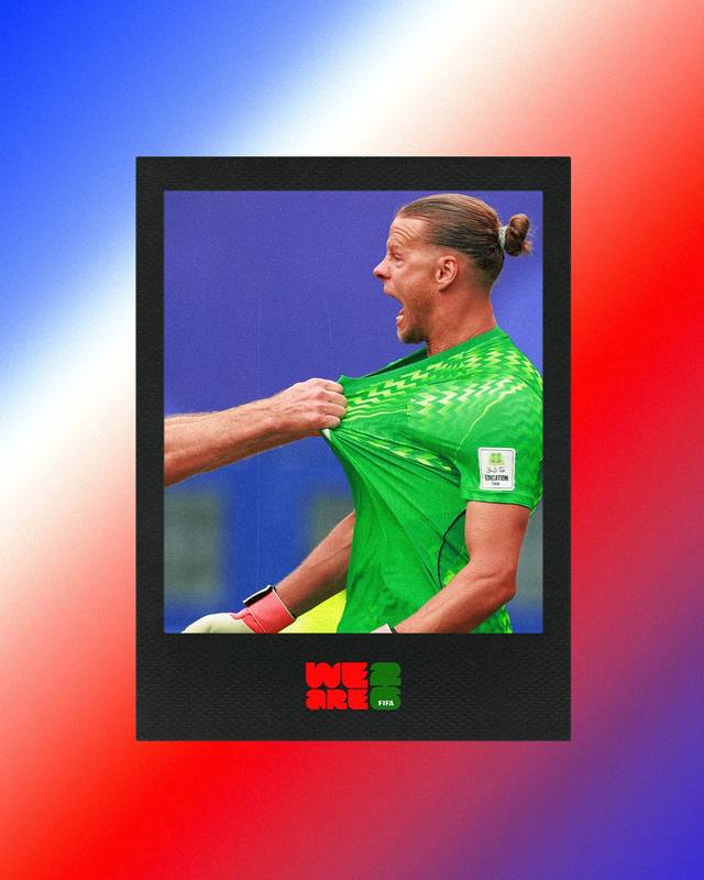
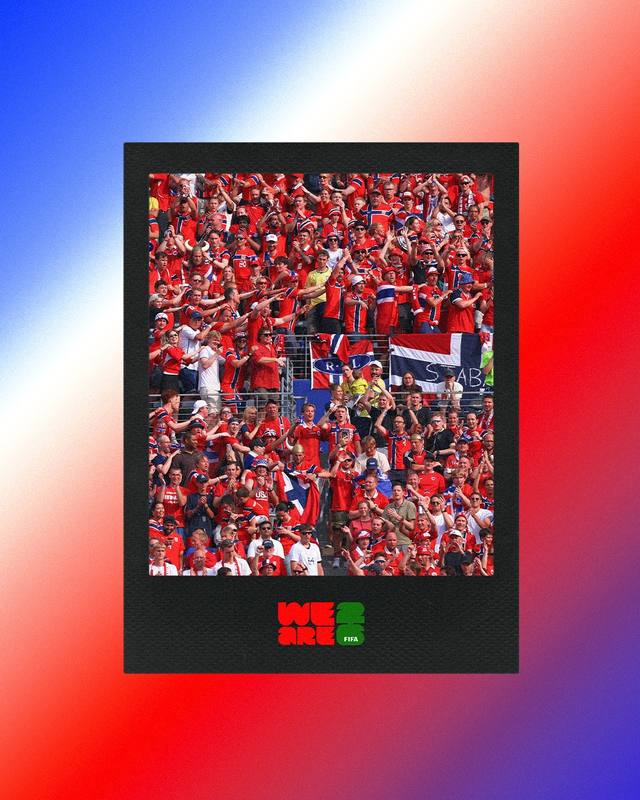
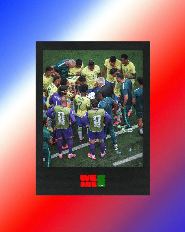
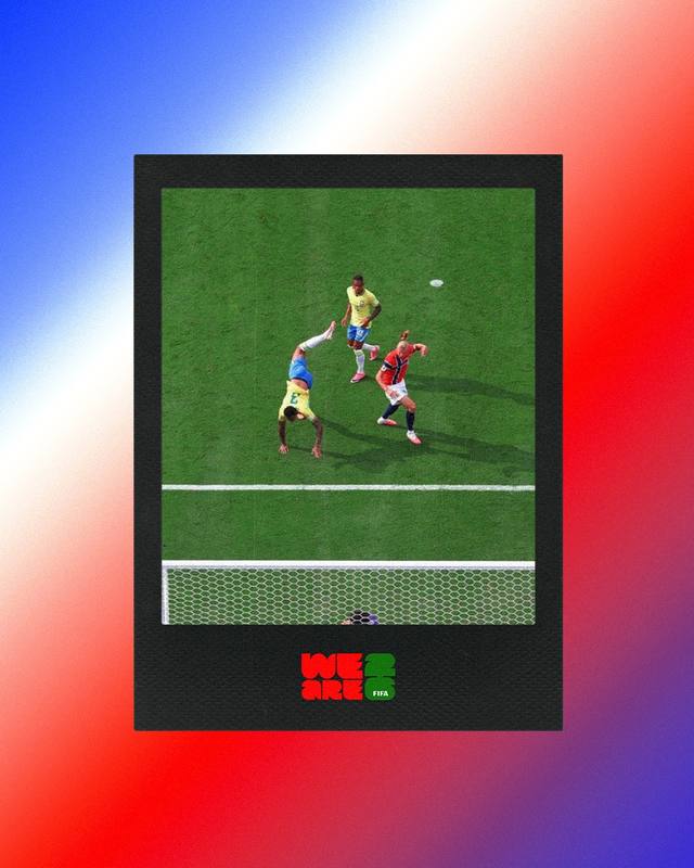
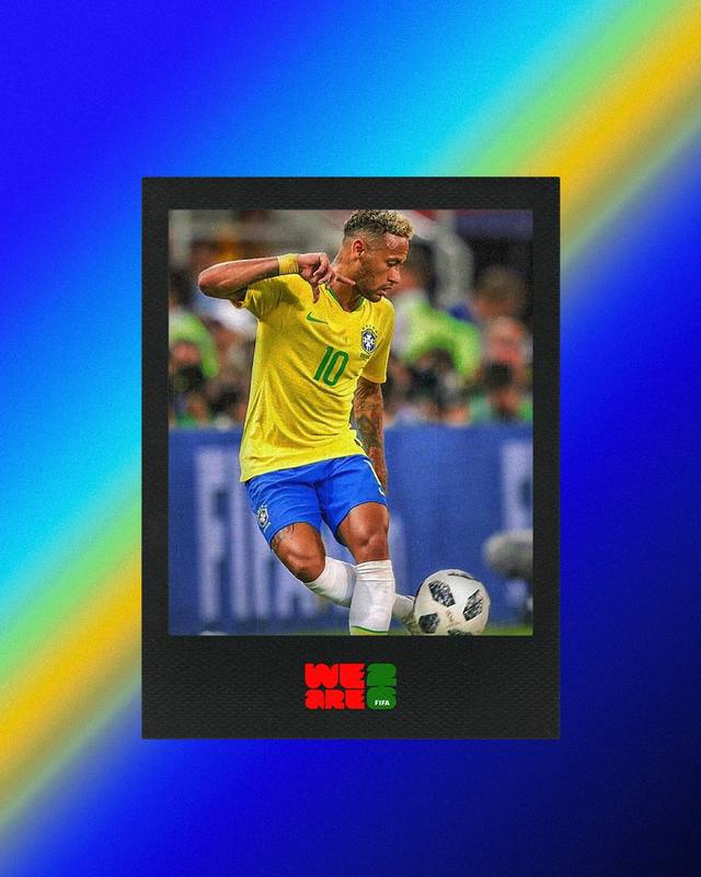
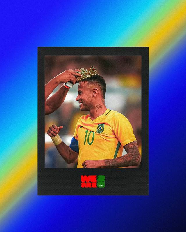
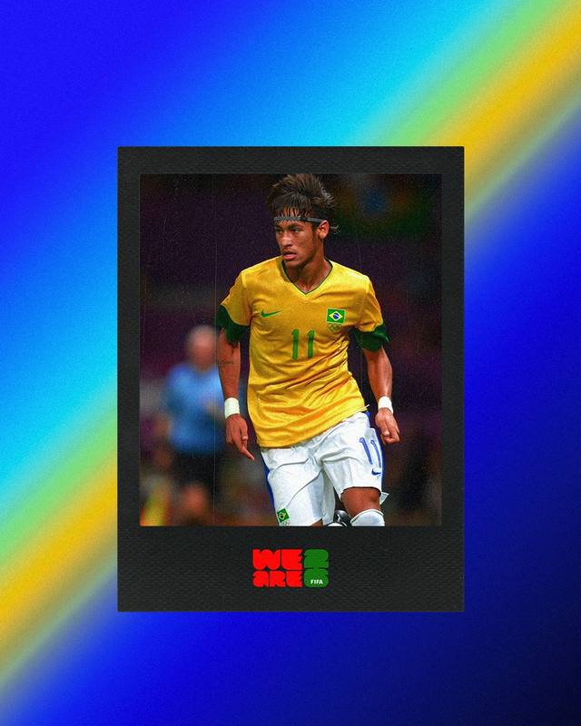
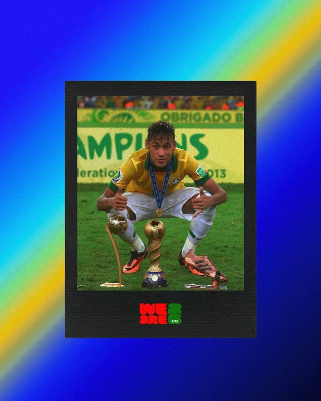
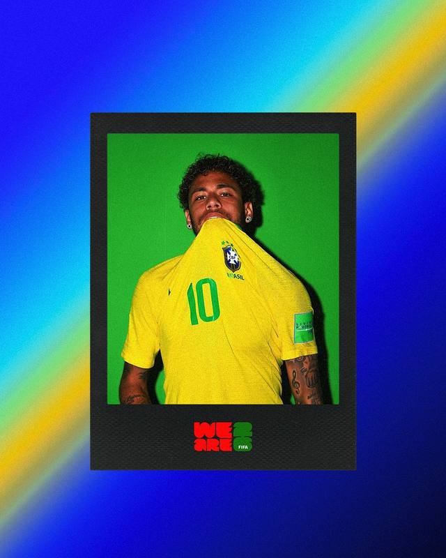
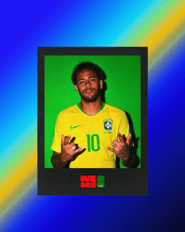
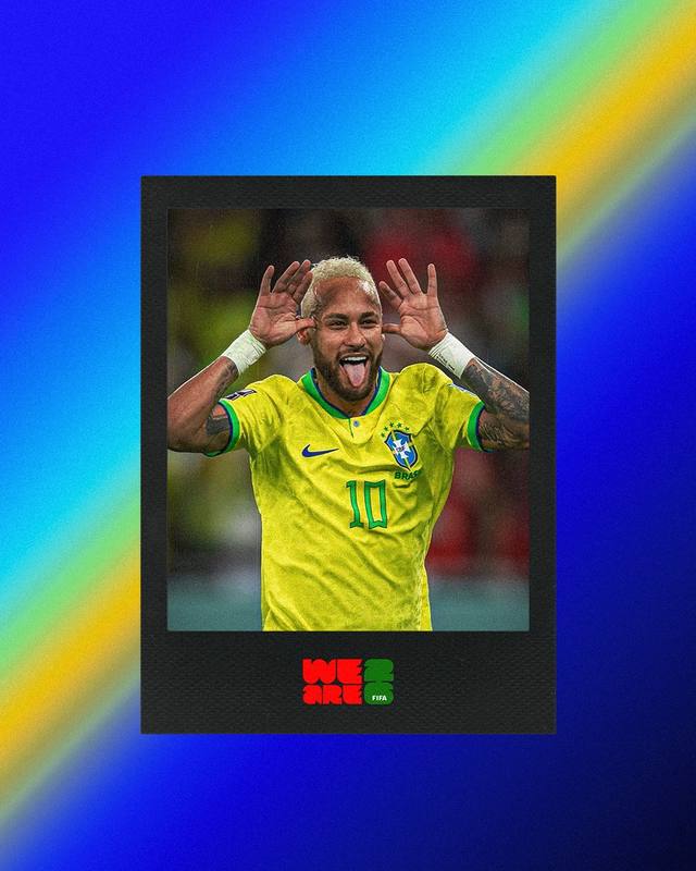
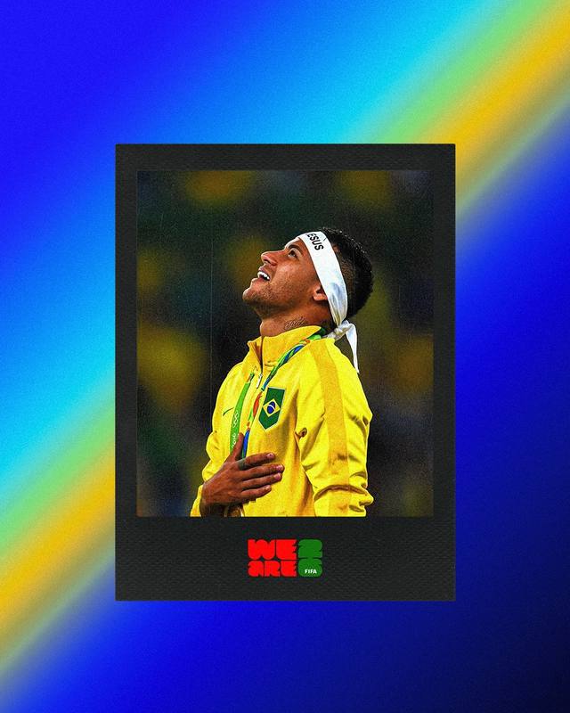
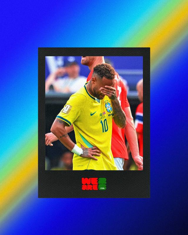
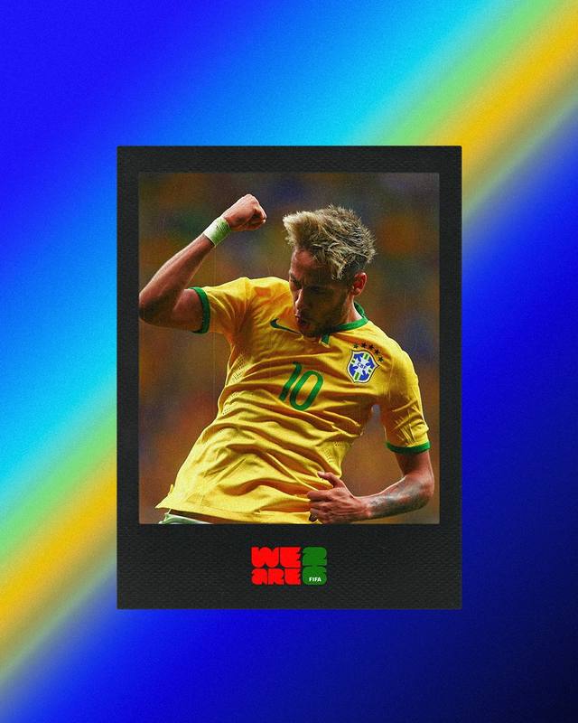
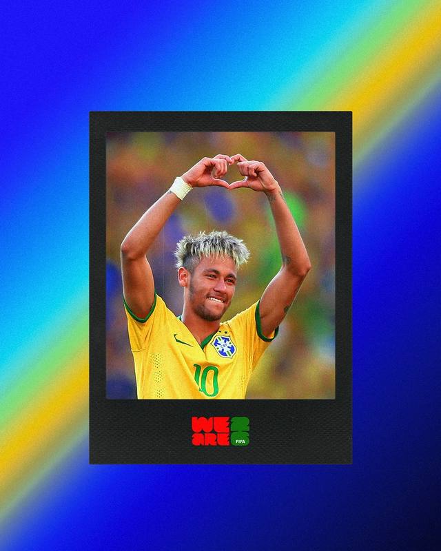
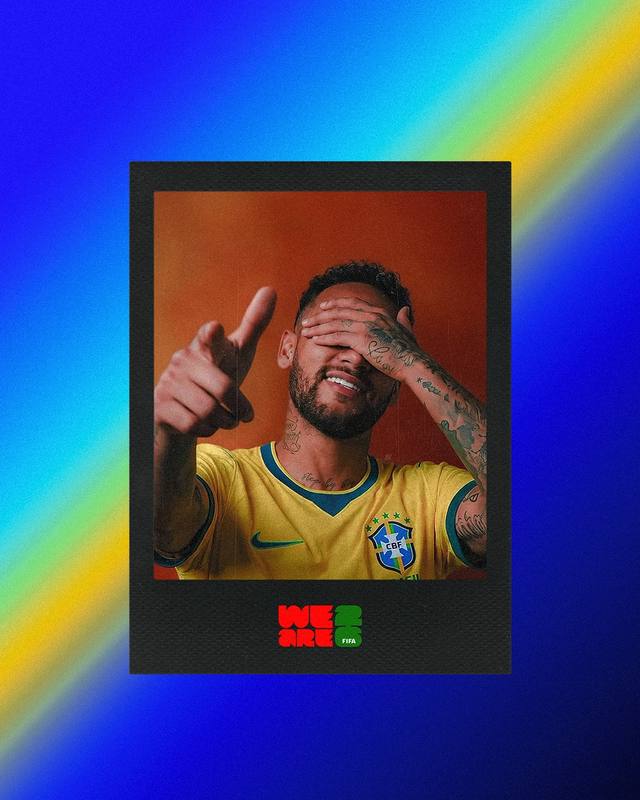
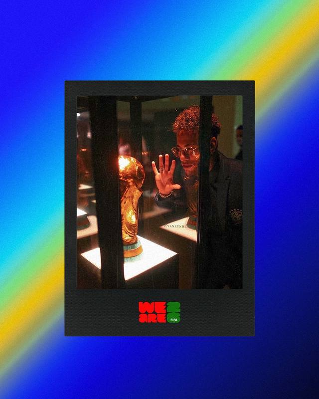
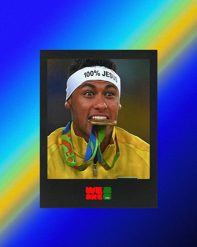
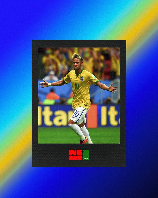
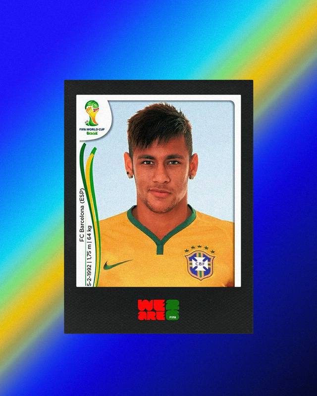
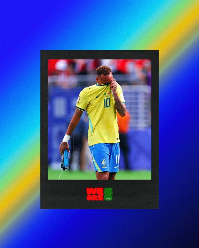
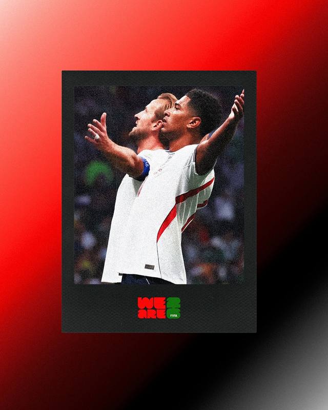
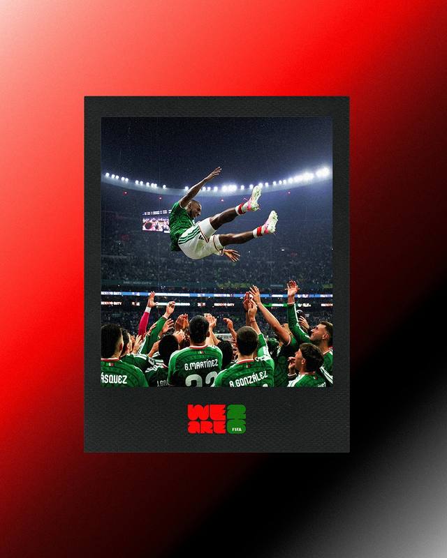
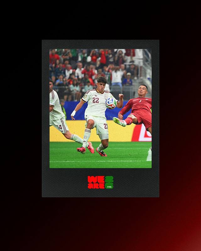
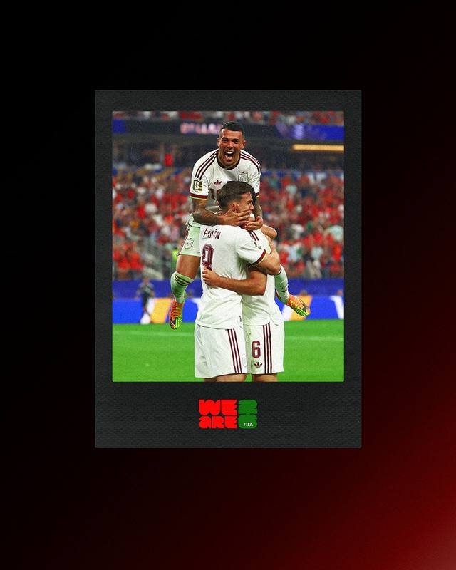
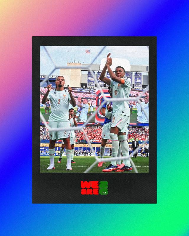
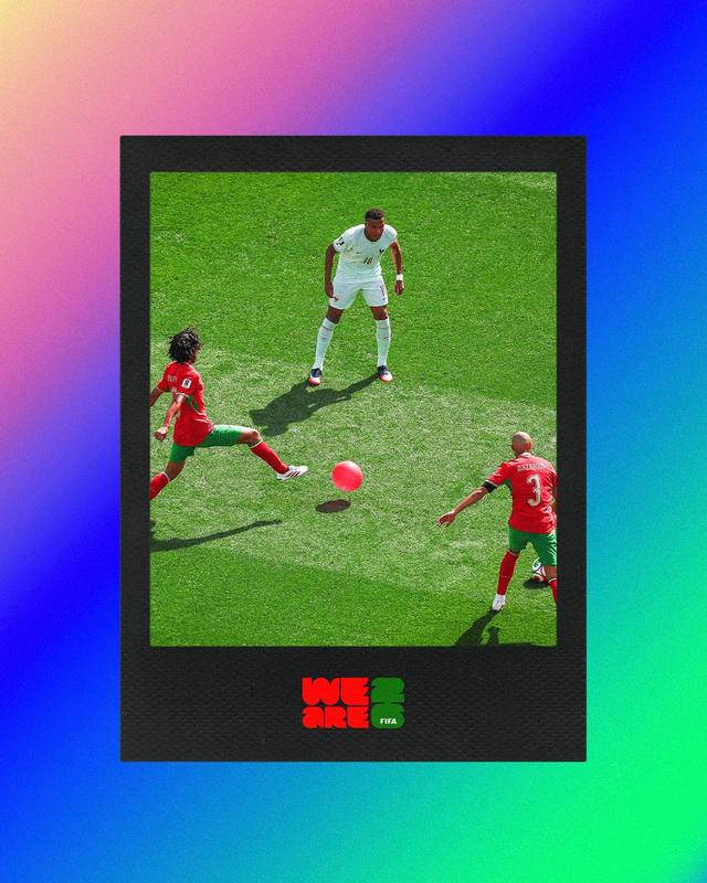
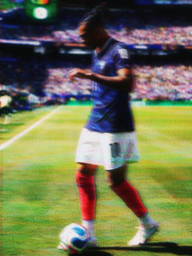
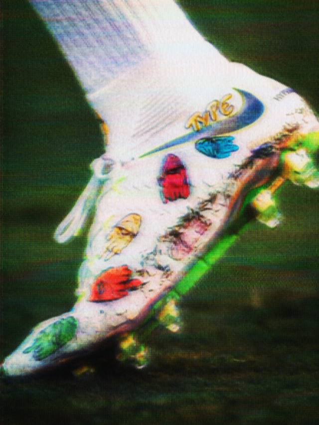
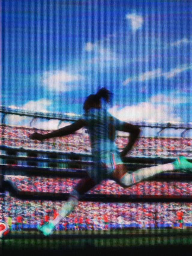
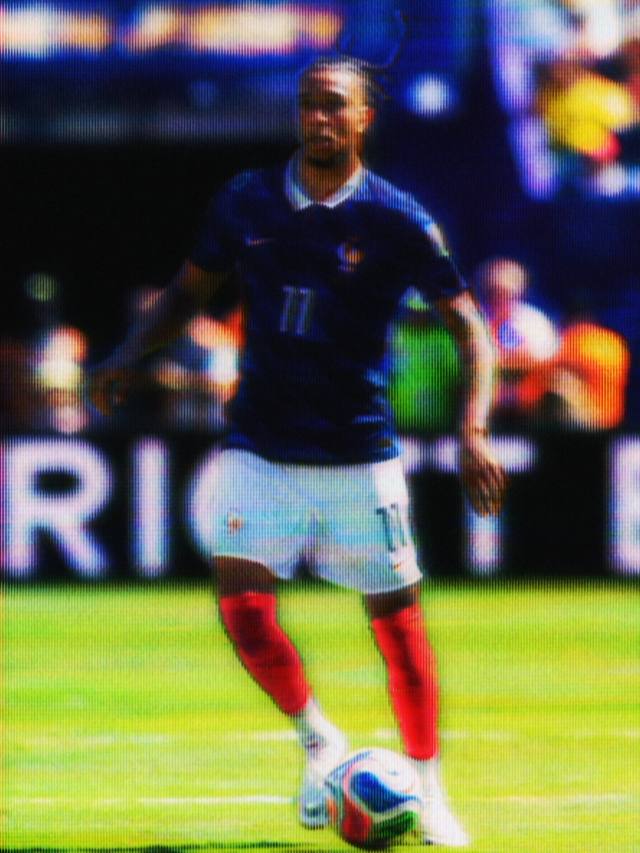
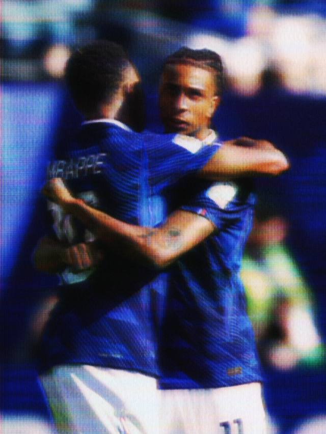
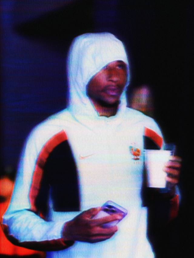
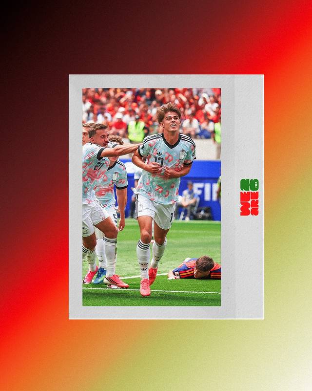
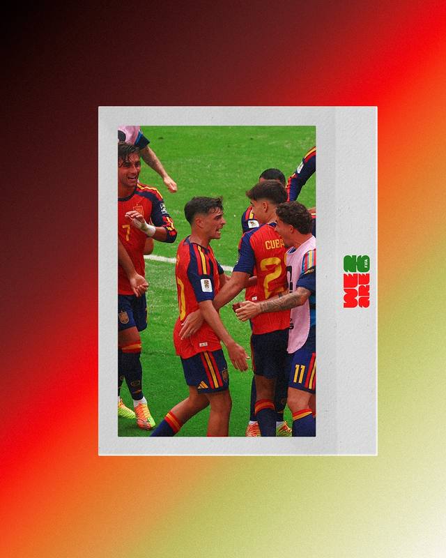
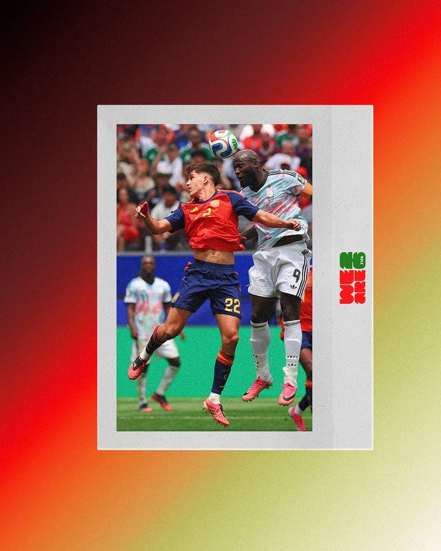
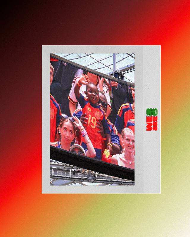
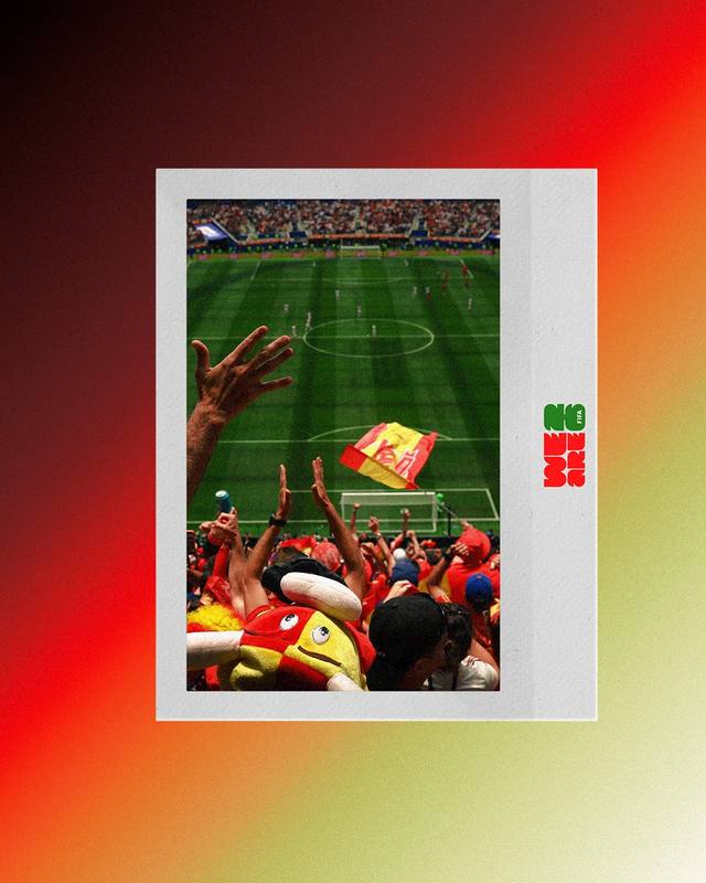
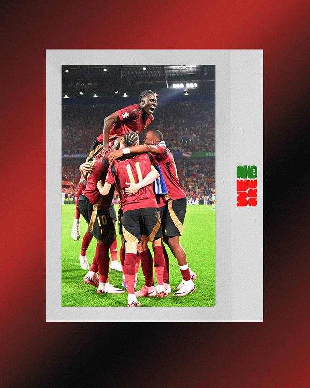
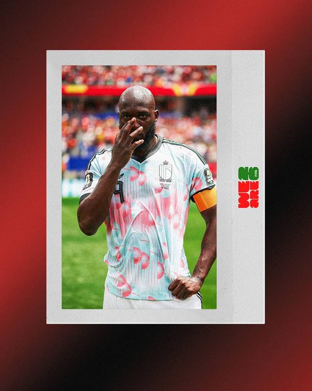
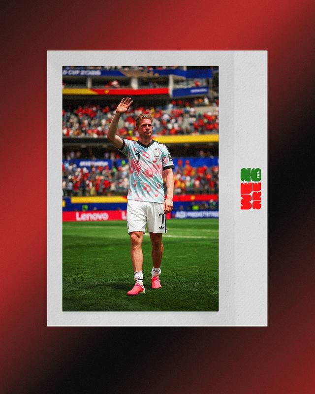
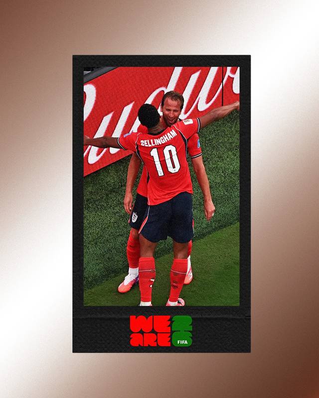
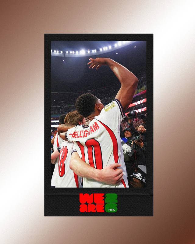
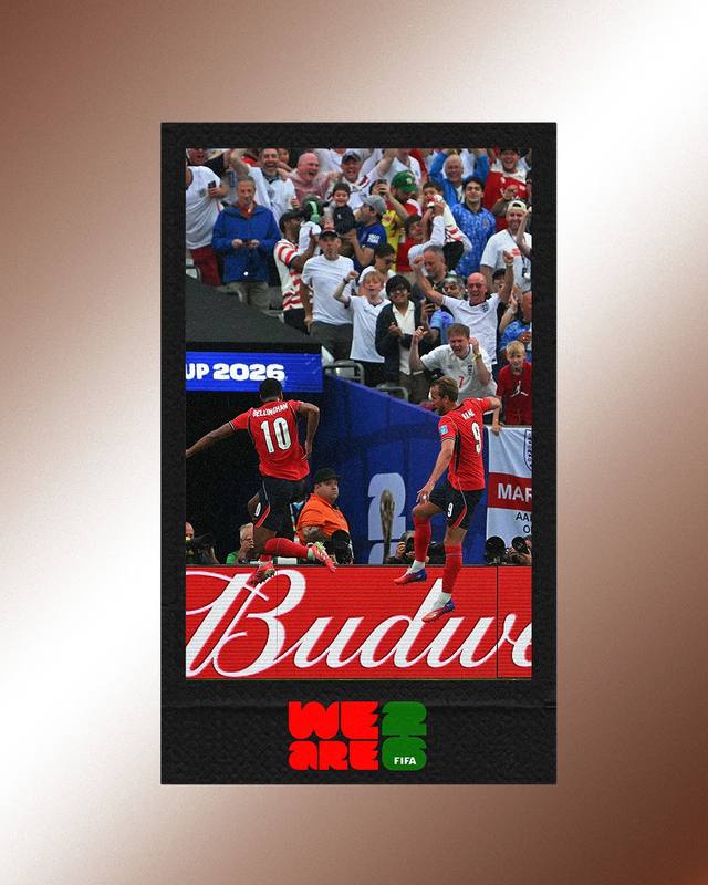
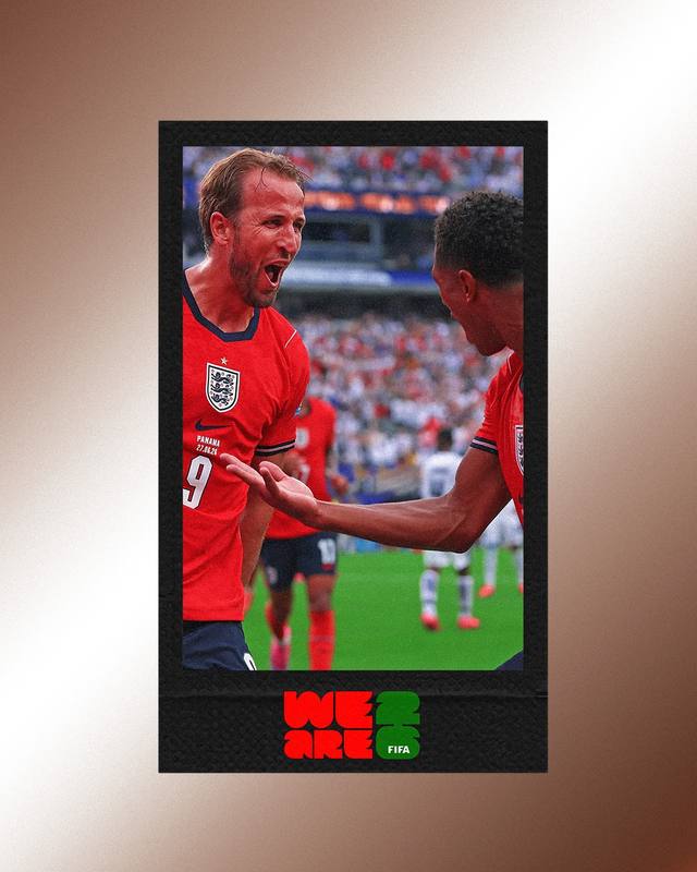
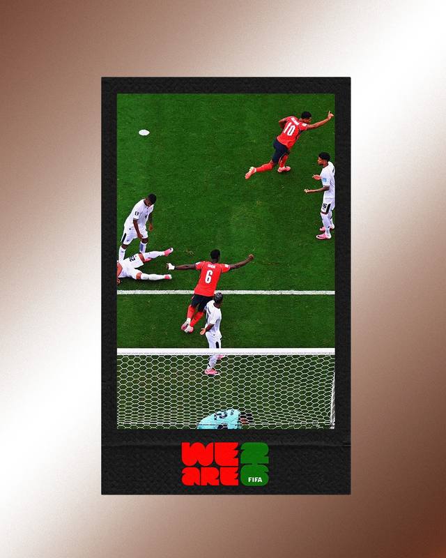
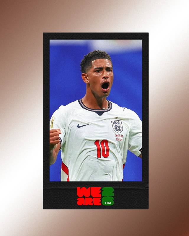
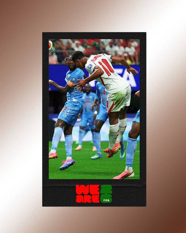
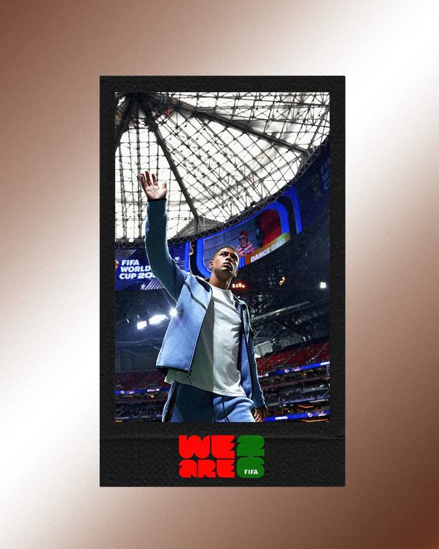
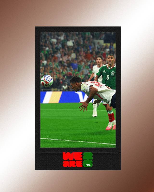
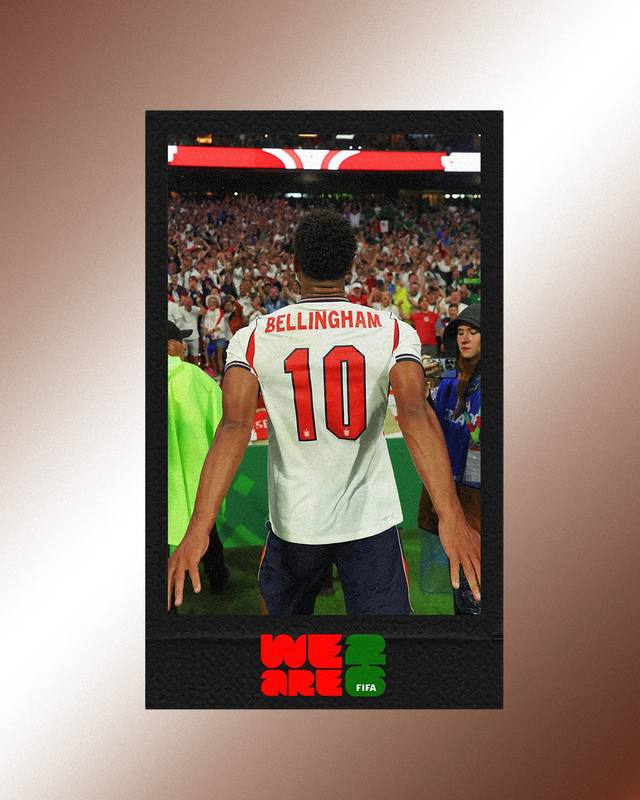
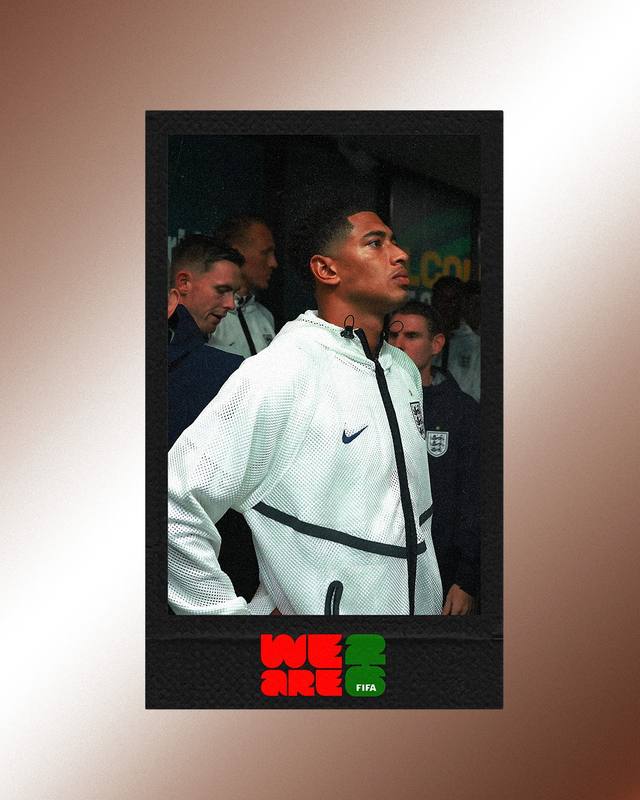
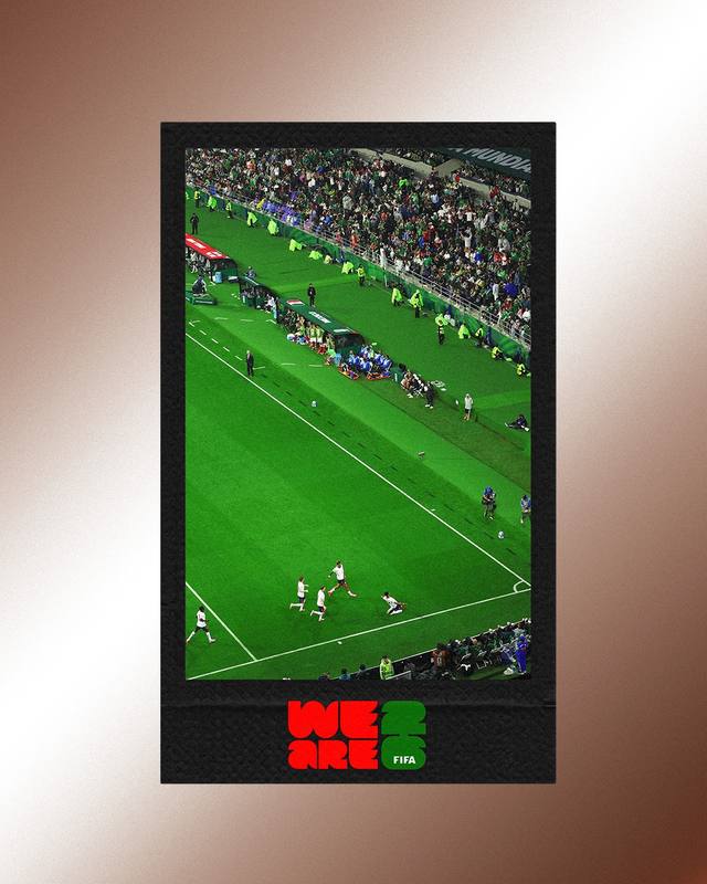
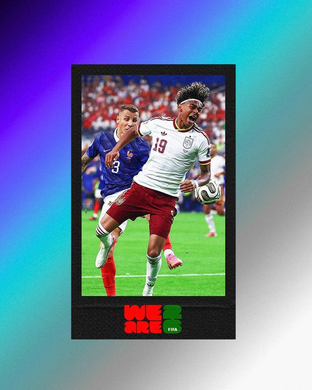
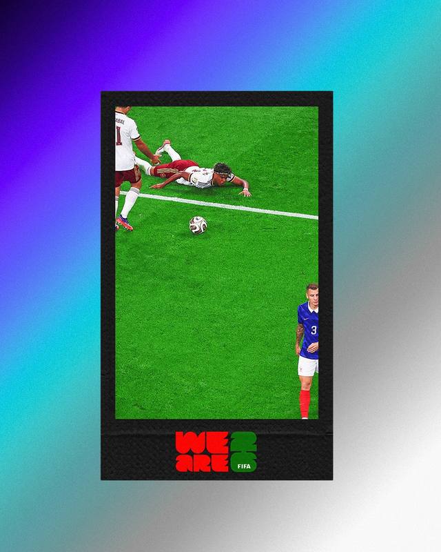
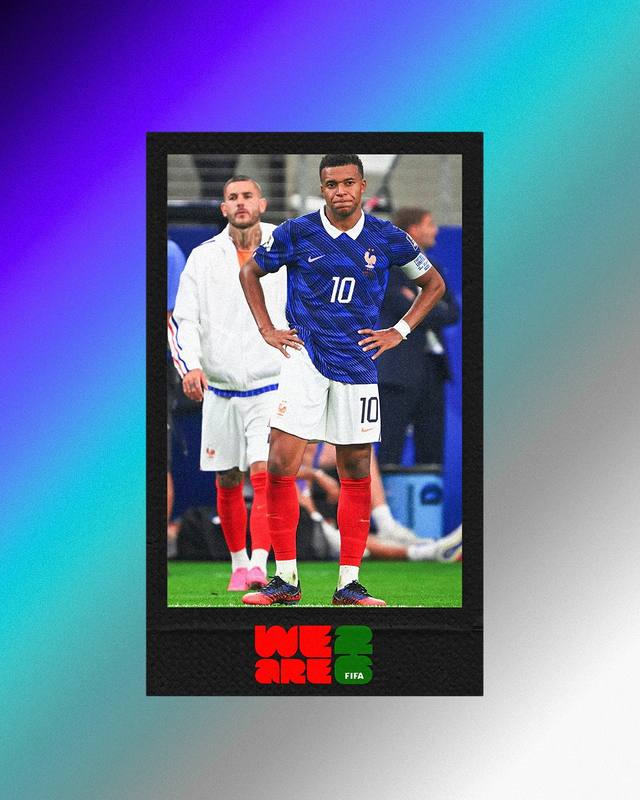
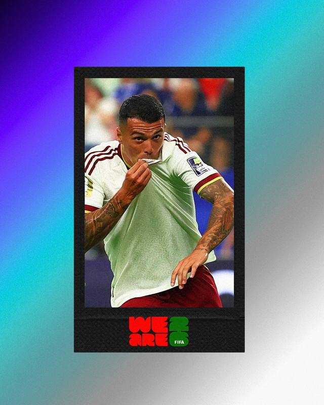
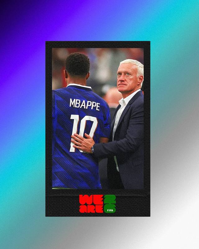
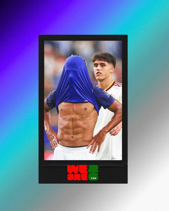
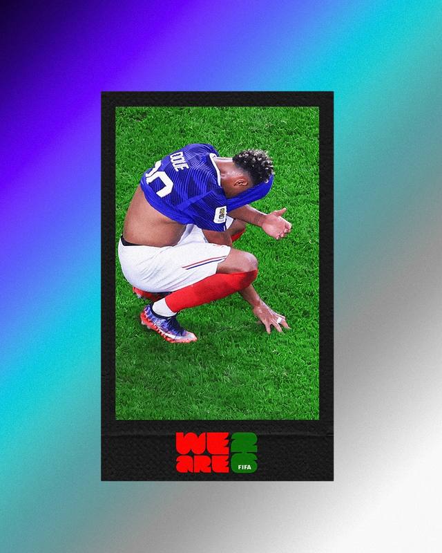
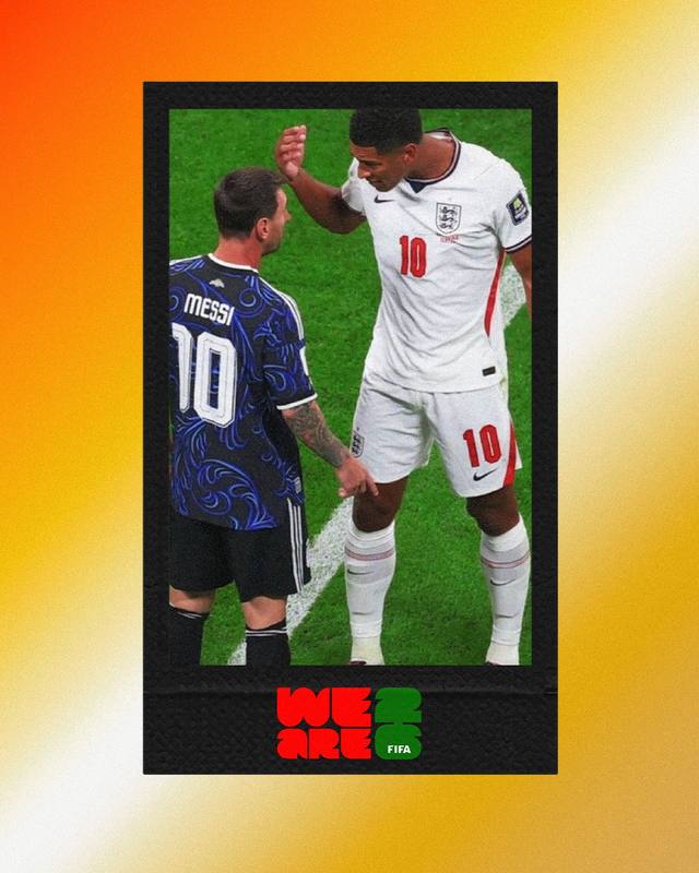
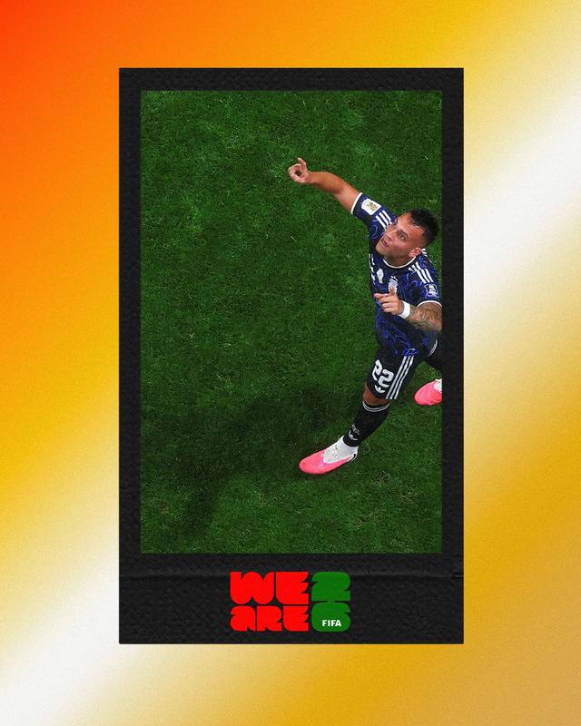
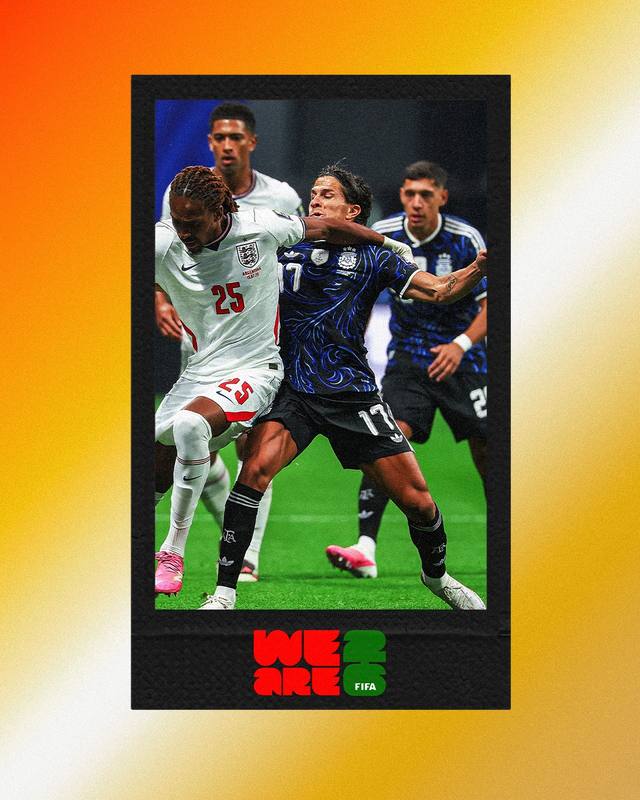
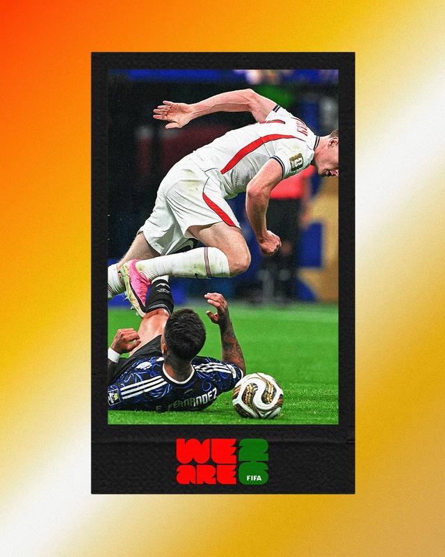
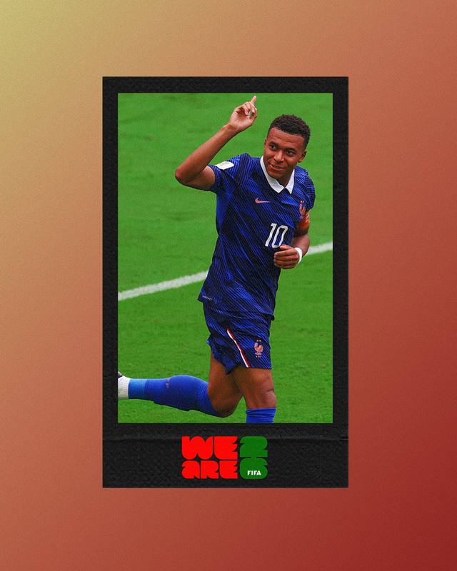
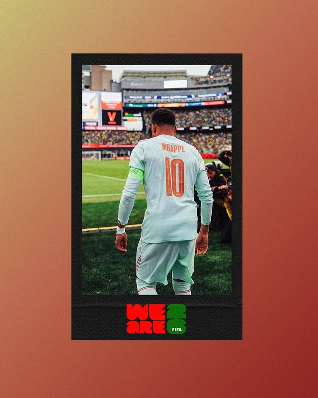
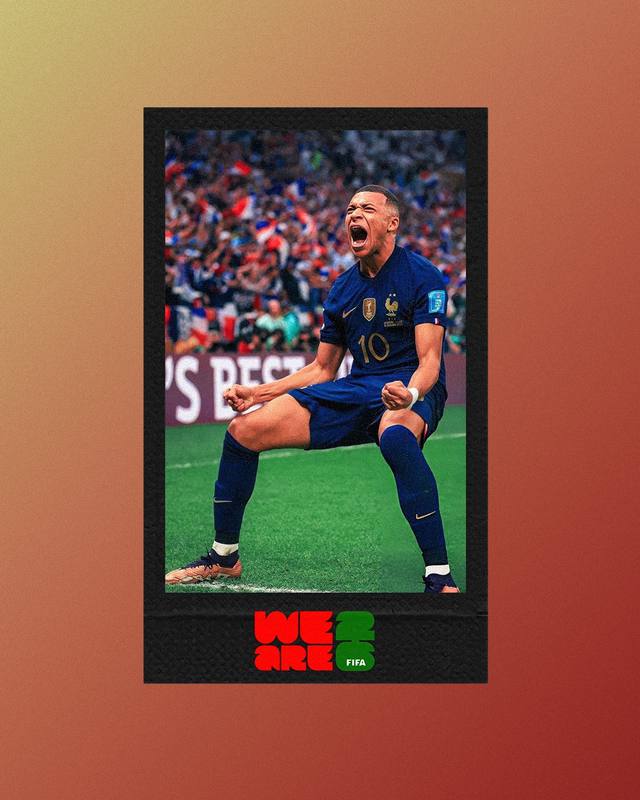
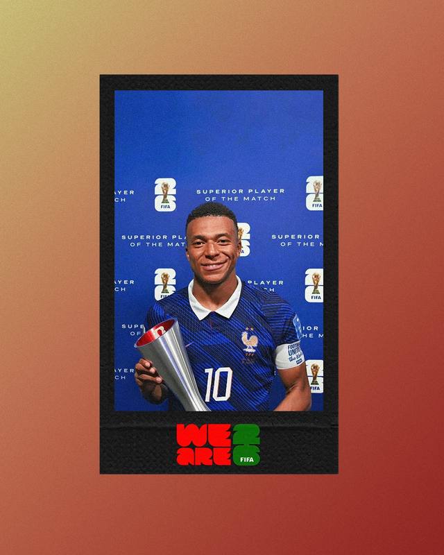
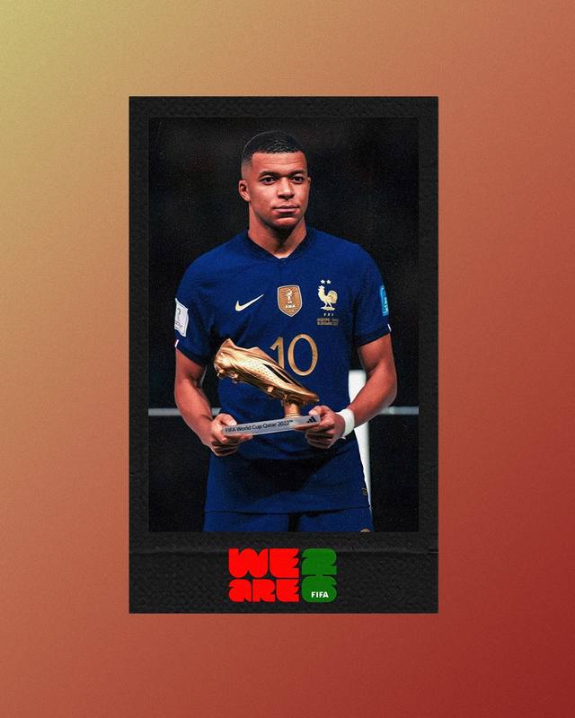
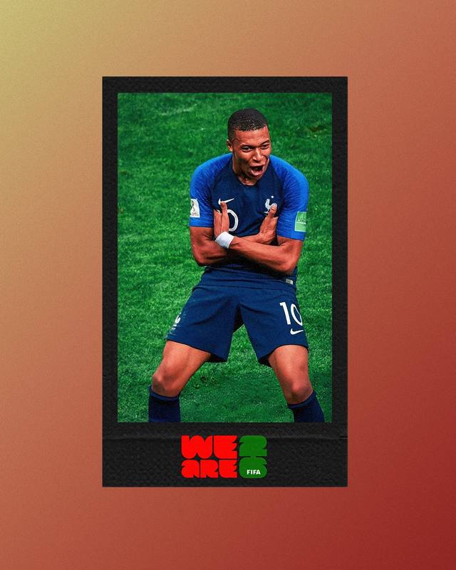
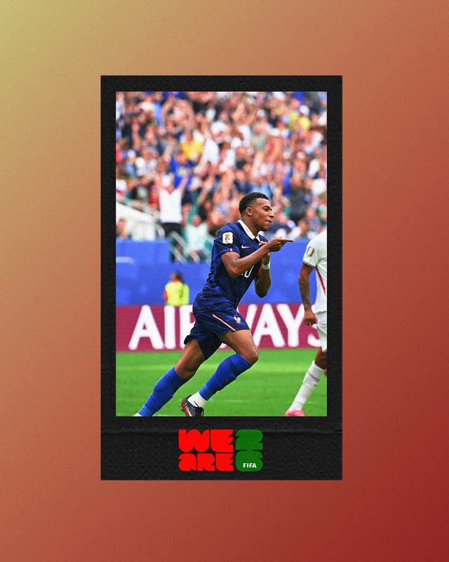
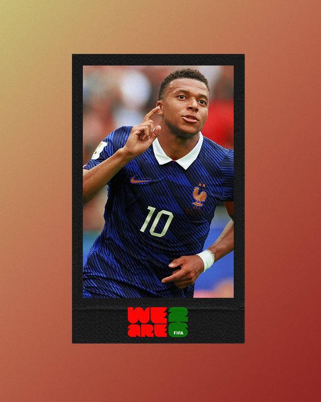
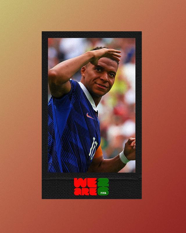
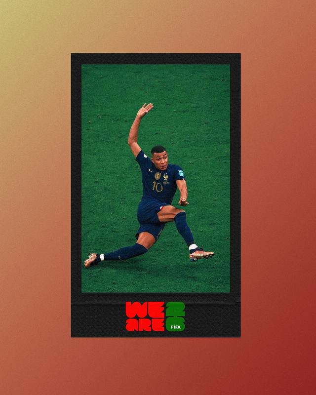
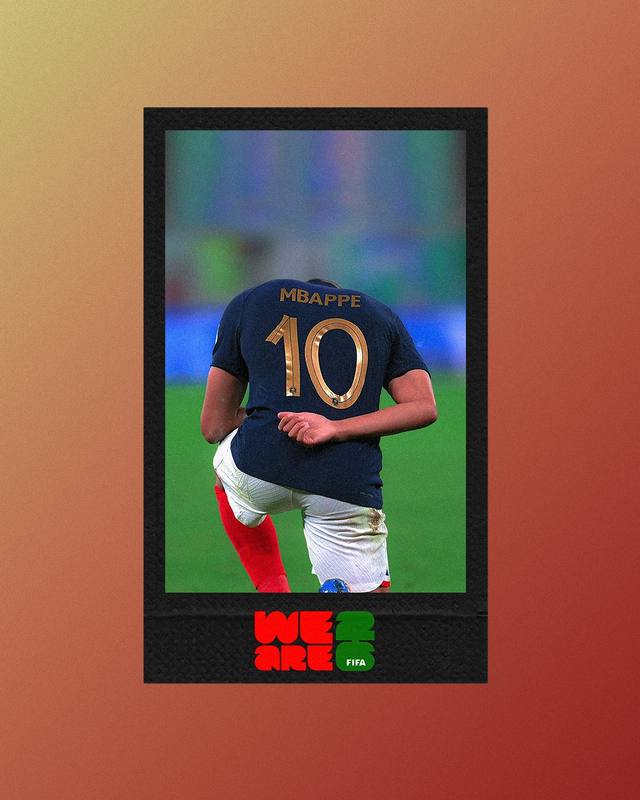
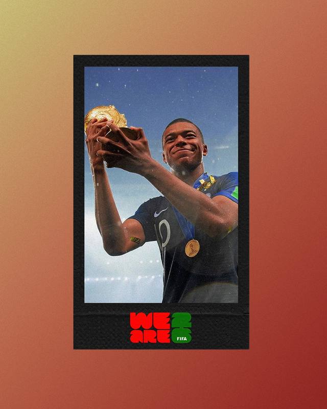
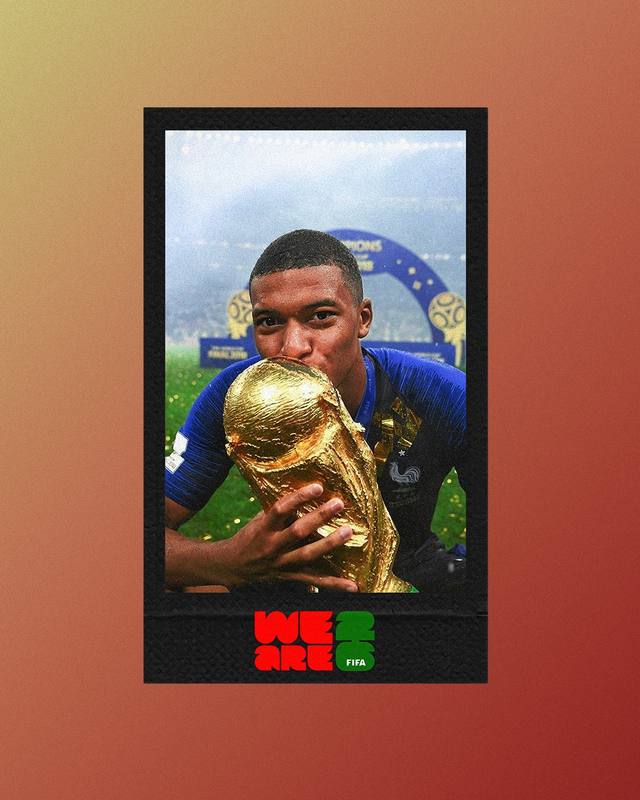
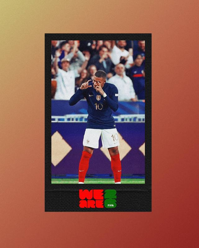
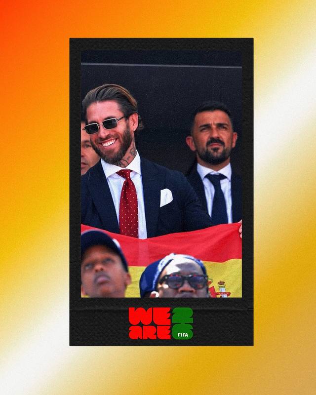
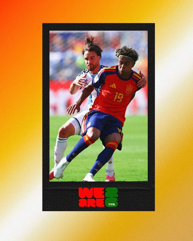
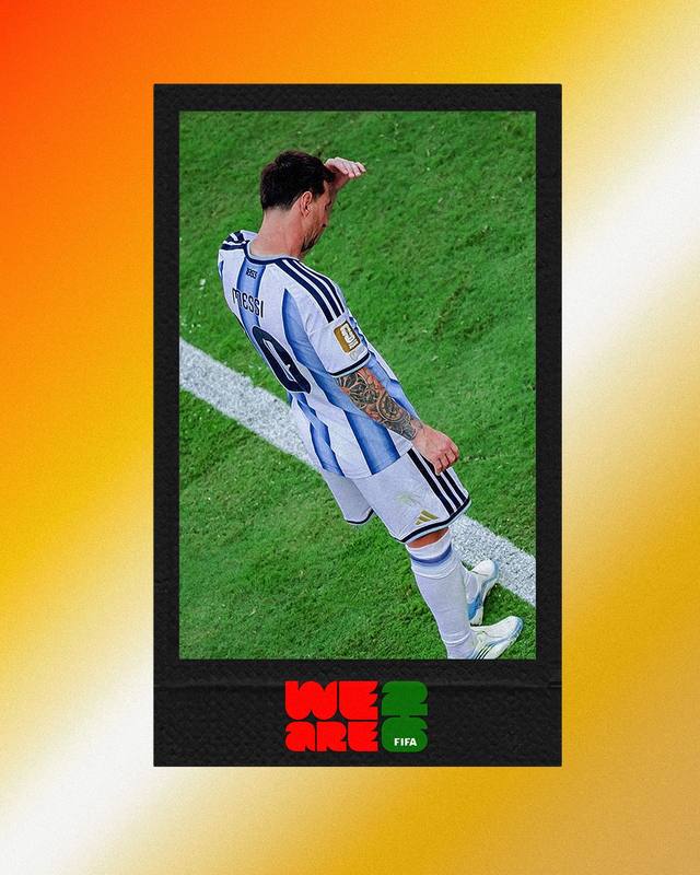
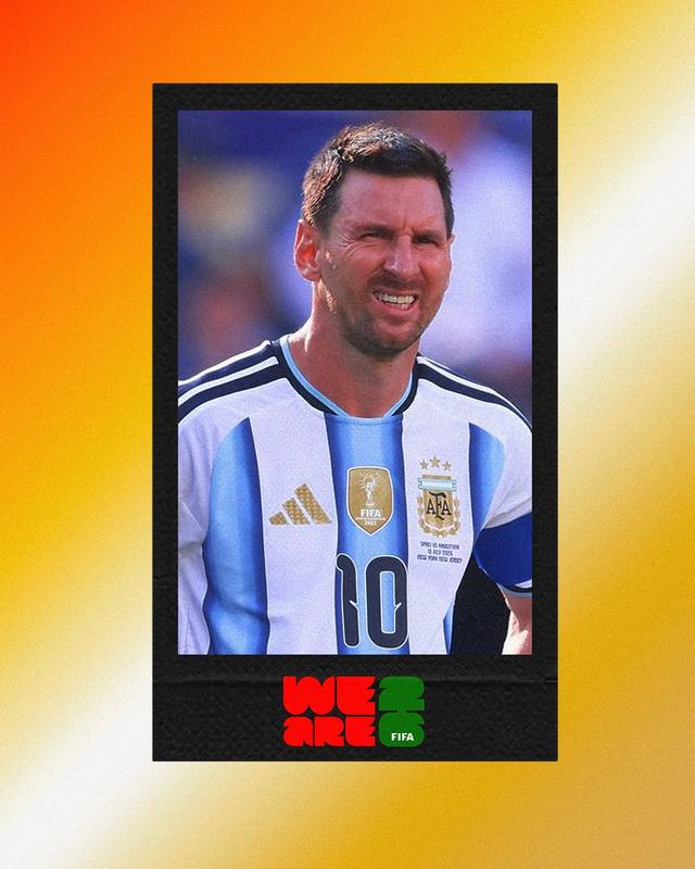
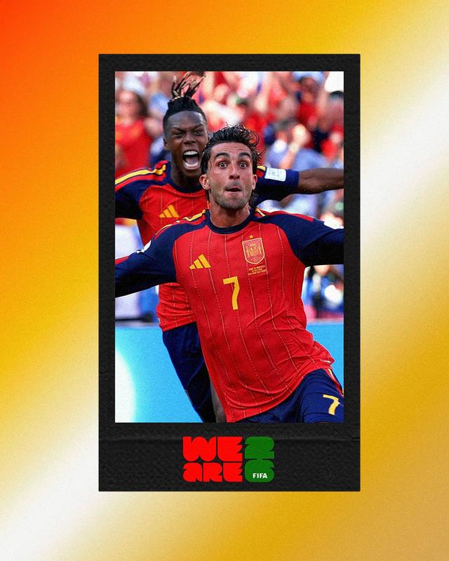
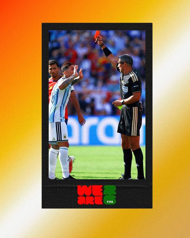
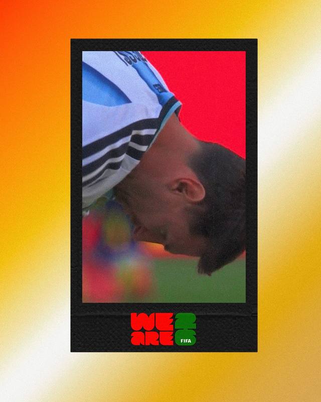
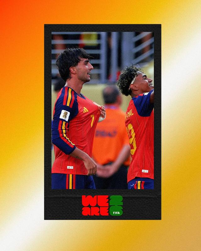
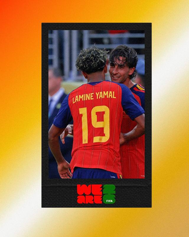
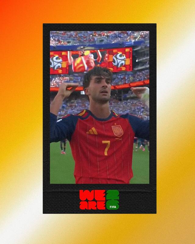
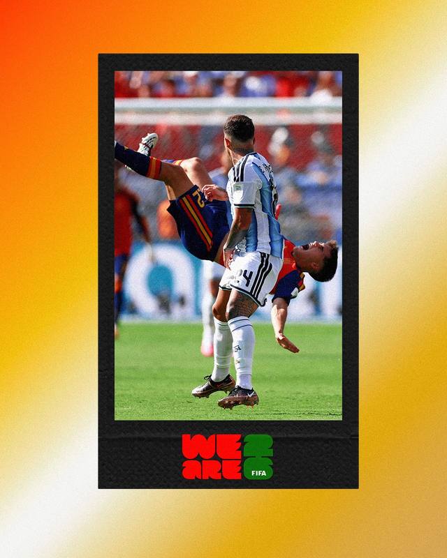
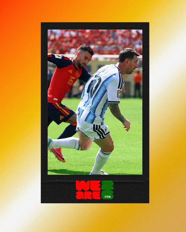
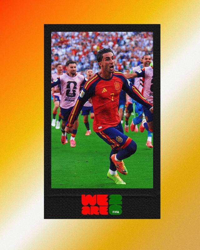
Running underneath nearly every hero graphic in this project is a polaroid — the real, unedited moment from the match itself. Over two hundred of them exist across the full campaign. They're the connective tissue of the whole page, proof sitting directly beside interpretation.
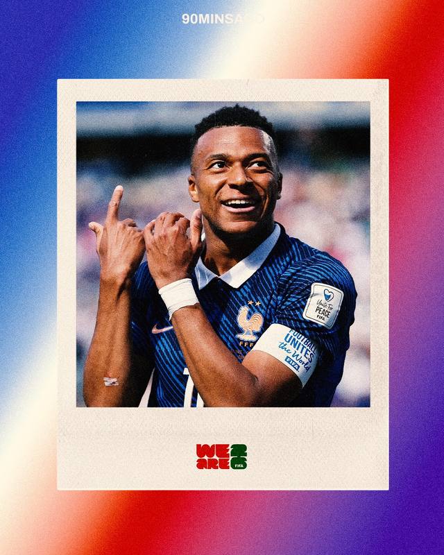
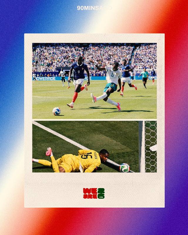
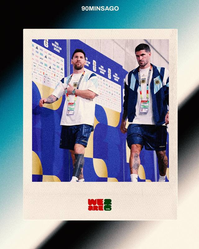
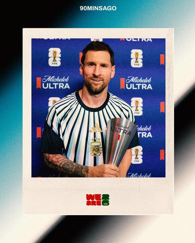
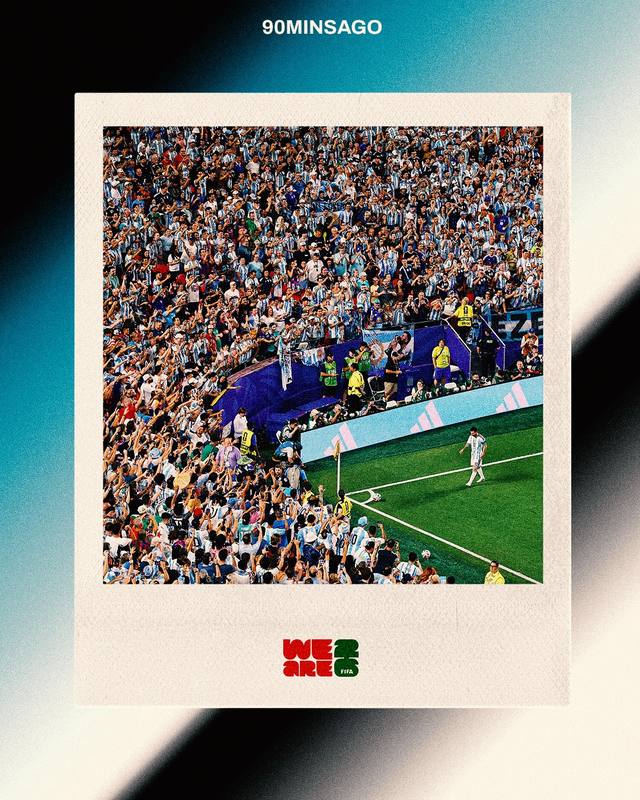
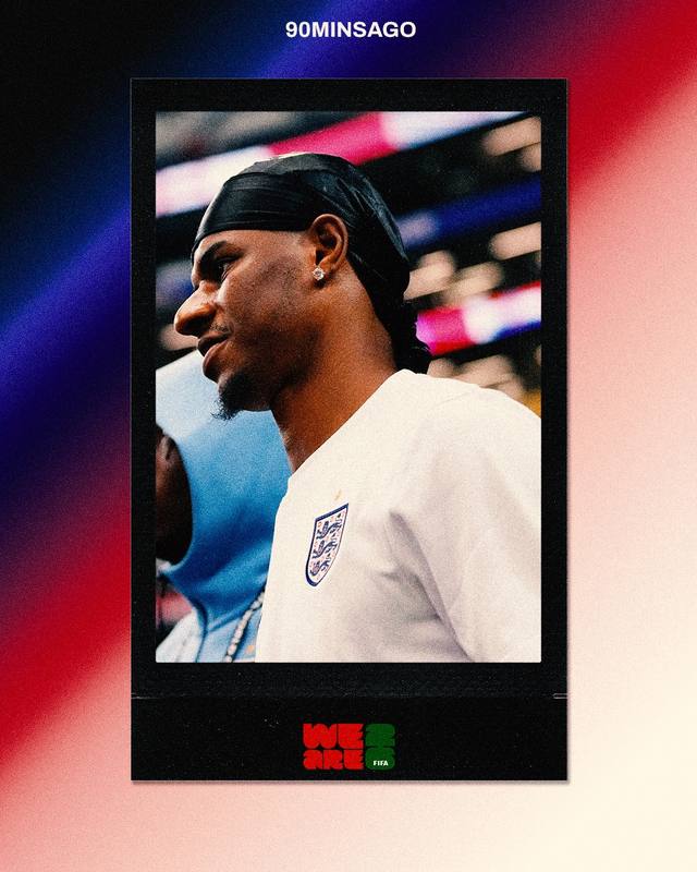
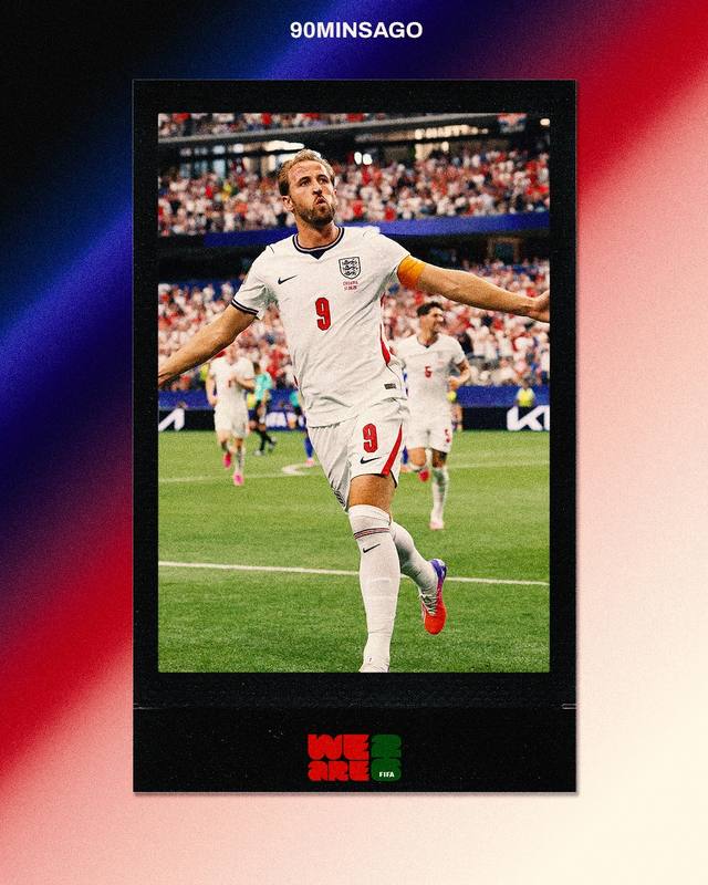
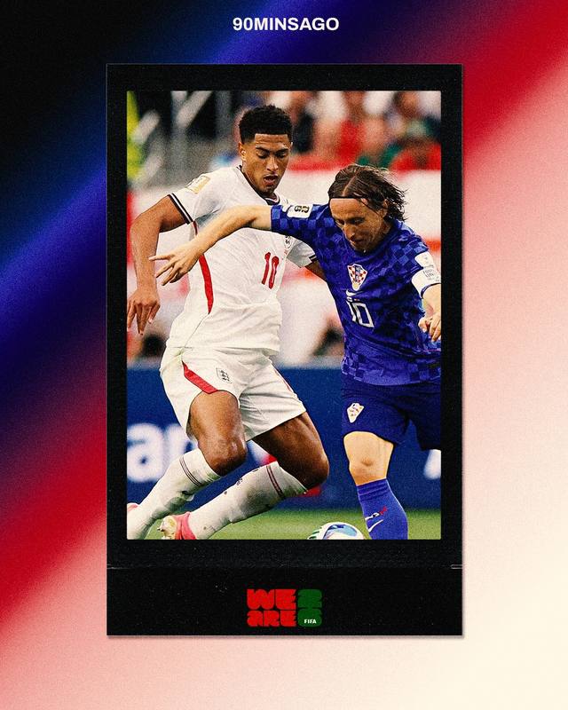
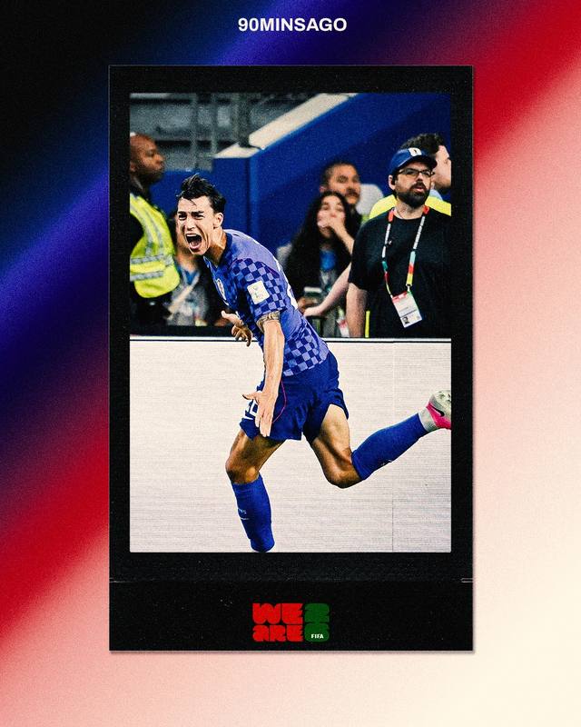
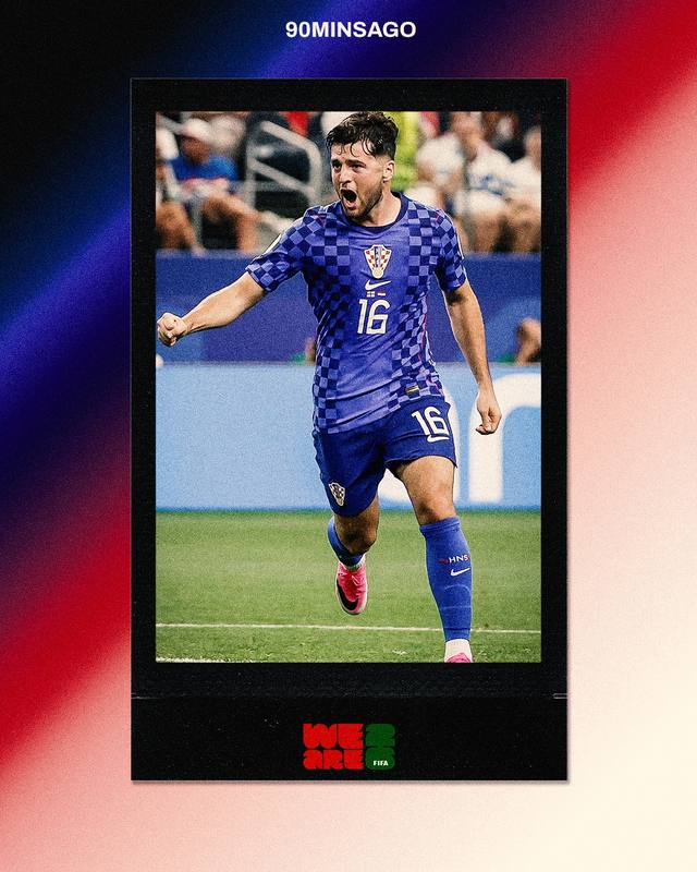
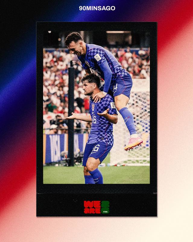
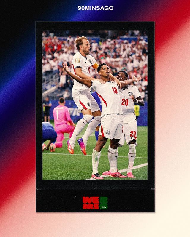
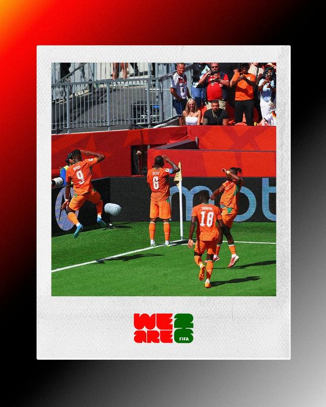
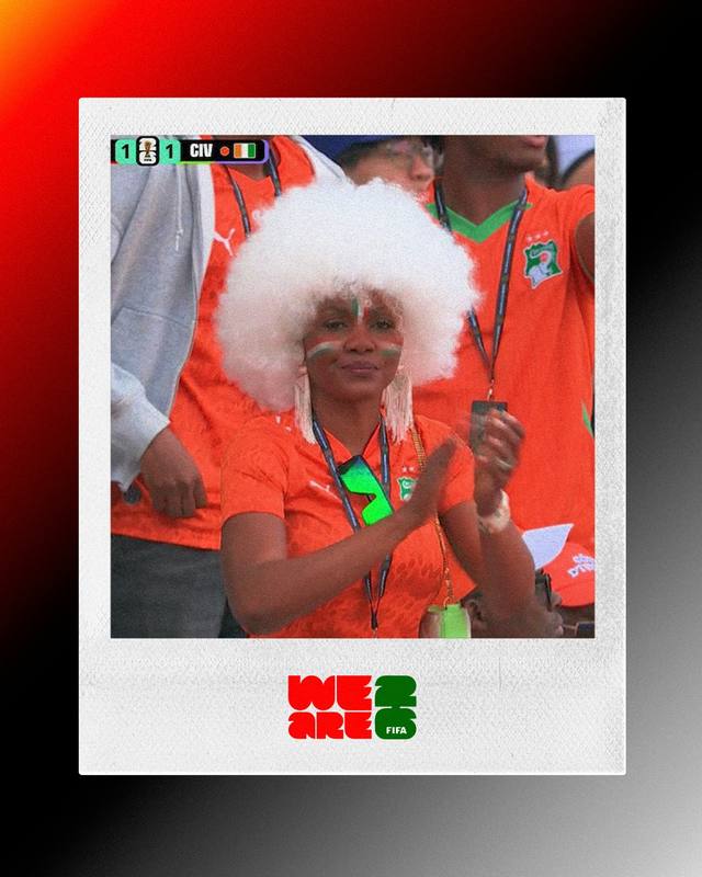
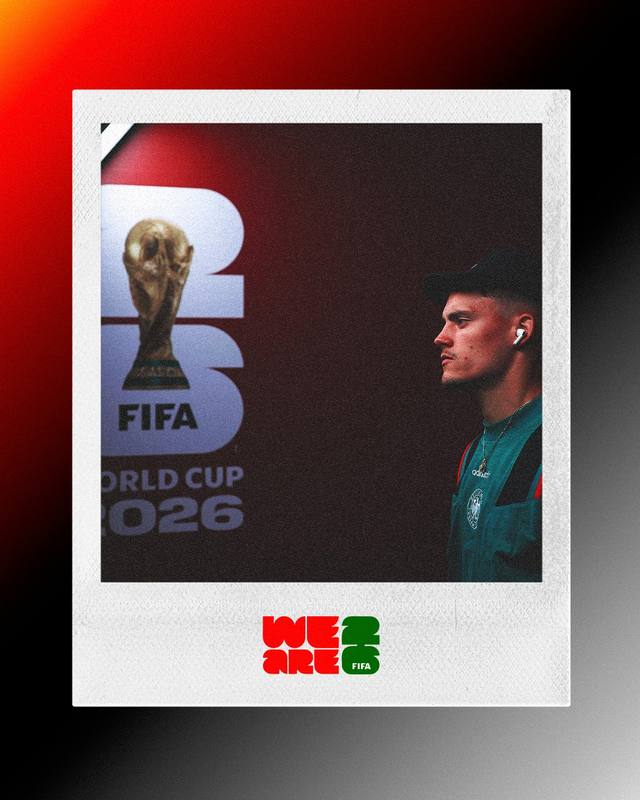
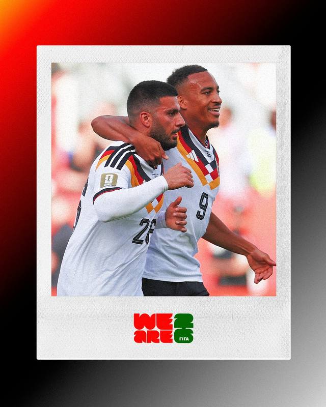
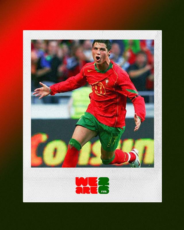
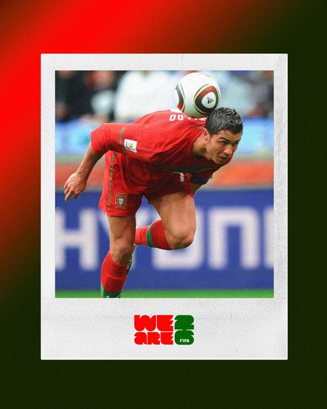
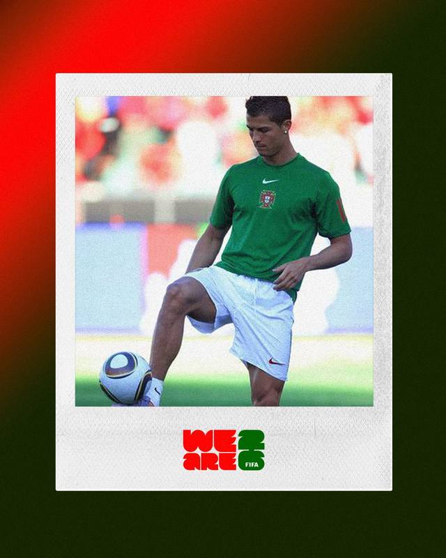
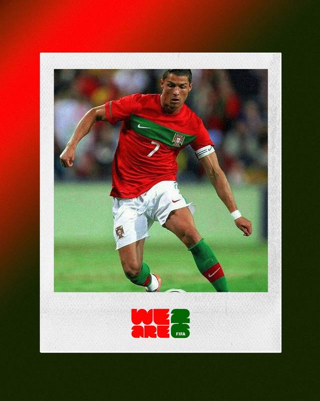
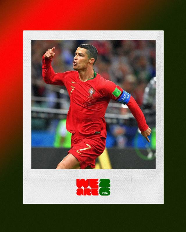
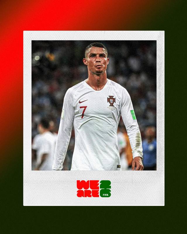
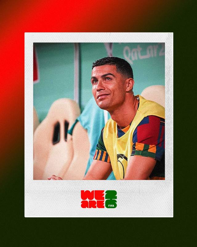
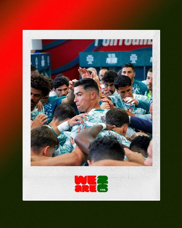
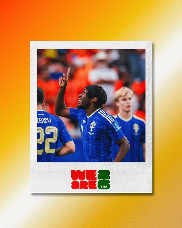
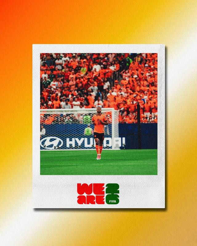
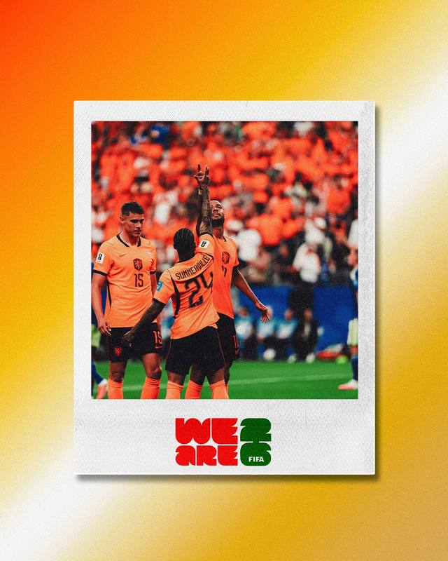
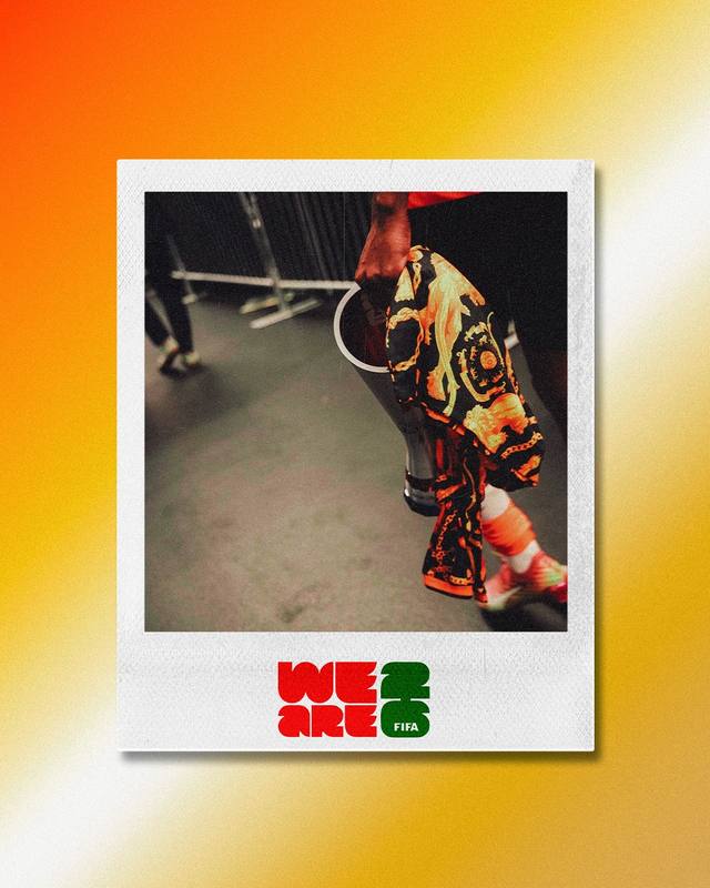
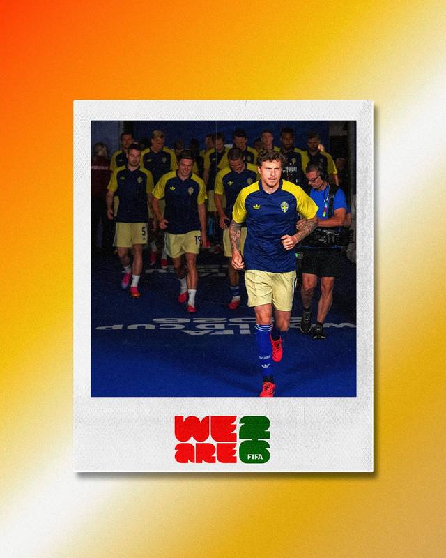
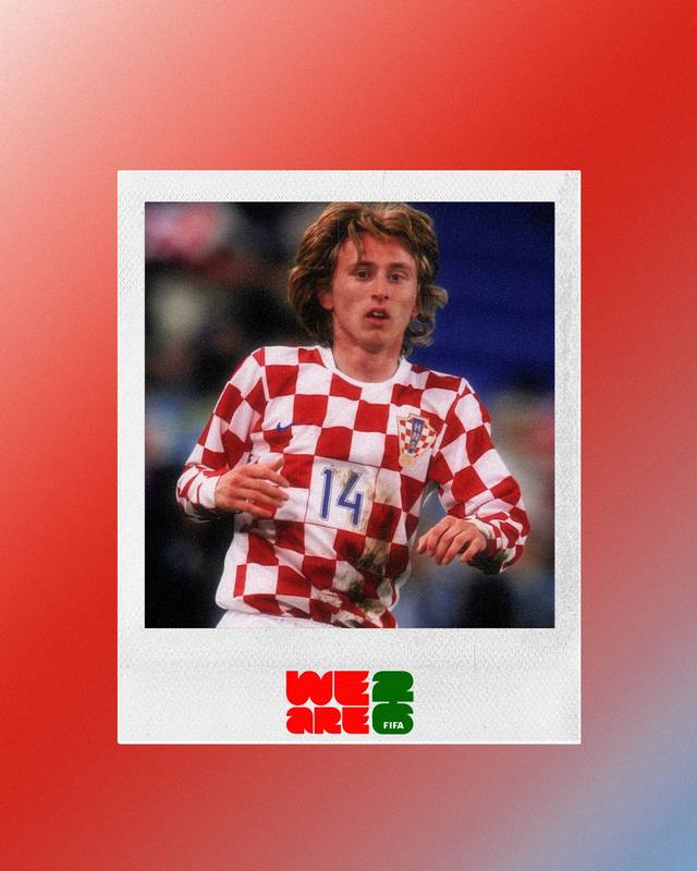
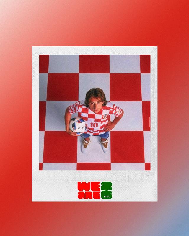
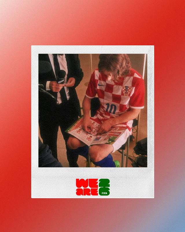
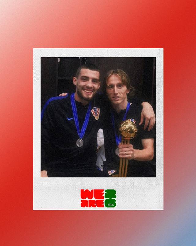
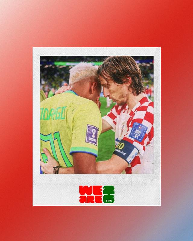
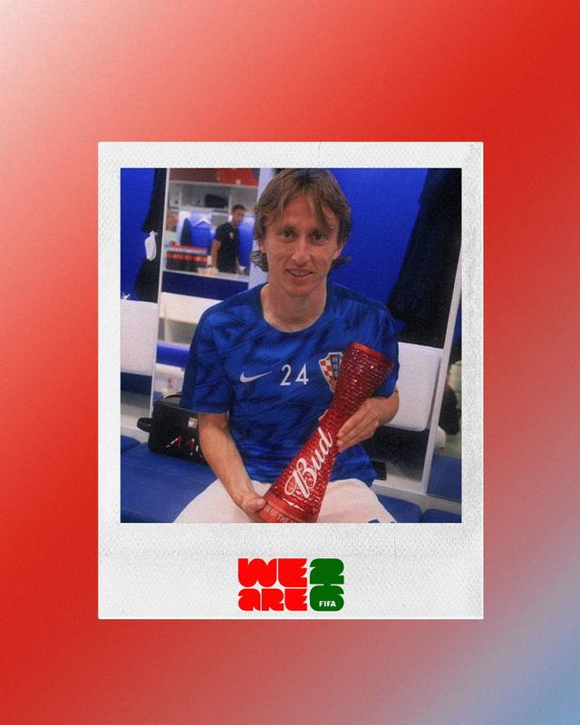
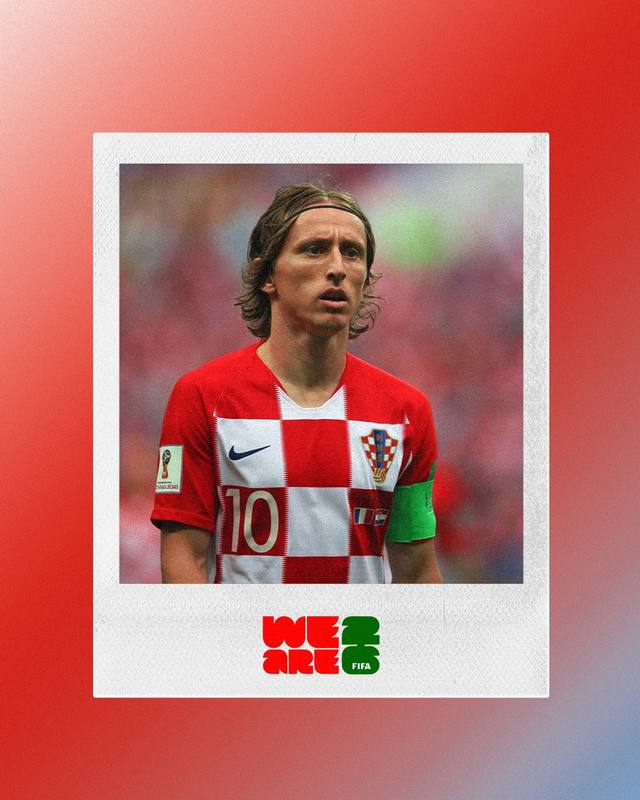
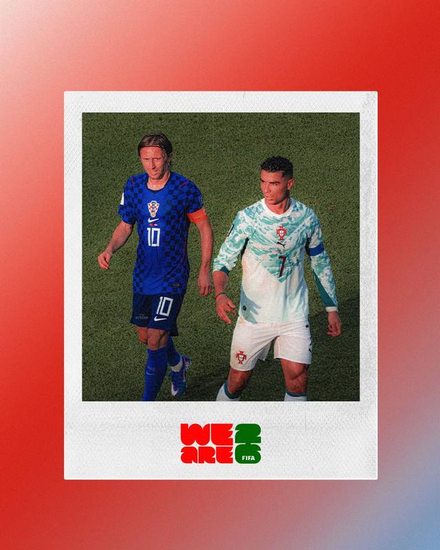
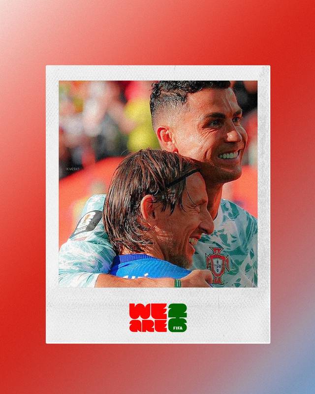
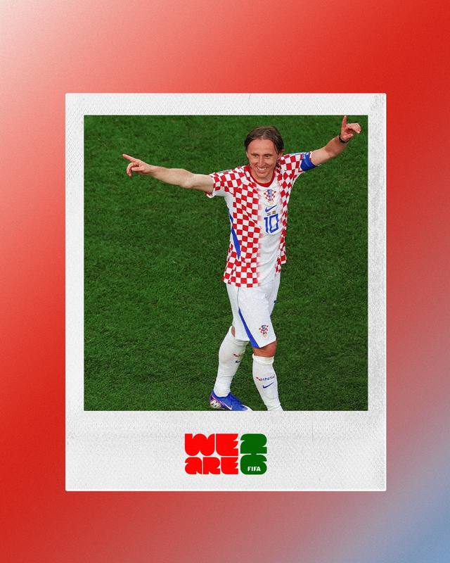
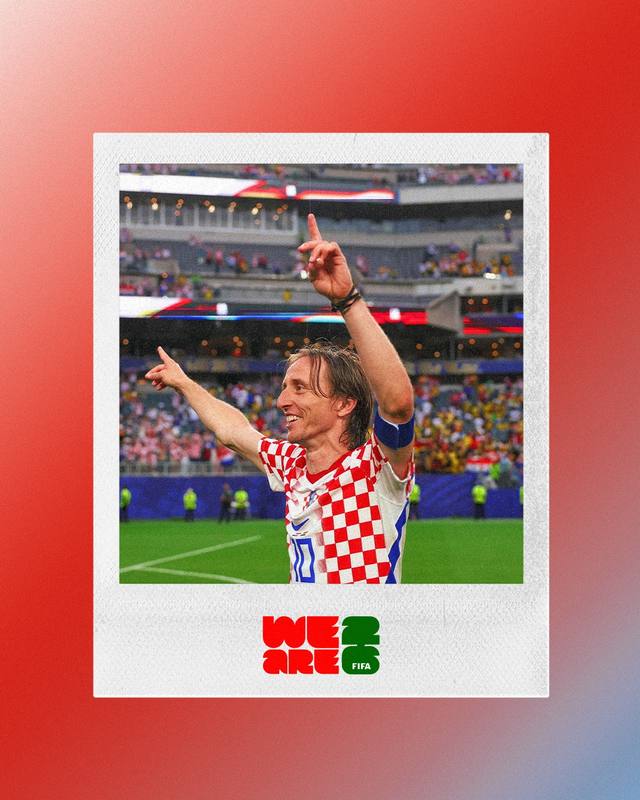
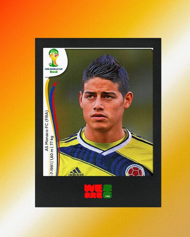
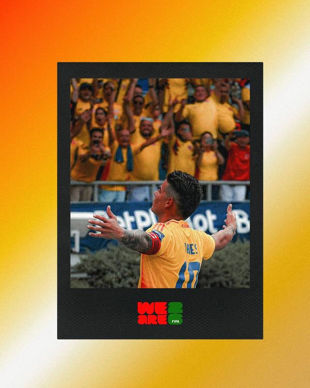
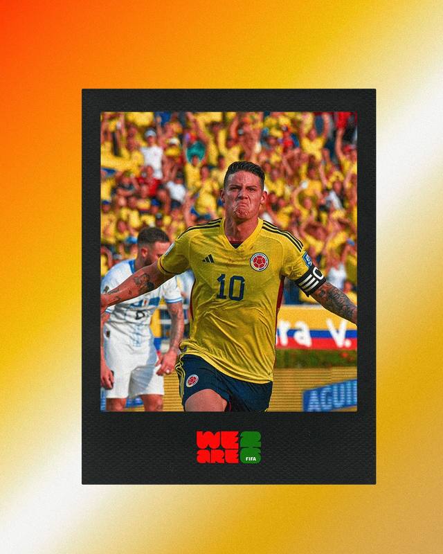
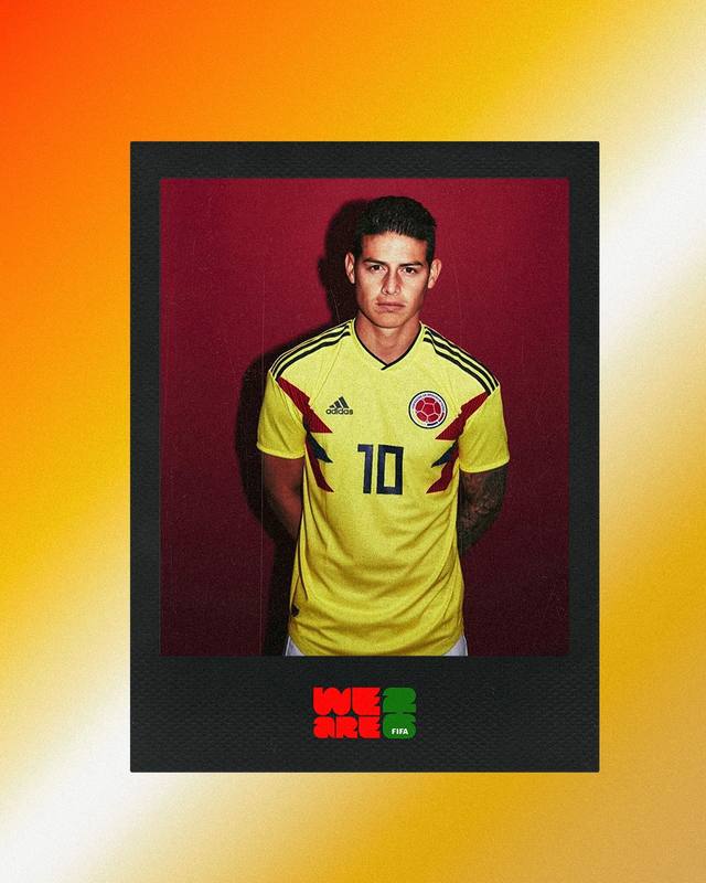
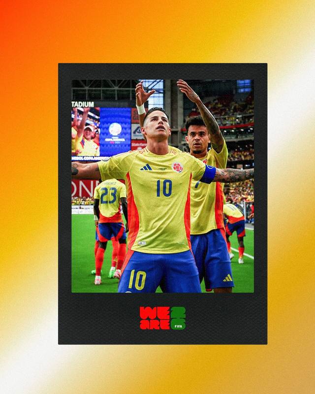
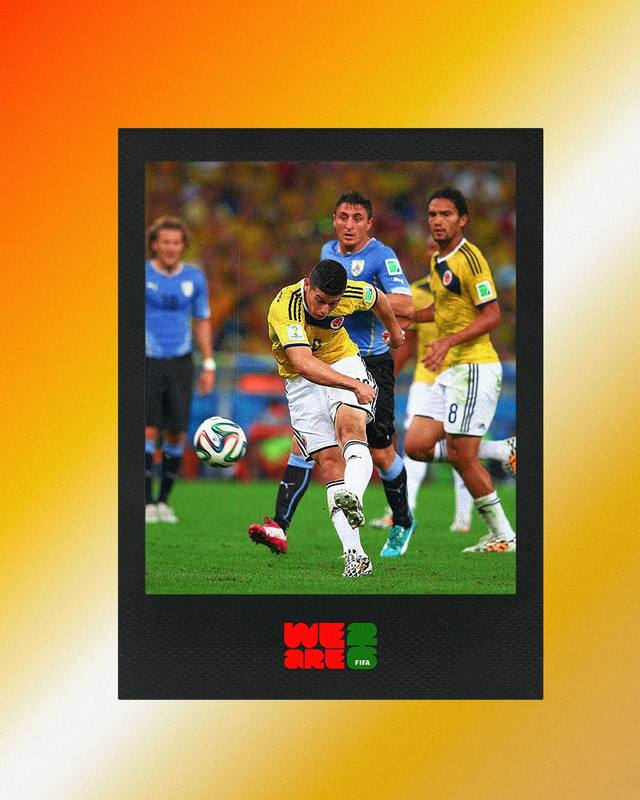
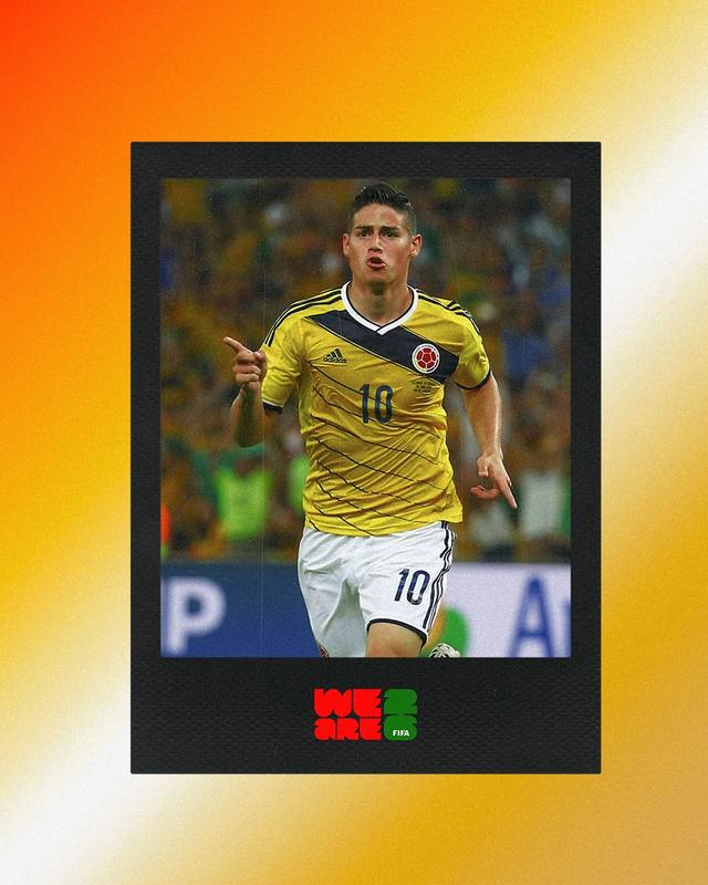
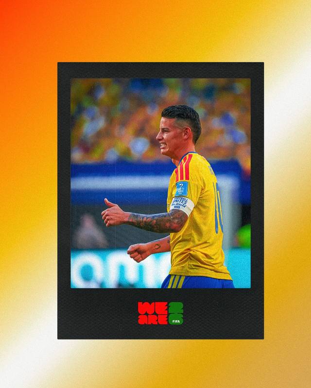
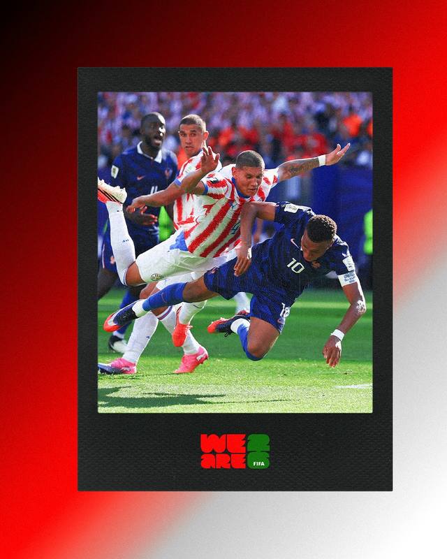
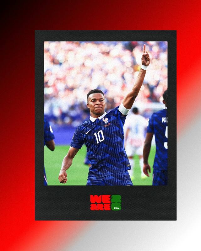
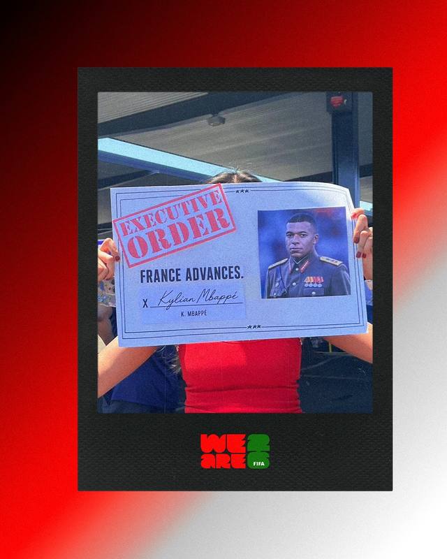
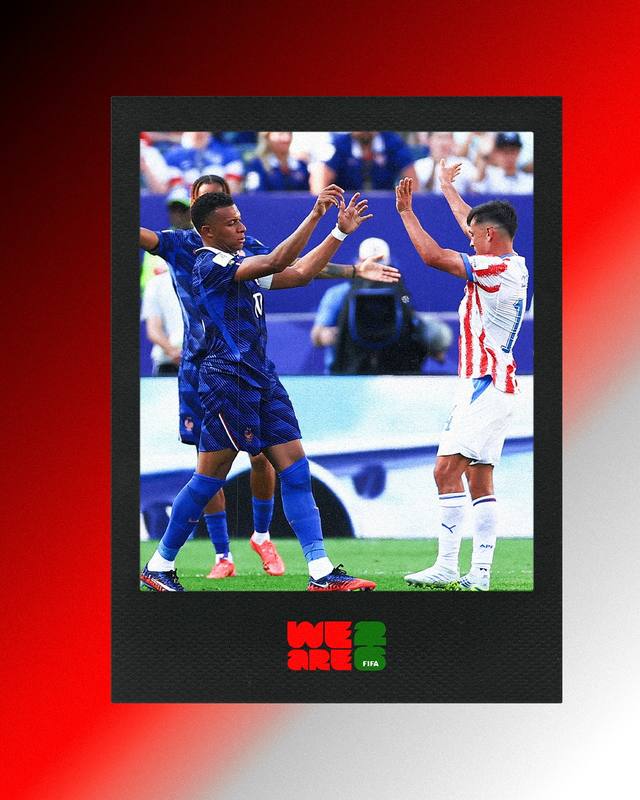
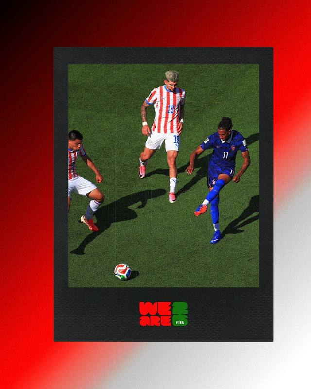
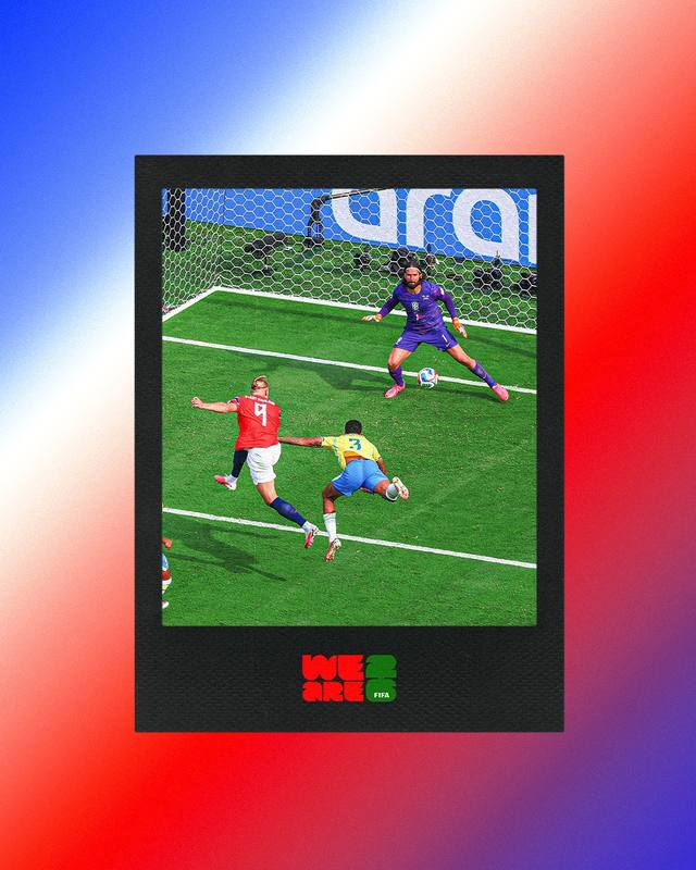
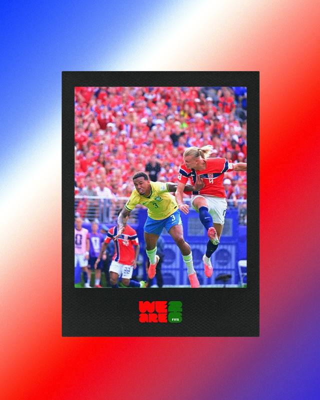
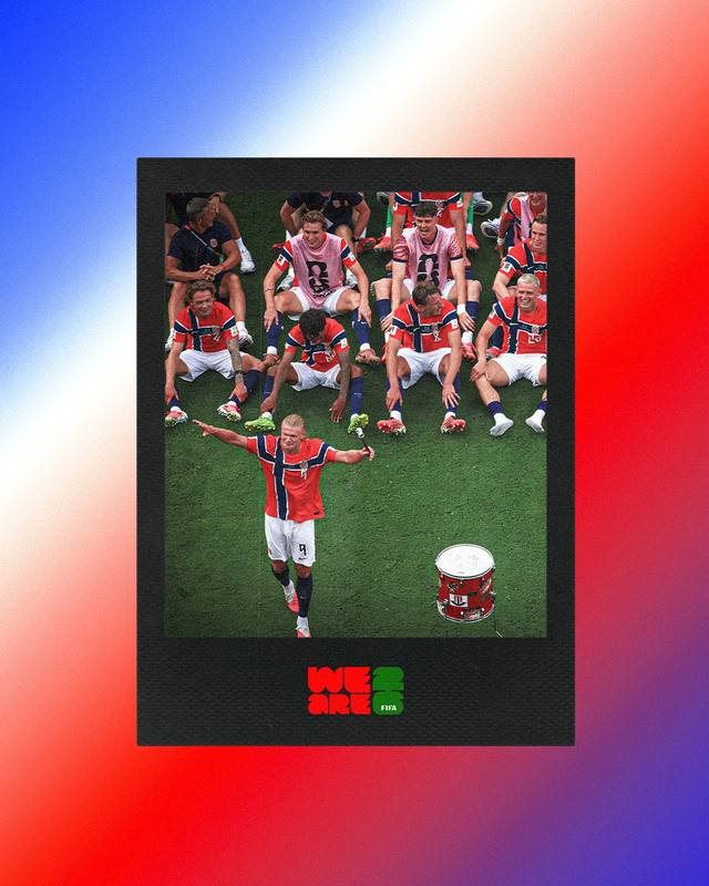
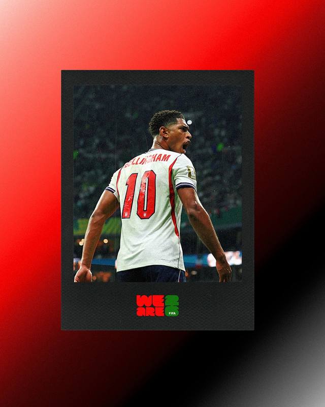
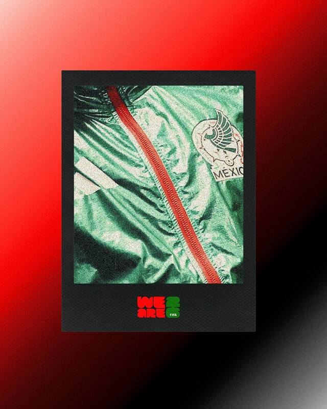
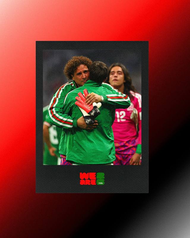
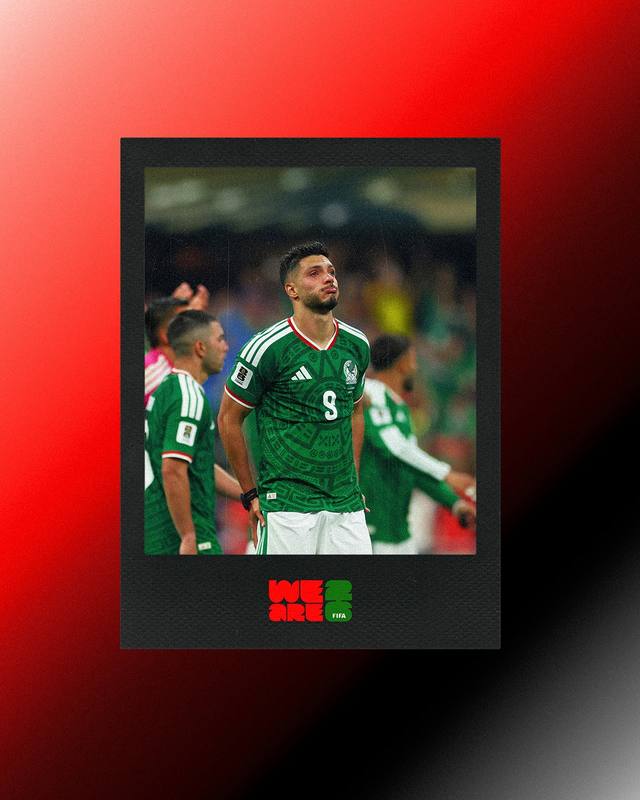
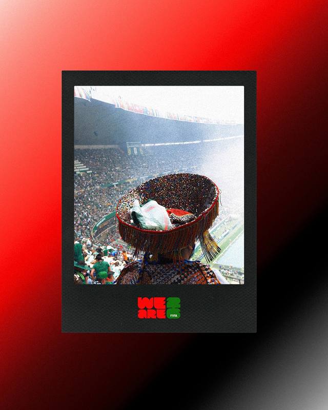
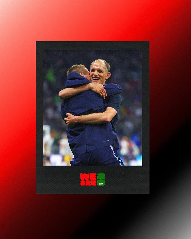
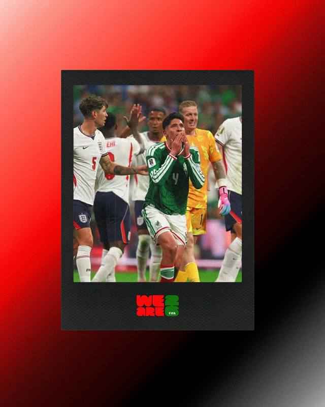
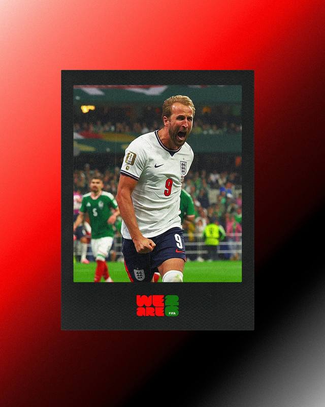
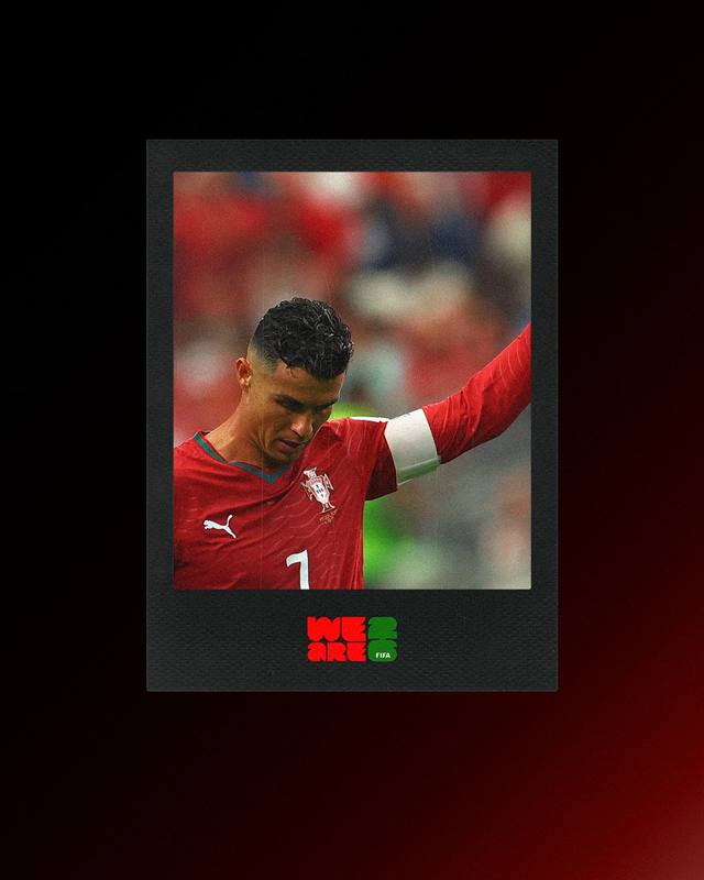
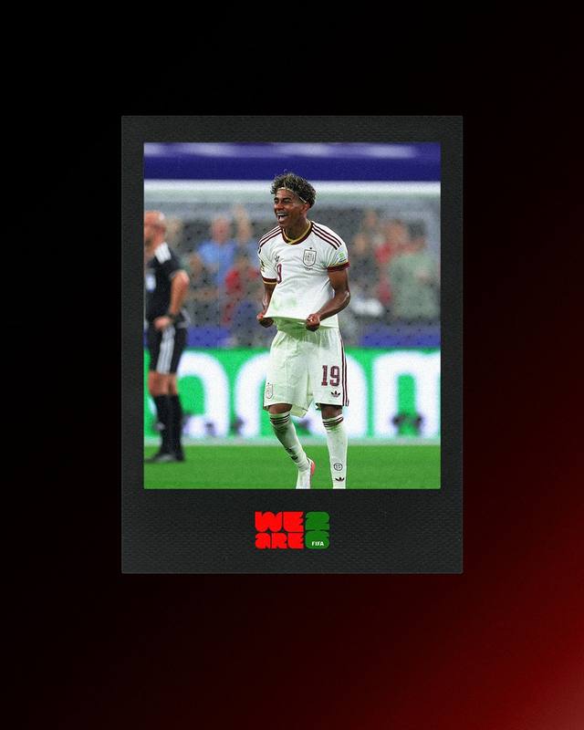
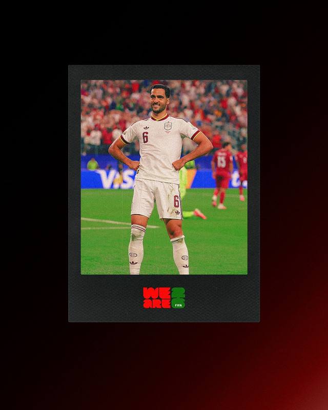
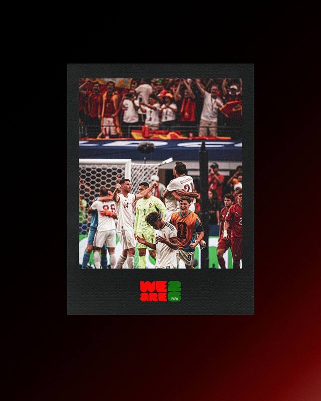
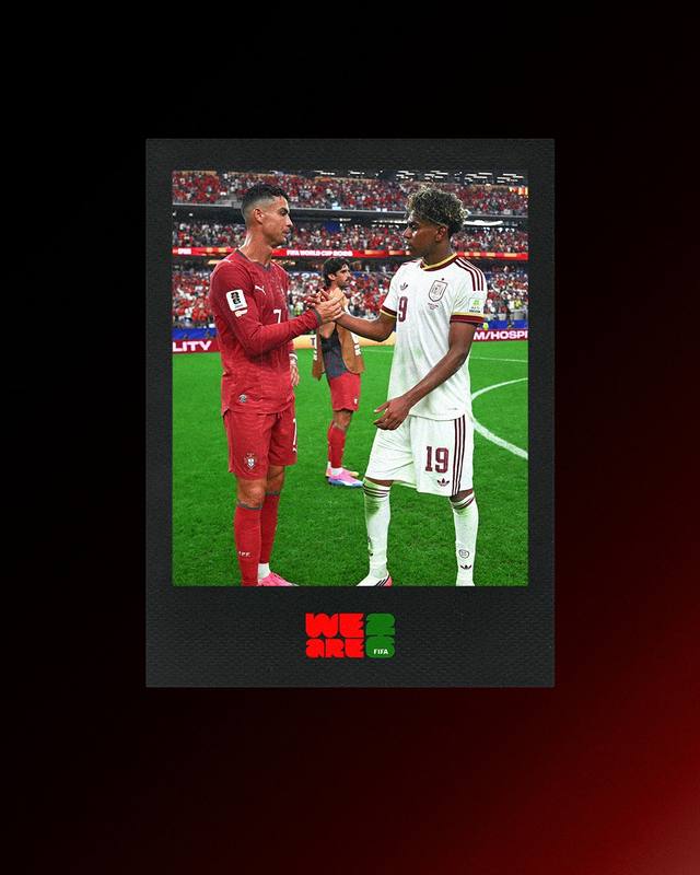
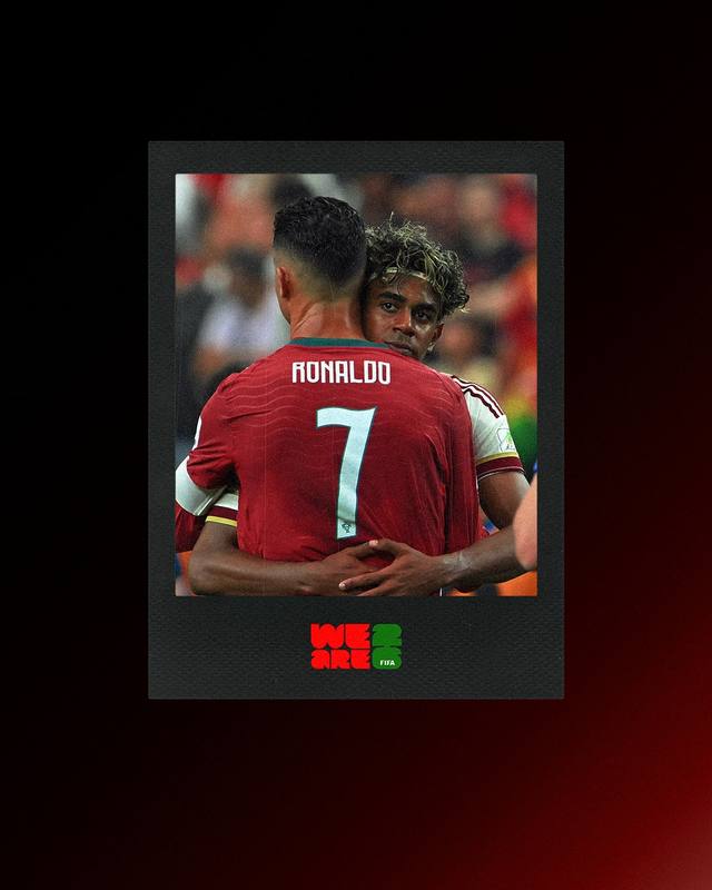
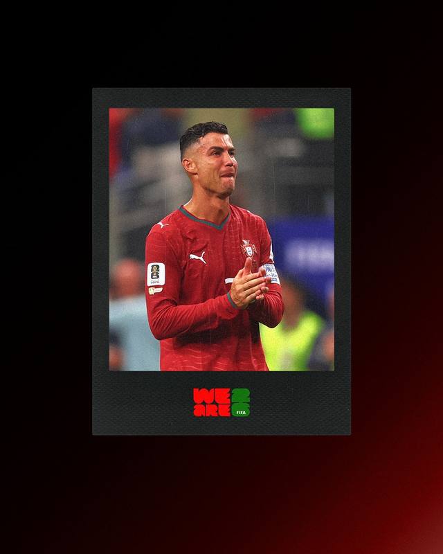
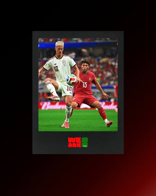
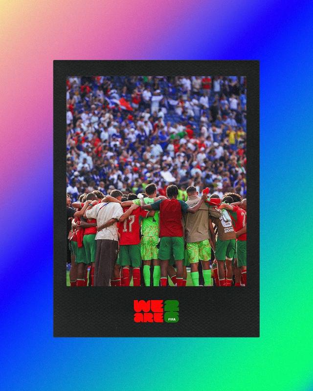
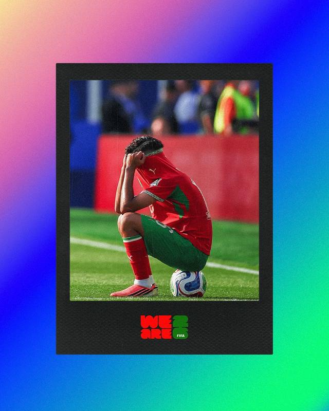
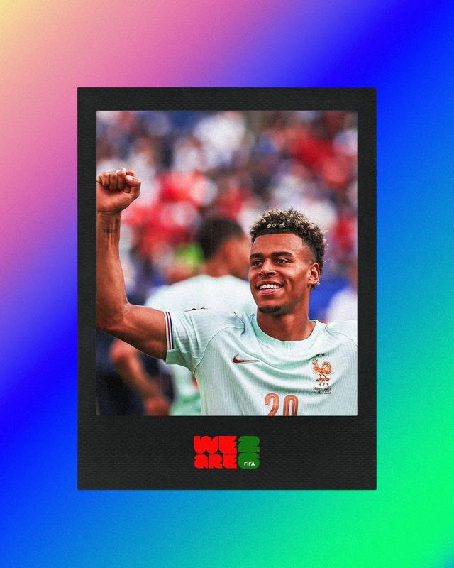
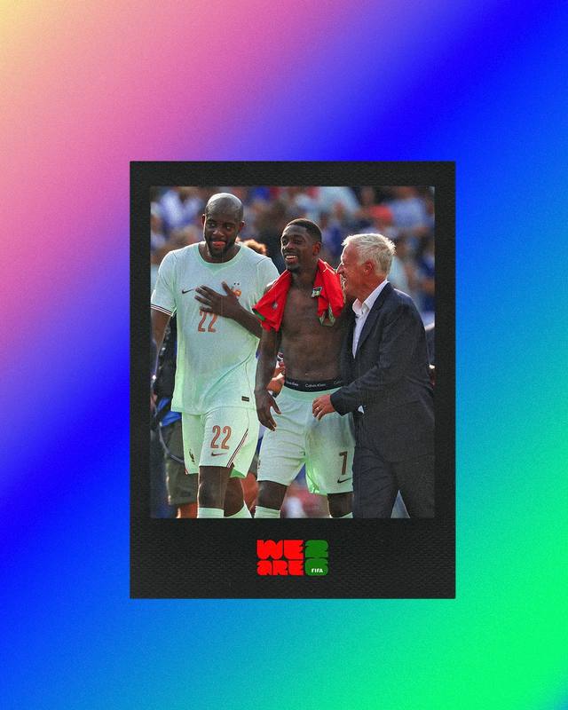
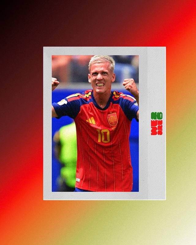
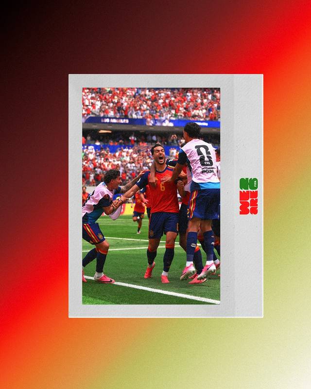
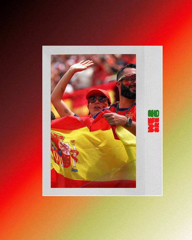
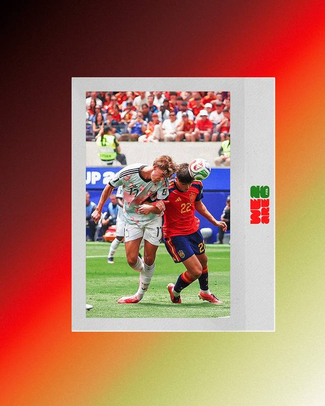
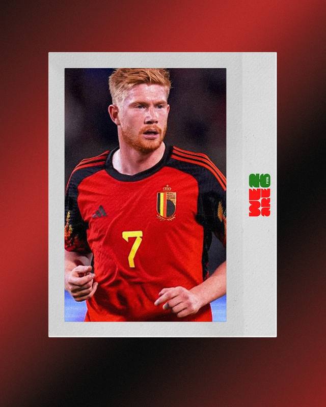
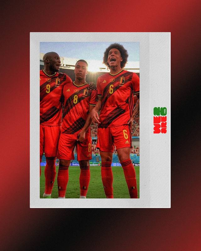
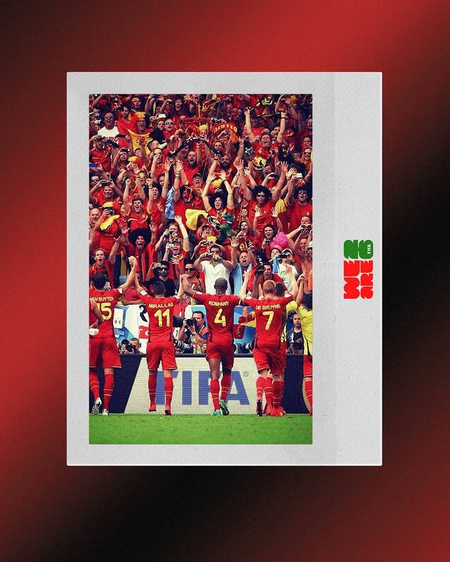
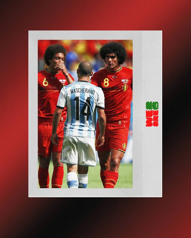
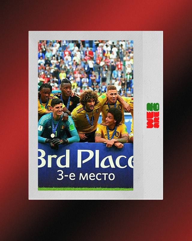
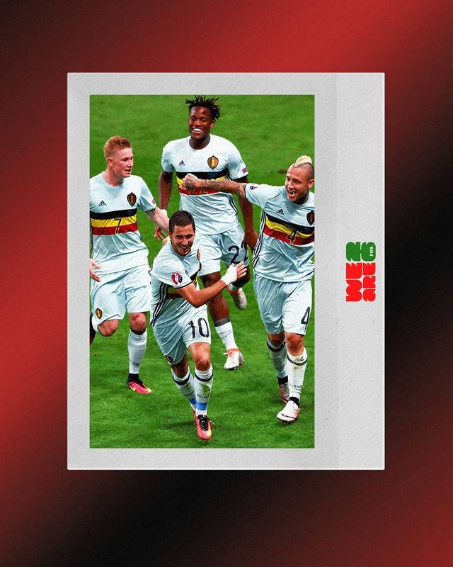
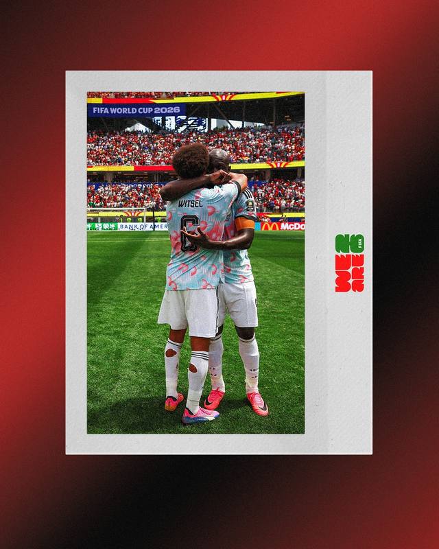
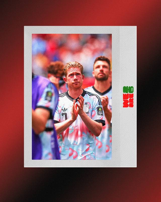
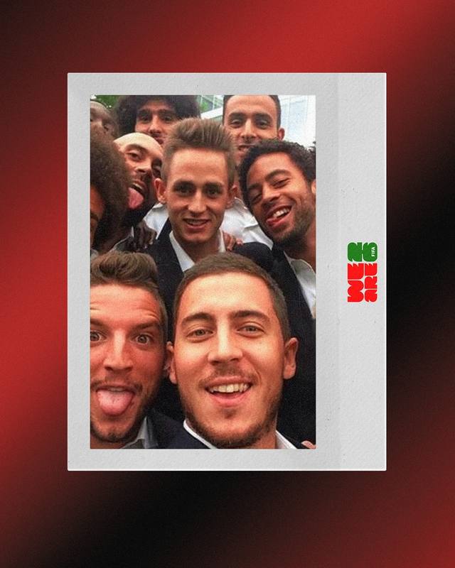
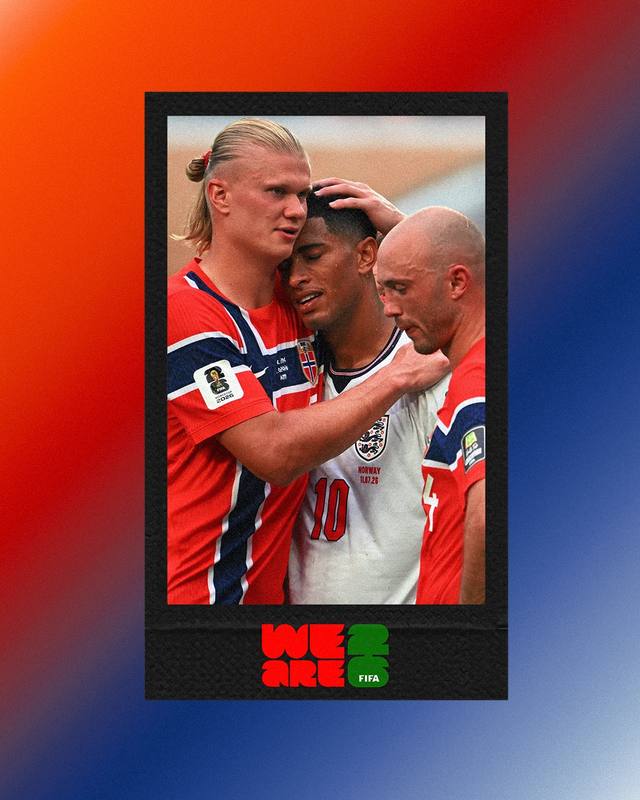
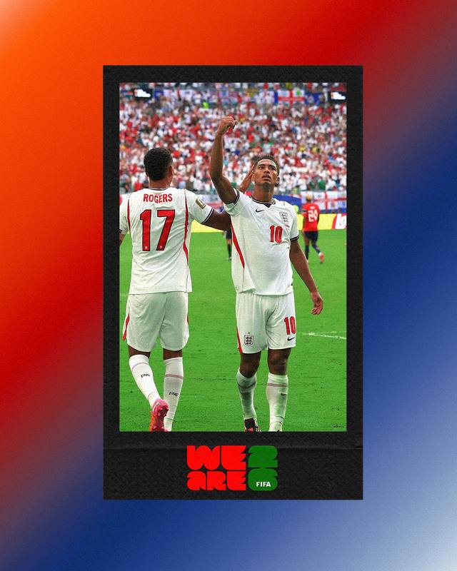
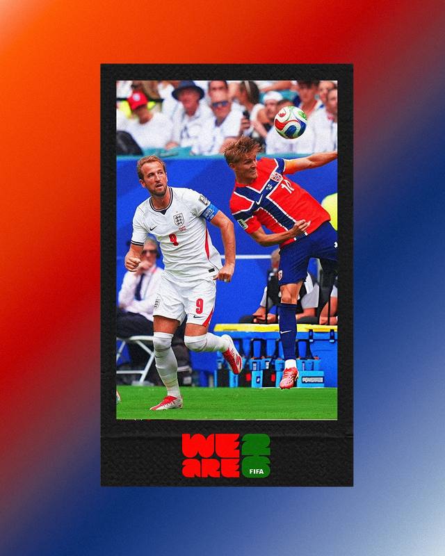
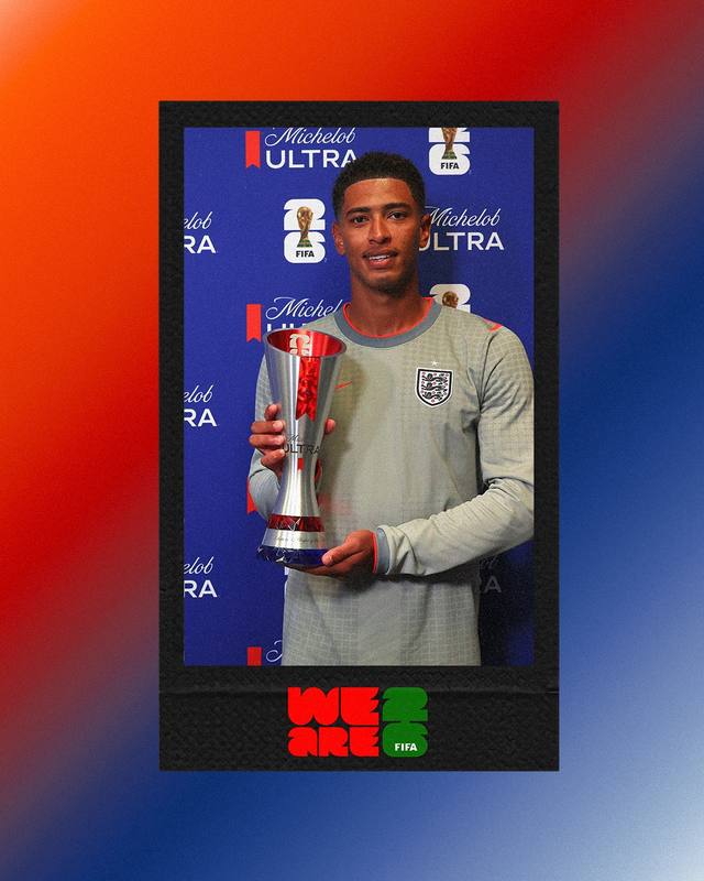
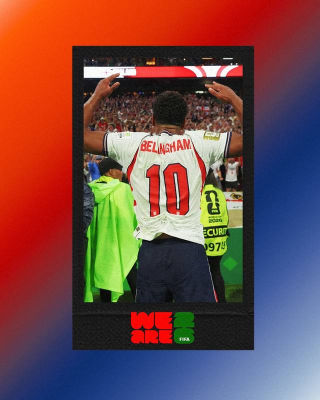
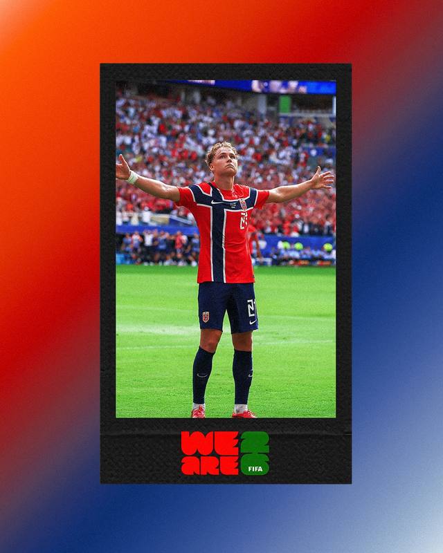
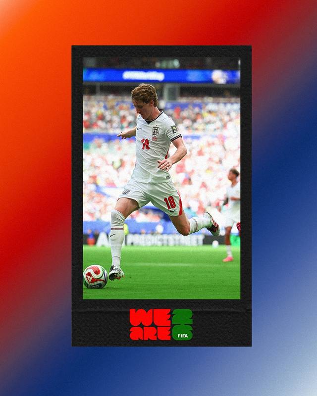
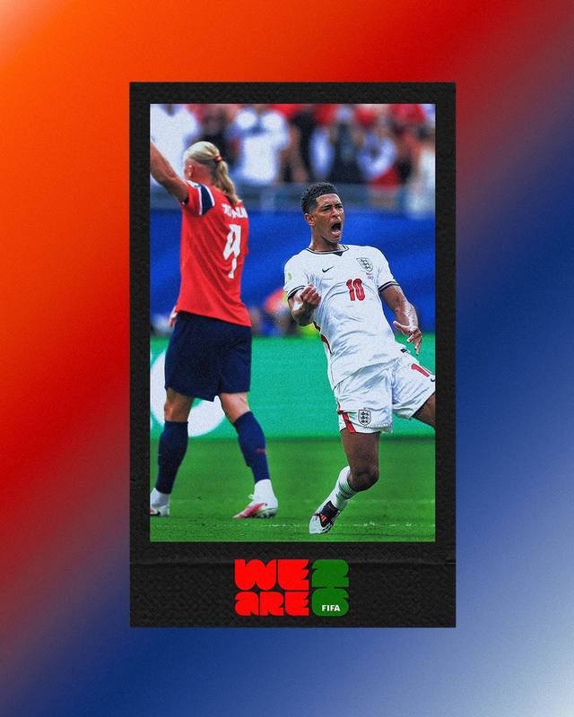
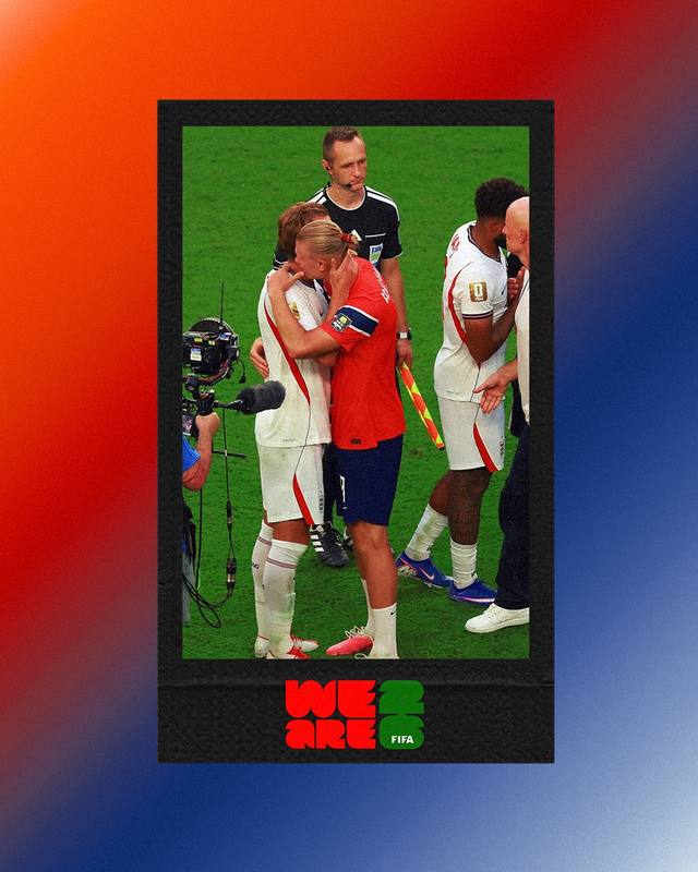
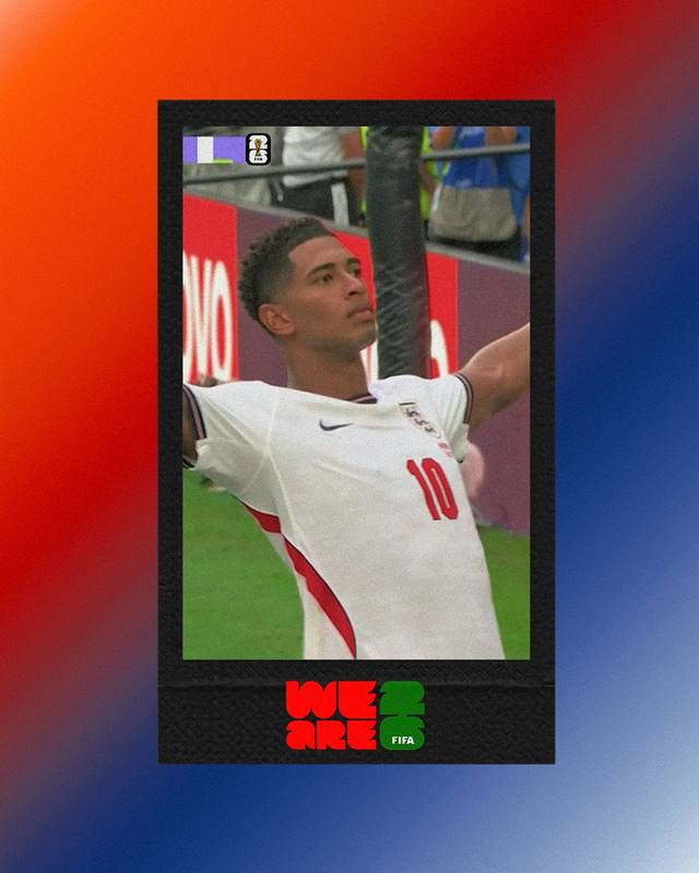
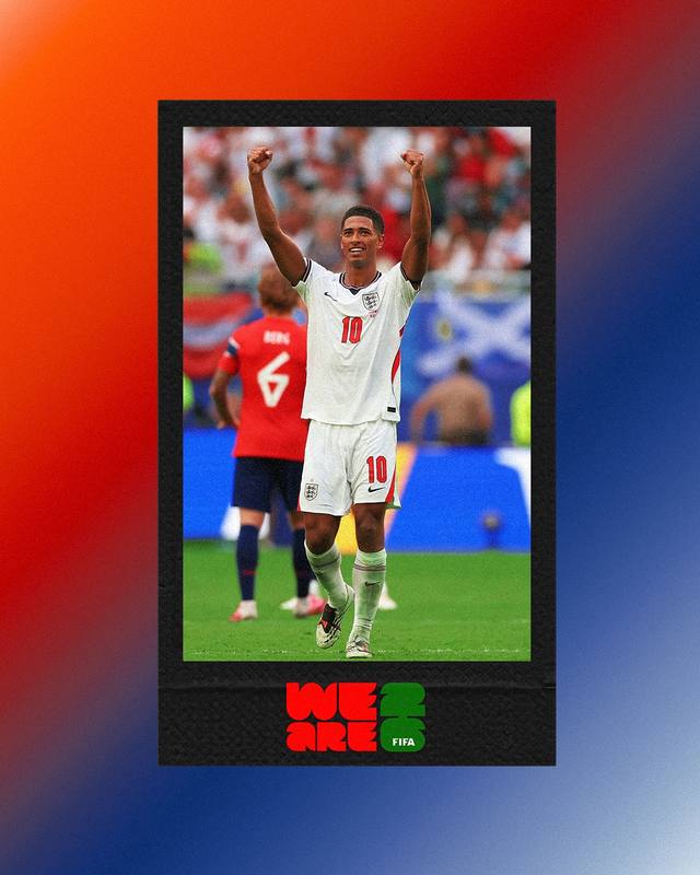
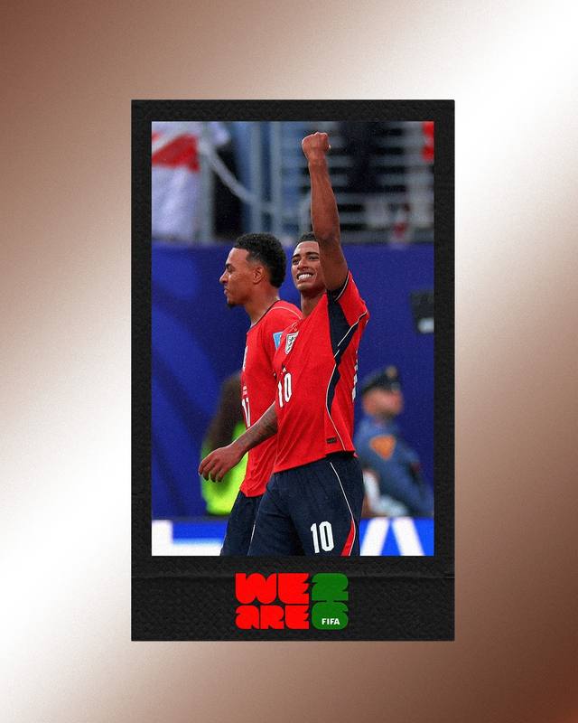
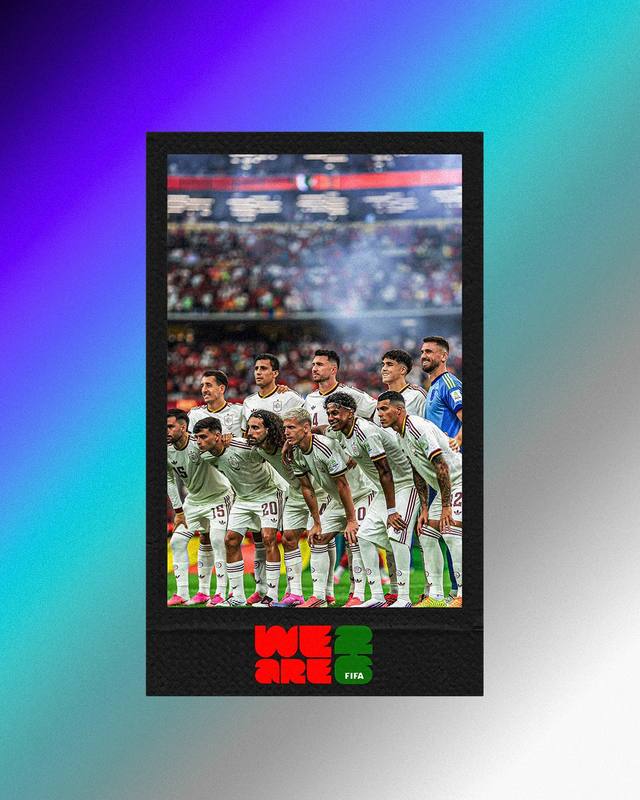
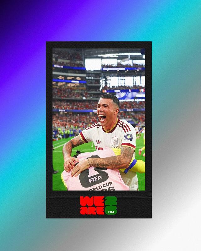
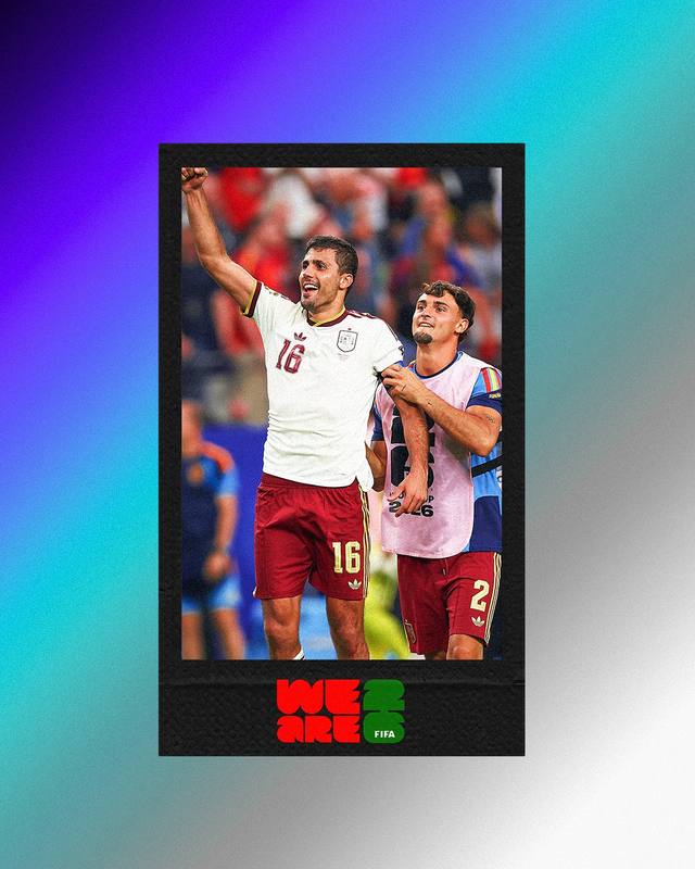
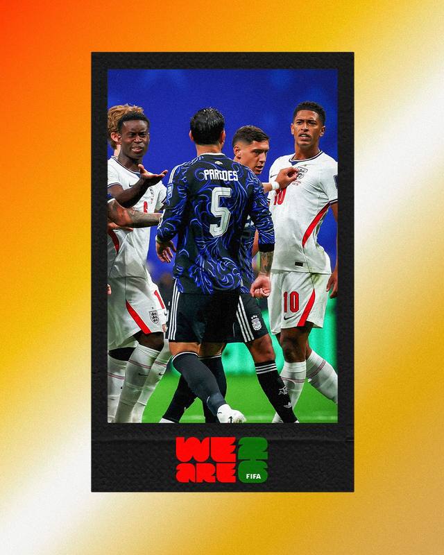
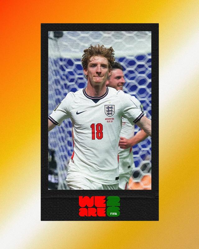
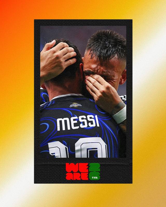
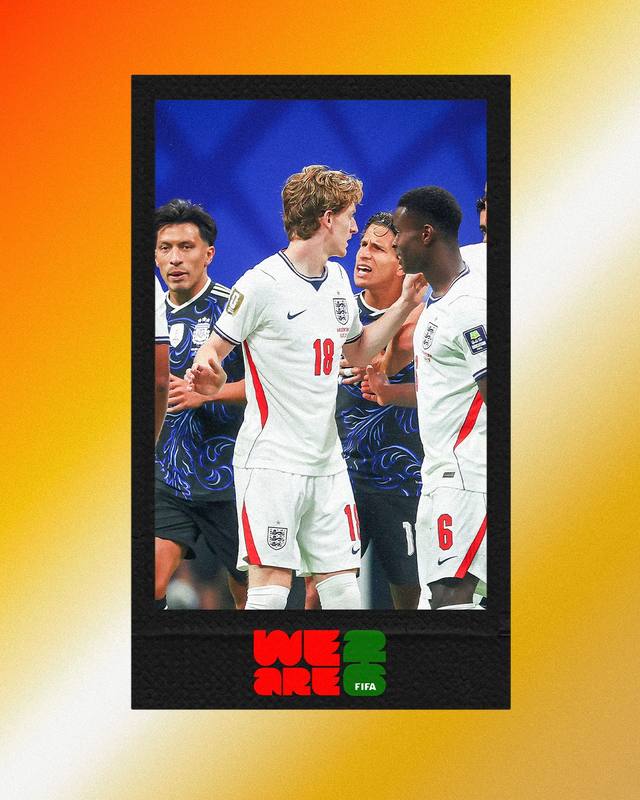
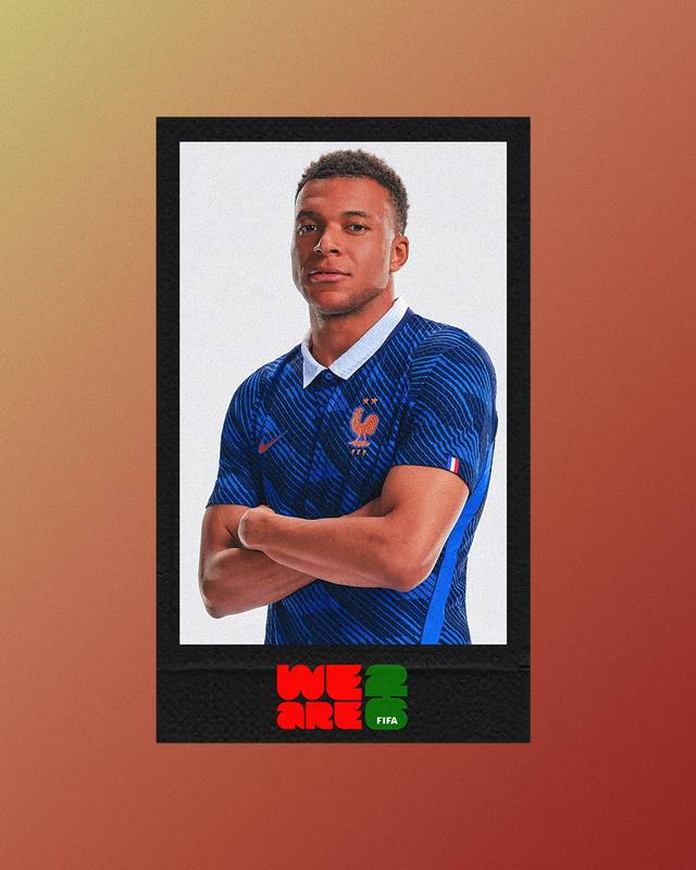
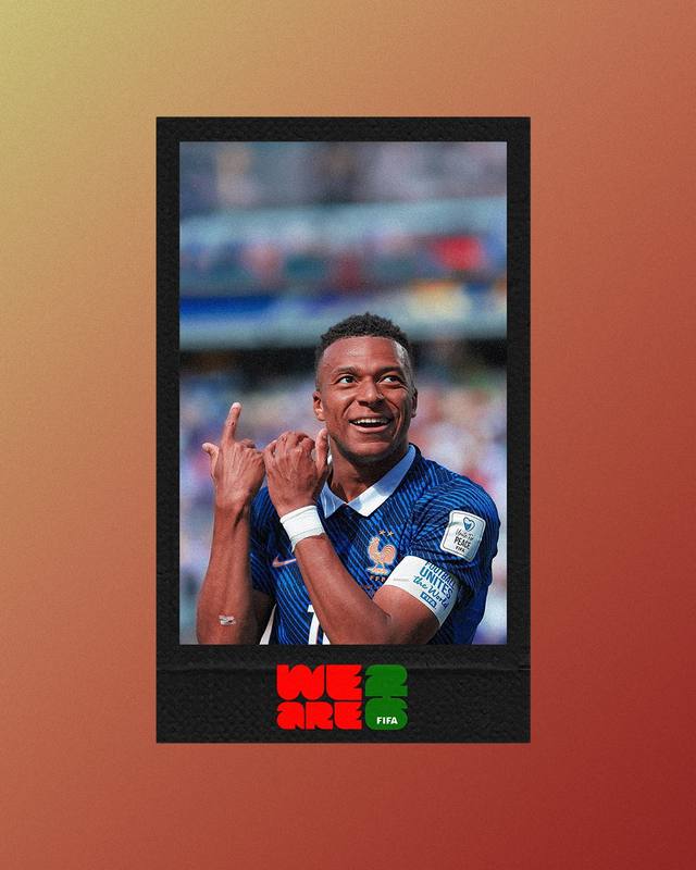
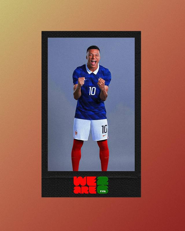
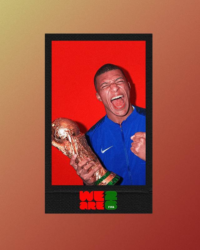
The slow ones outperformed the fast ones.
When this started, the working theory was simple: quality over speed, documentation over reaction. I didn't know yet whether an audience built on instant match reactions would actually sit with something that showed up a day later, built with more care. The numbers ended up answering that question clearly.
Across the campaign, the account pulled 69,338 views and over a thousand direct interactions in a single 30 day stretch, reaching well beyond Jamaica and the UK into the US, Italy, Indonesia, and India, a genuinely international spread for what started as a two person collaboration. Close to 91 percent of that audience sat between 18 and 34, which is exactly the demographic that grew up on football content built for speed. They didn't skip the slower work. They stayed for it.
What actually rose to the top confirmed the whole thesis. The pieces with the most weight behind them, The Last Dance series, the Cape Verde post, Neymar's last kick at a World Cup, weren't the fastest turnarounds in the project. They were the slowest, the most considered, the ones built on an idea rather than a deadline. Cape Verde alone pulled 8.8K views on a caption that read more like a piece of writing than a stat update. That's the actual lesson here: an audience raised on instant content will still stop for something that was clearly thought through, if the thought is real.
No brief asked for any of this. It came from being given room to think, and choosing to use it. What I learned is that the room is worth defending, even when the instinct in football content is always to move faster.
30-Day Views
69,338
Interactions
1,046+
Countries Reached
UK · US · IT · ID · IN
Core Audience Aged 18–34
90.9%